Marta Wasilewska
Graphic Designer
ABOUT
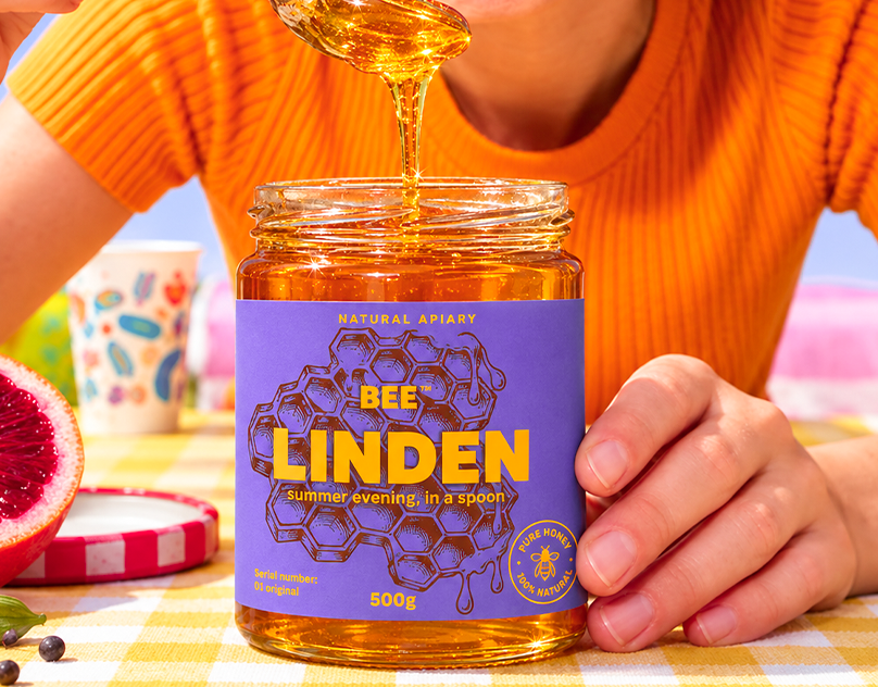
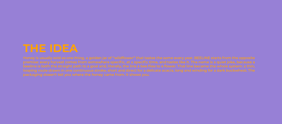
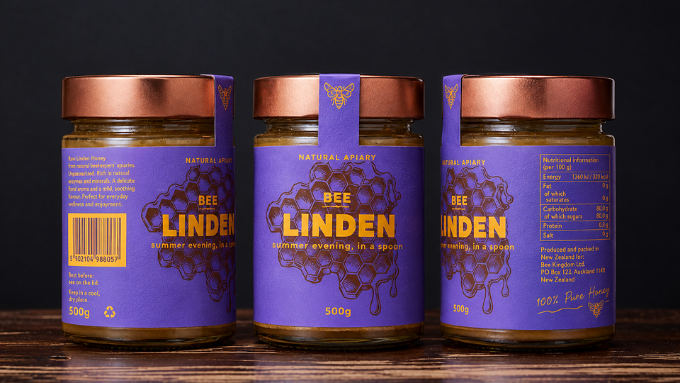
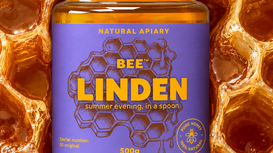
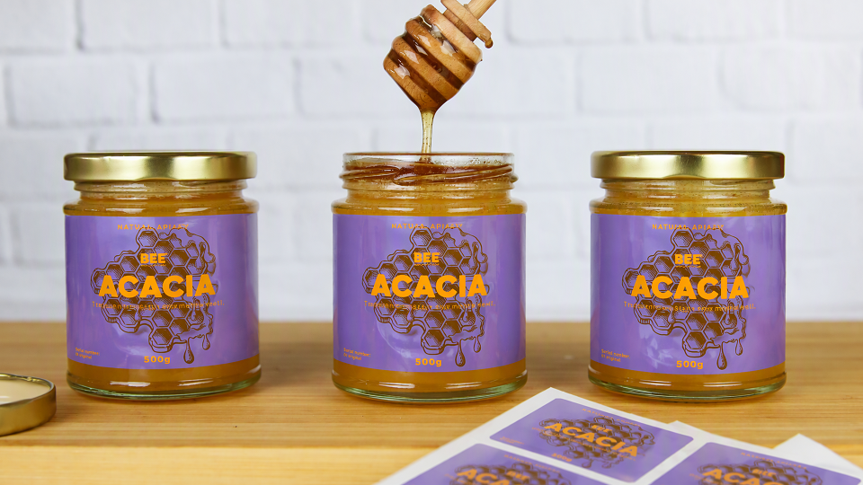
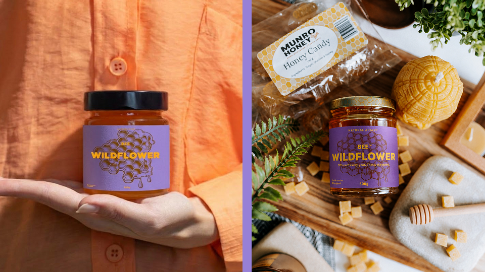
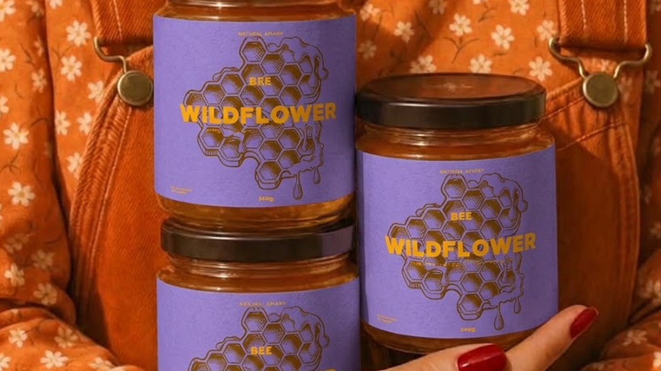
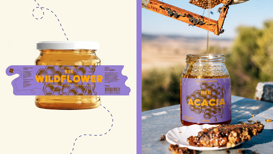
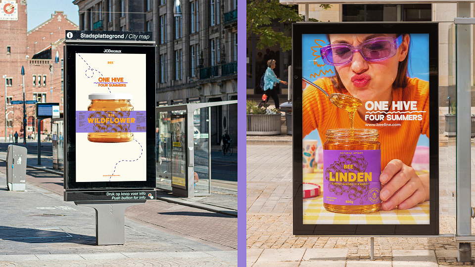
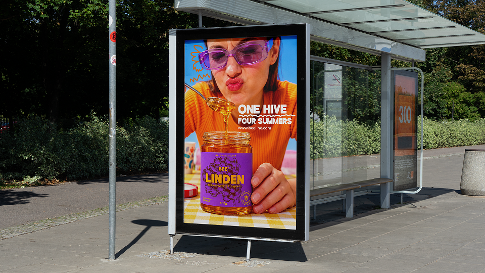
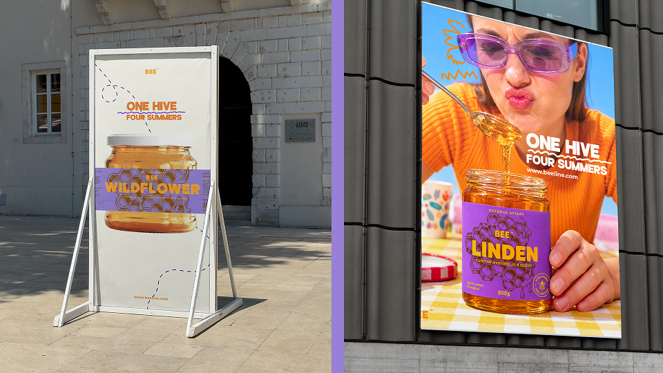
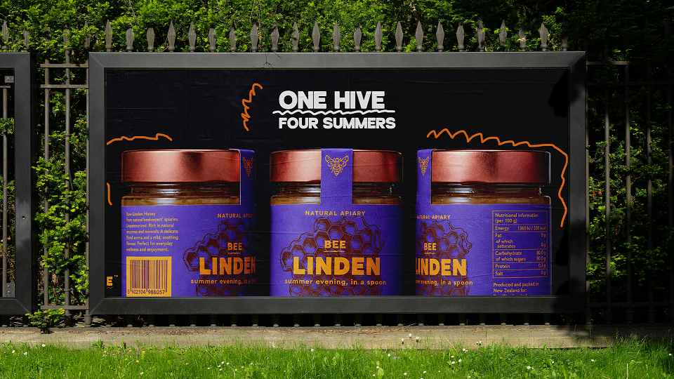
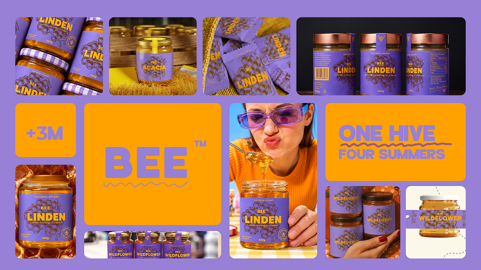
BEELINE is a brand identity and packaging system for a single-apiary honey brand, built on one idea: honey should taste like somewhere. Where most honey branding reaches for the same shorthand of hexagons, cartoon bees, and wooden crates, BEELINE tells the one story honey really has: where the bees went, and when.
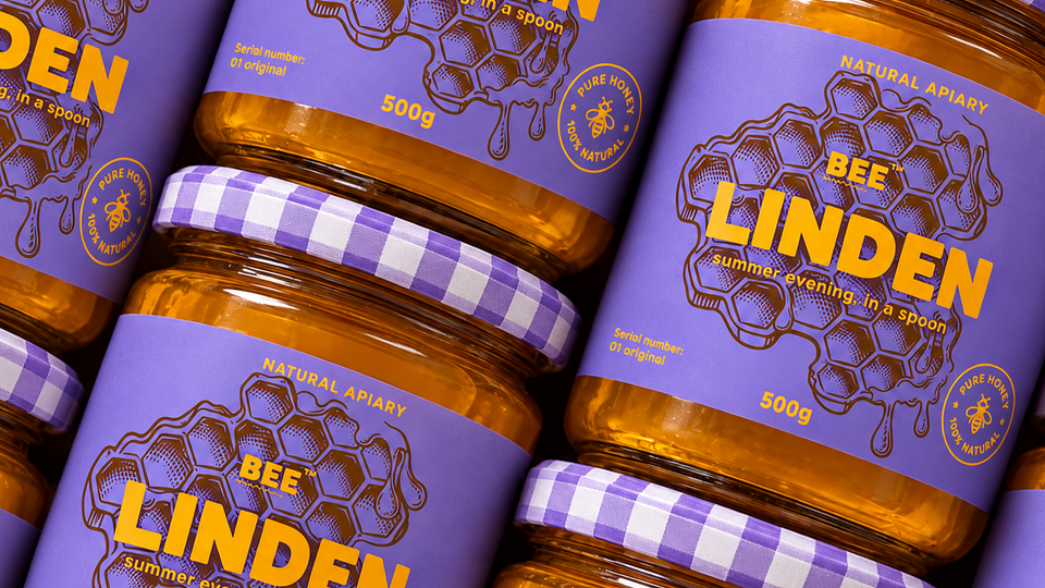
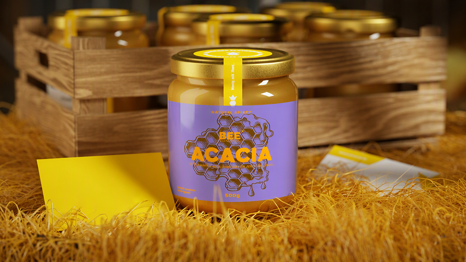
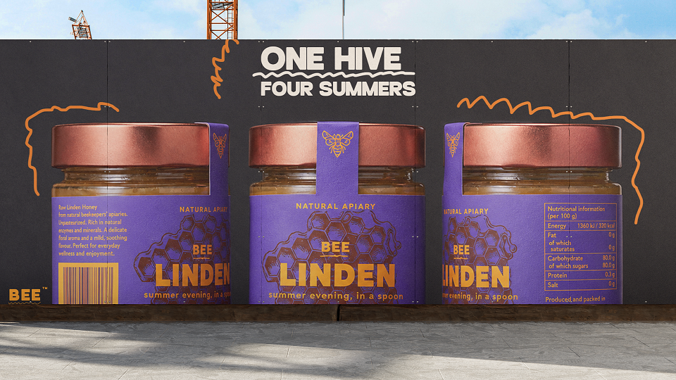
The system is built around a single drawn line, the flight path of a bee from hive to flower, which changes shape with every variety: short and direct for acacia, long and tangled for buckwheat. This case study covers the full identity: logo and visual system, a four-variety jar line told apart by one color and one route each, gift packaging, shipping materials, and a campaign built on dry, specific copy rather than health claims.
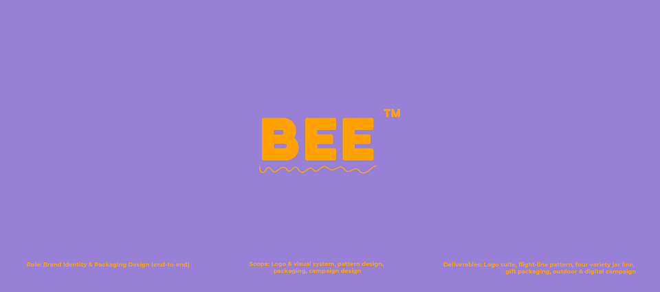
Role: Brand Identity & Packaging Design (end-to-end)
Scope: Logo & visual system, pattern design, packaging, campaign design
This is an independent concept project. The brand is fictional.
MADEIT CREDITS
-

Marta WasilewskaGraphic Designer