Mark Doyle
Design Director
ABOUT
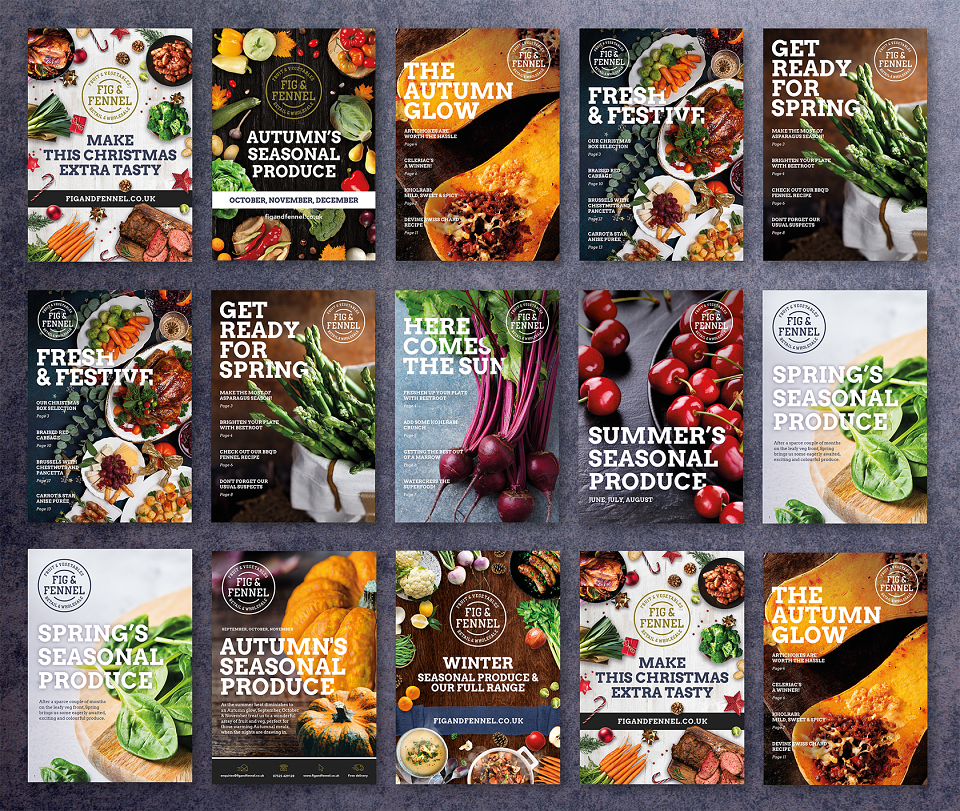
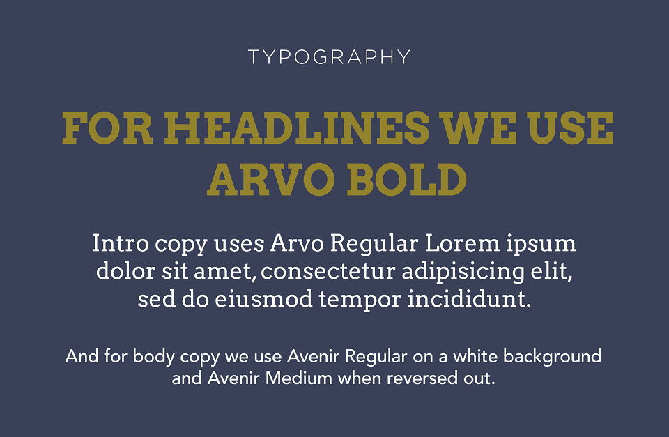
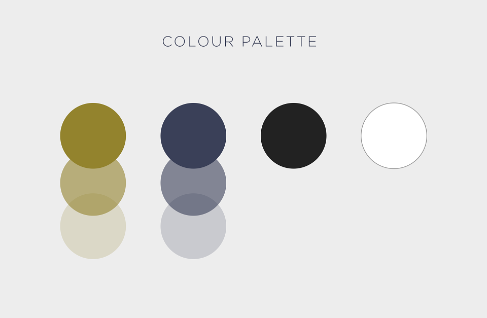
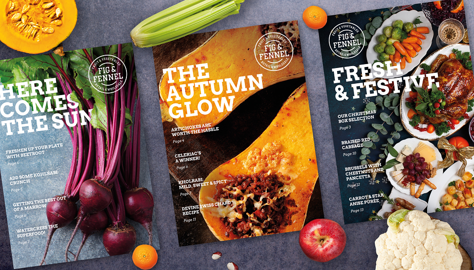
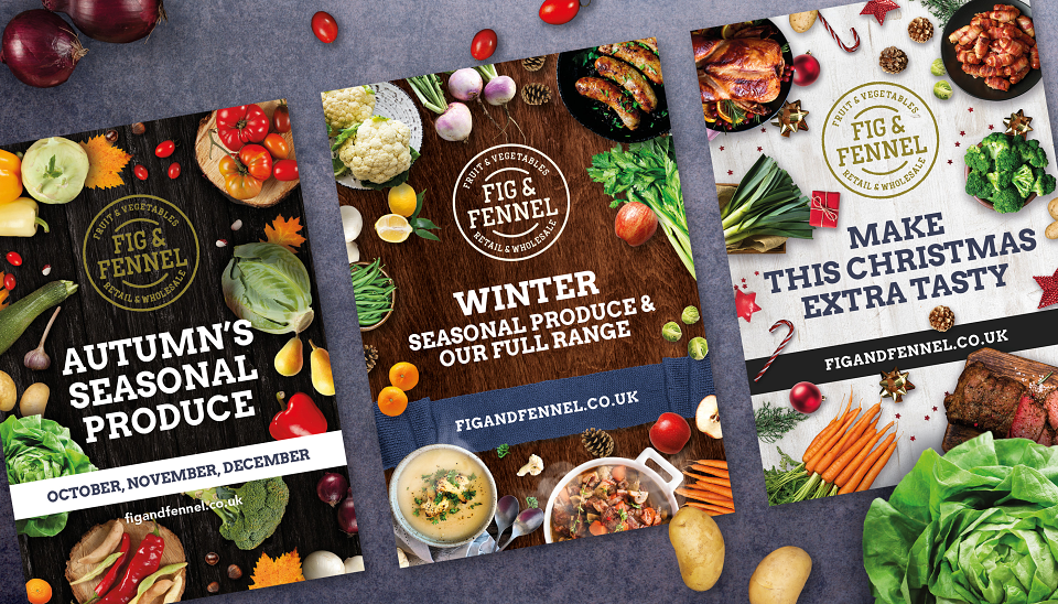
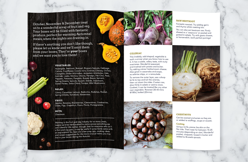
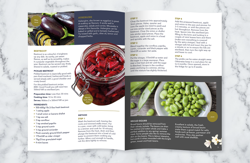
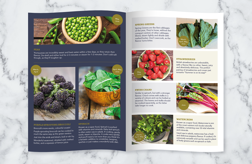
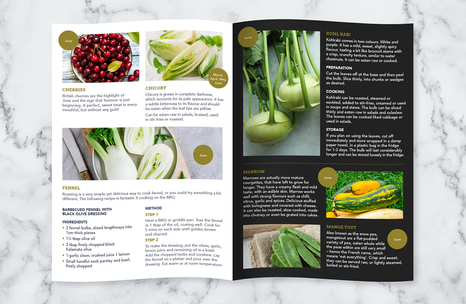
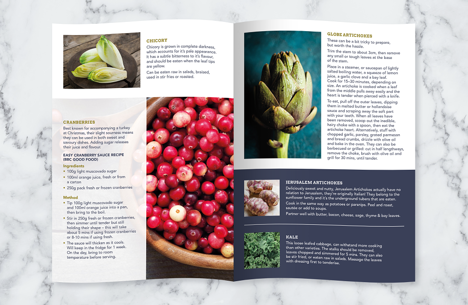
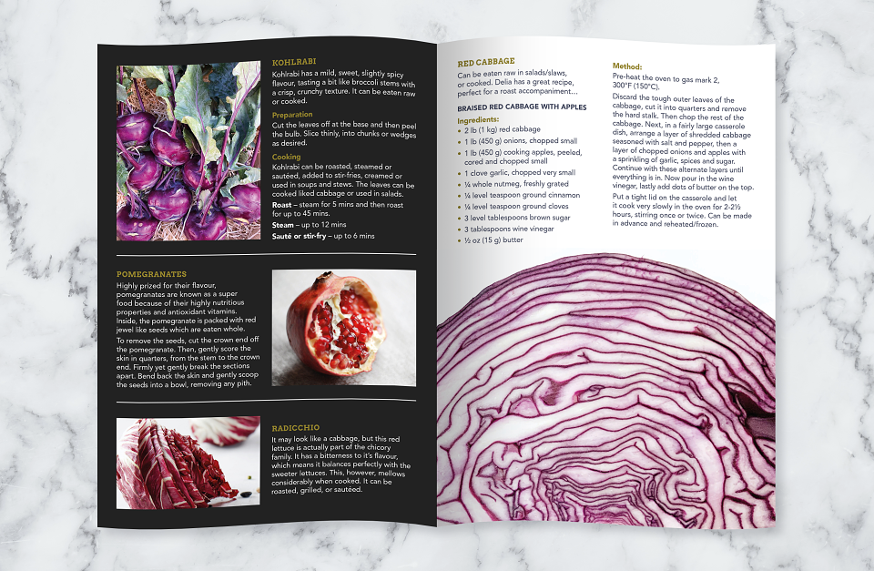
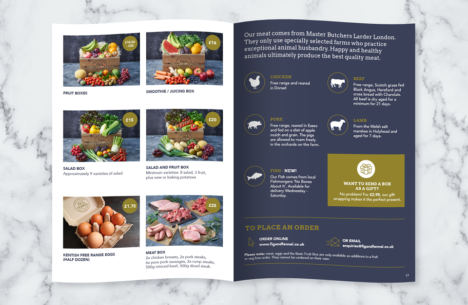
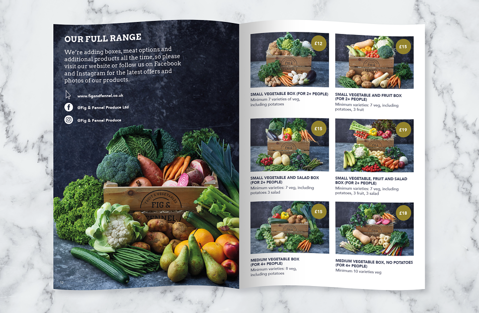
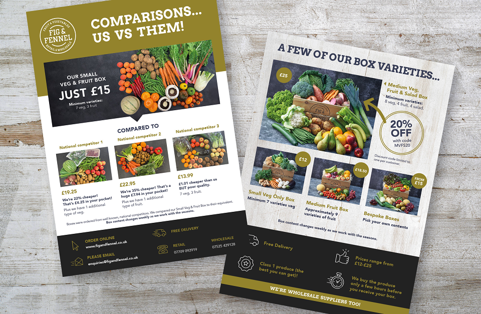
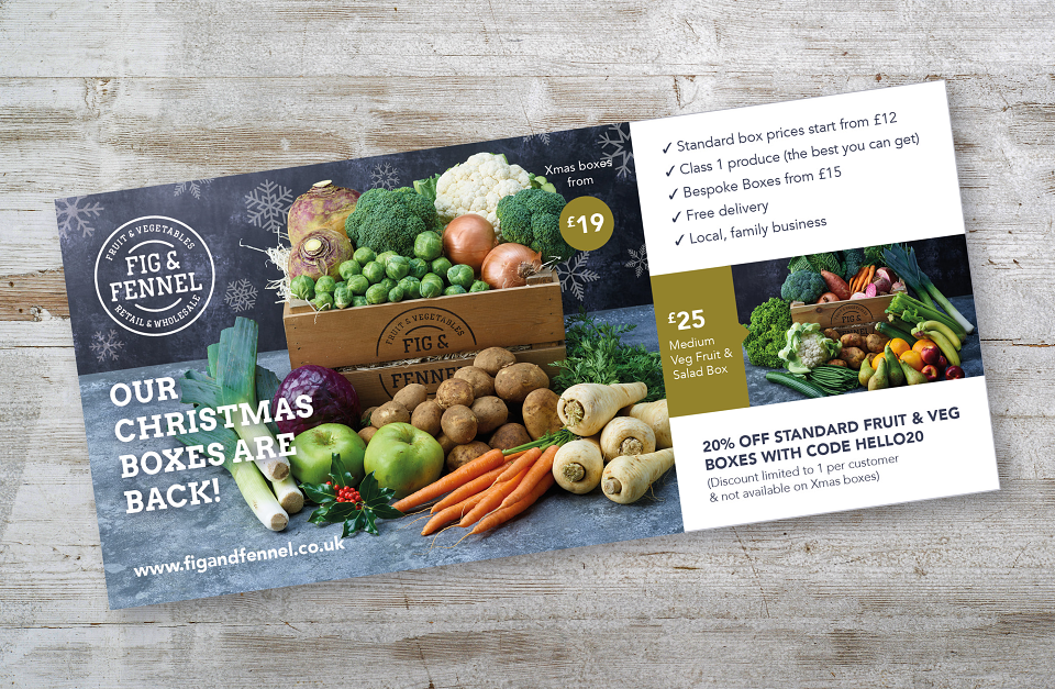
When we first came in to contact with Fig & Fennel they had the shell of a brand identity in the form of a logo and a colour scheme. They wanted their comms to come to life and to really showcase the top class produce they sell to their customers. So that was the brief, to make their booklets and flyers look amazing. We sourced beautiful photography, constructed a bold, impactful typographic hierarchy and created interesting and varied page layouts on booklets and flyers.