Mariska Le Roux
Co-founder and Graphic Designer at Flair Foundry
ABOUT
Ruimsig Centre: Creative Rationale
BRAND POSITIONING STRAPLINE
Our strategy revolves around the following central trigger points
- The area surrounding Ruimsig Centre exudes a feeling of a simple, yet affluent and aspirational lifestyle.
Ruimsig Centre offers its customers a “fresh” experience to enhance their sophisticated lifestyle. The tenant mix and atmosphere reflects the aspirations and lifestyle of the surrounding residents. The area surrounding the centre includes a golf course, botanical gardens, equestrian and country estates.
- Key category offerings include Health & Beauty, Groceries and Home & DIY
These retail categories are displayed in the tenant mix at Ruimsig Centre – a fully-equipped Planet Fitness Gym, and multiple hair and beauty stores keep you looking and feeling good; a big Superspar makes sure you’re cupboards are always stocked with the freshest ingredients; an Easy Life Kitchens store and Mica Paint & Hardware cater for all your home & DIY recreations.
With the above in mind we propose the following positioning strapline:
Ruimsig Centre
Revitalise. Refresh. Recreate
Ruimsig Centre: Look and Feel
LOGO
The existing Ruimsig Centre logo has received the addition of the proposed strapline to support the brand message, but the logo and strapline can be used separately if needed.
LOOK & FEEL
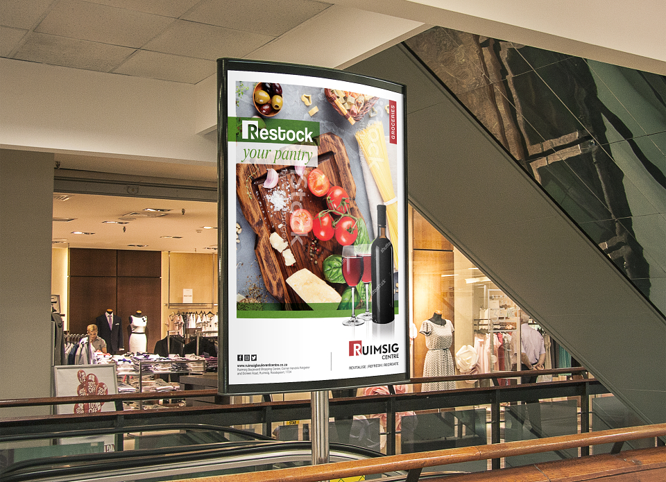
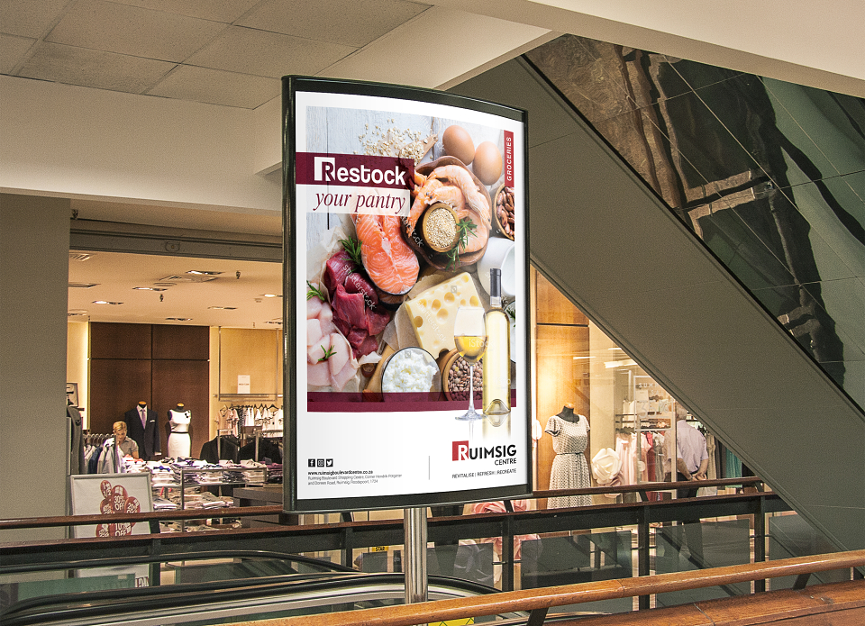
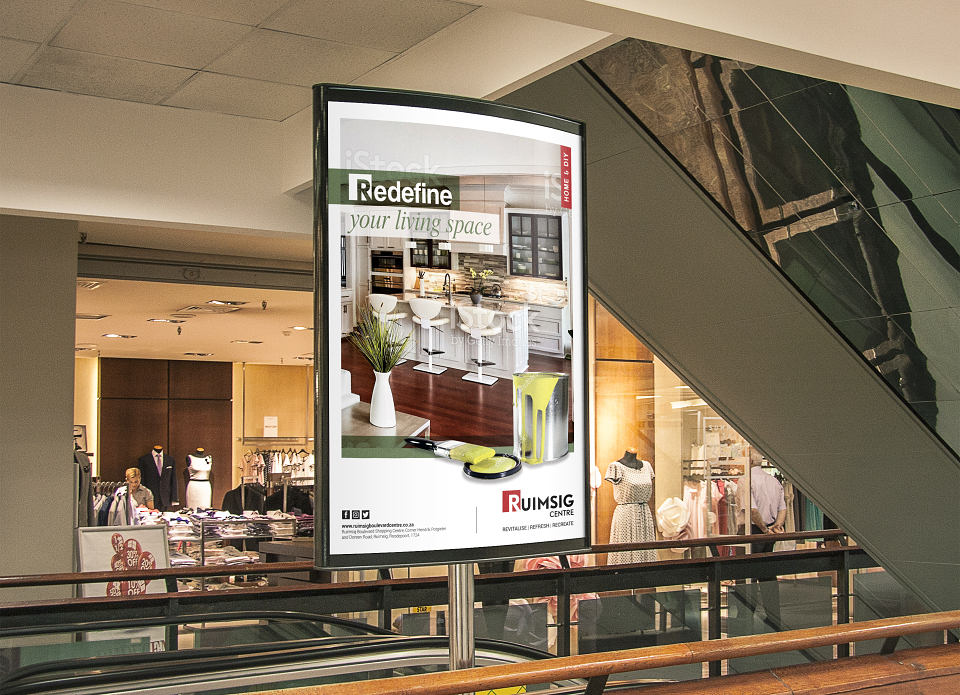
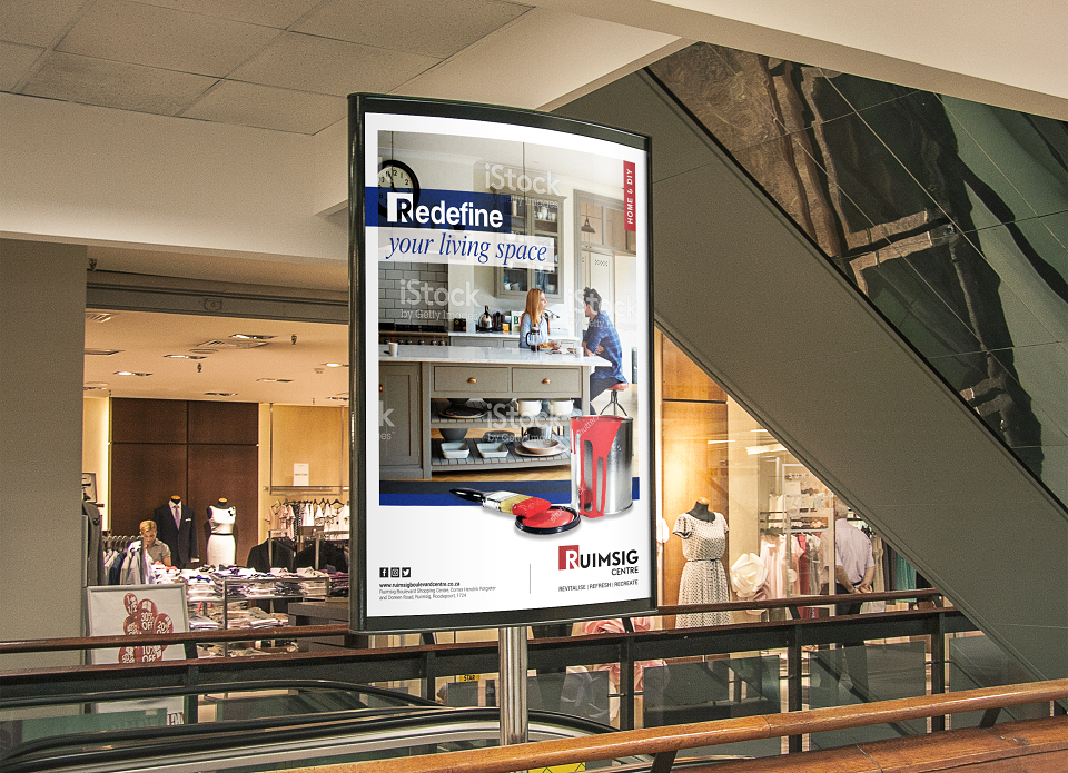
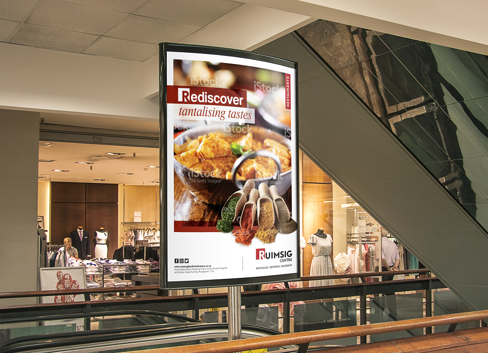
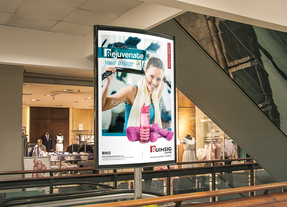
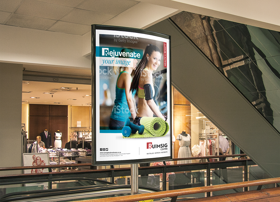
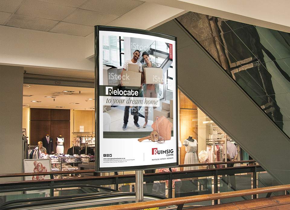
The overall look is clean, contemporary, bold and colourful. The use of a white border on the retail category posters expresses a modern and sophisticated look and enhances the colourful visuals used on the artwork.
The headline on the retail category posters, and for any future poster artwork, uses the main colour picked up in the visual. This is echoed in the transparent bar, of the same colour, located towards the bottom of the visual. The headline is placed inside a holding shape which can be moved to fit in with the visual.
The headline always starts with a ‘Re’ word to echo the strapline, and the ‘R’ always receives the same treatment as the ‘R’ in the Ruimsig Centre logo.
The product shot in the foreground reinforces the offering.
The category tag element at the top of the visual uses the same red colour as in the Ruimsig Centre logo, and this will remain consistent on all future artwork.
Social media icons, contact details, and the Centre’s address are located at the bottom left of the artwork.
On the flags, which use the same visual as the retail category posters, the Ruimsig Centre logo and strapline have been replaced with the logo of the main tenant within that retail category. This helps to inform potential customers of the tenant offering at Ruimsig Centre. The Ruimsig Centre logo and strapline will be placed on its own flag placed in between the retail category flags.