Marina Saprykina
Presentation designer | Graphic designer
ABOUT
The idea
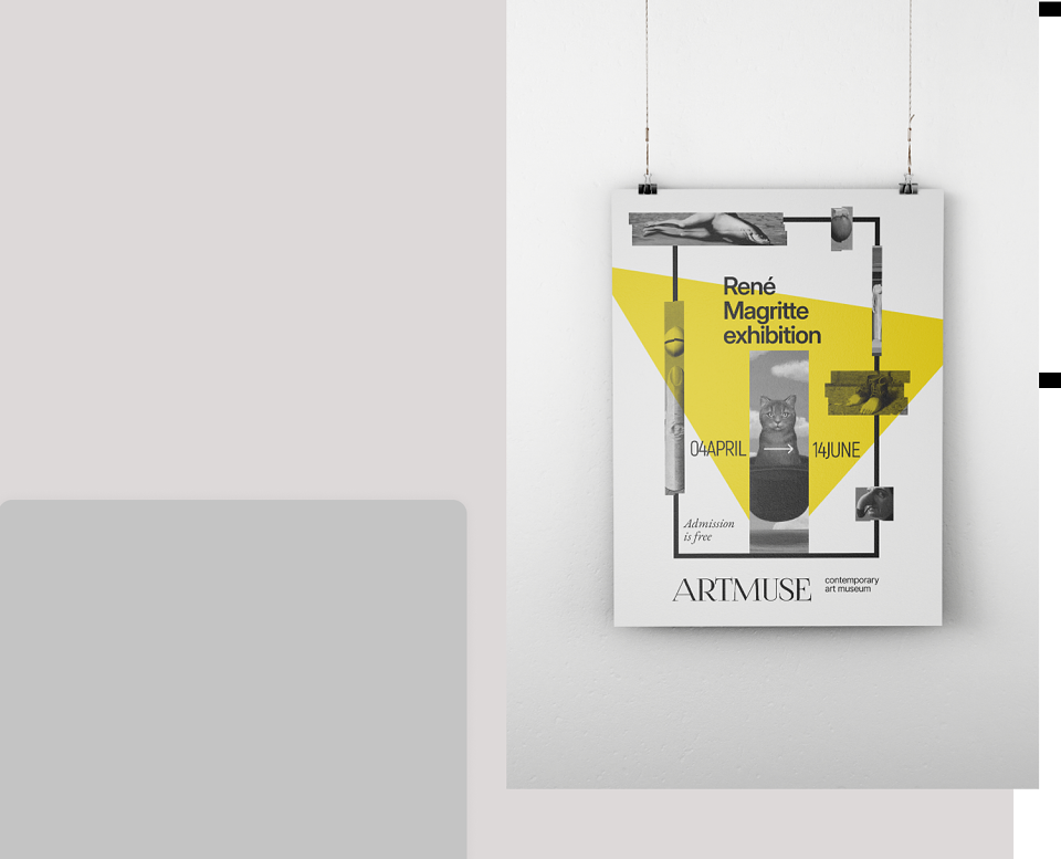
This is not a complete story about René Magritte’s work.
This is a small, silent doorway into his surreal universe — a teaser, not a summary.
I wanted the poster to reflect not the full catalogue of his works, but the feeling of his language:
The mystery.
The contradiction.
The delicate balance between the absurd and the elegant.
The concept
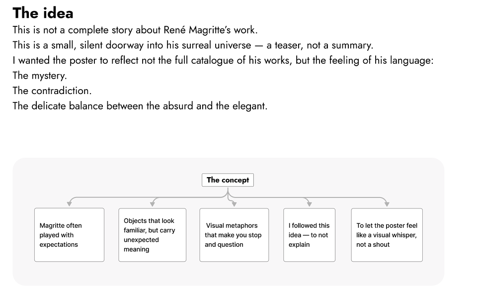
Magritte often played with expectations:
Objects that look familiar, but carry unexpected meaning.
Visual metaphors that make you stop and question.
I followed this idea — to not explain.
To let the poster feel like a visual whisper, not a shout.
Visual language
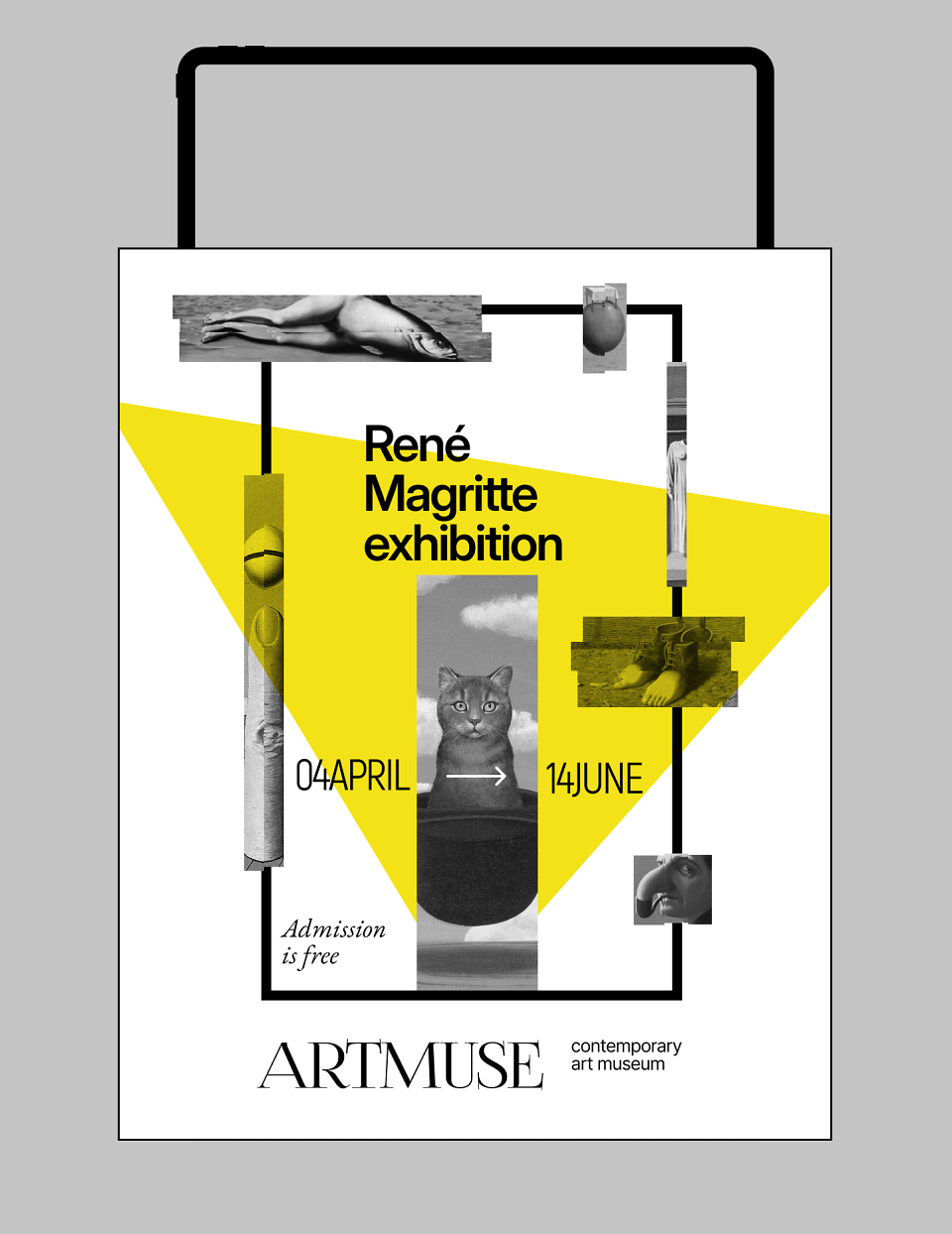
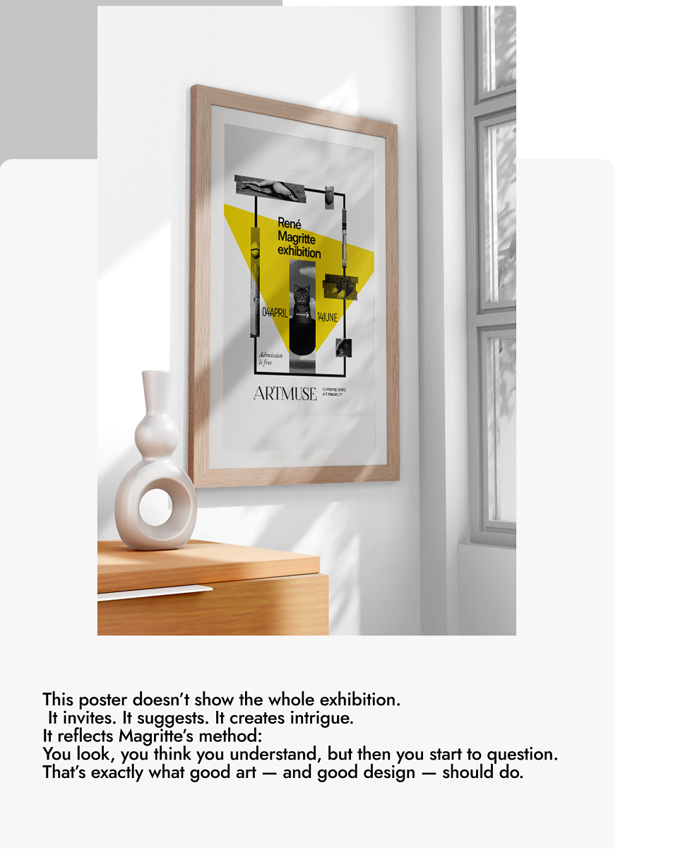
Collaged fragments hint at surrealist symbolism. Geometric cuts reflect visual order inside visual chaos. Yellow triangle acts as a stage spotlight: part of the image, part of the meaning
The arrow between dates is a playful nod to Magritte’s own use of irony and direction. Typography is clean but contrasts with the imagery — to give space and focus.
Why it works
This poster doesn’t show the whole exhibition.
It invites. It suggests. It creates intrigue.
It reflects Magritte’s method:
You look, you think you understand, but then you start to question.
That’s exactly what good art — and good design — should do.
MADEIT CREDITS
-

Marina SaprykinaPresentation designer | Graphic designer