Marie-Louise O'Neill
Branding Designer
ABOUT
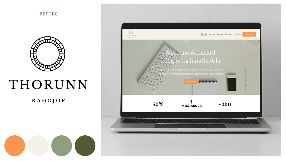
This is a rebranding project for Thorunn. She is Icelandic and offers consultancy services and support for businesses applying for grants in Iceland.
Her original brief was to move away from using her own name for the business. She needed two brands to represent the two main areas of her business, whilst still linking together visually. She was drawn to circular icons and wanted to keep with that motif.
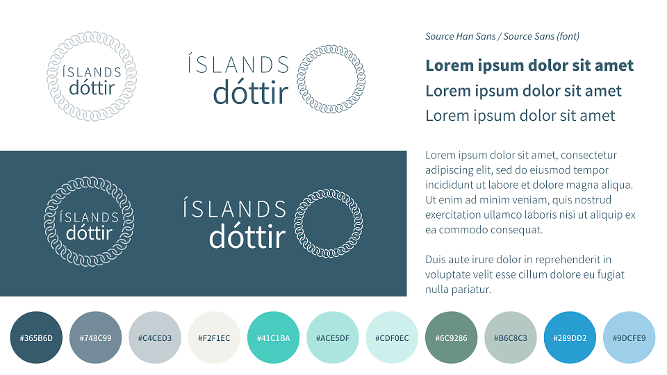
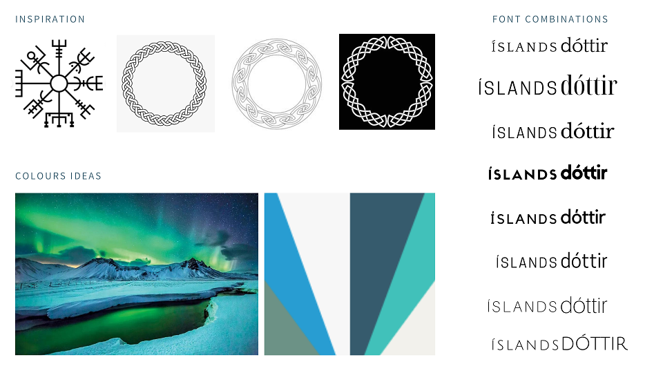
Initially she wanted another 'pop' of colour to be used alongside the orange in her old brand and to avoid blue tones that are popular with the financial industry. The overall logo design needed to be clean, modern and with a nod to Scandinavian aesthetics.
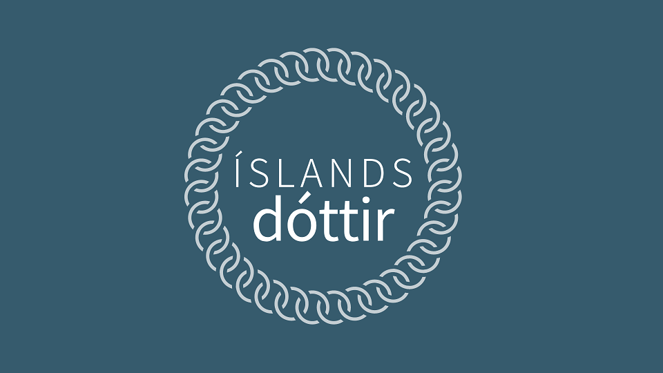
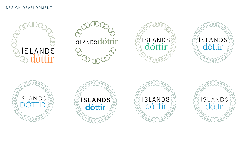
Her consultancy and high end work sits under the brand Íslandsdóttir, which translates to 'daughter of Iceland'. This name comes from a book character that’s popular in Iceland. The interlocking chain icon represents collaboration, support and is a nod to Nordic knots and circles that we looked towards for our design inspiration.
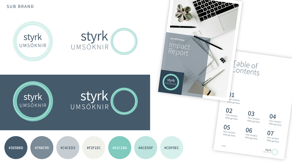
The client ended up changing her mind on the colours, discarding most of the old colours and bringing in turquoise and dark teal/grey for the primary colour palette. We kept the original buff/beige for warmth and softness, and the mid green was kept in the secondary colour palette as an option along with the others.
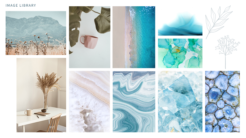
The design process was a collaboration with the client, held on video calls and using screen sharing to bounce the ideas, develop the ideas and then refine them at each stage. We looked at fonts, colours and images for the brand library together, cutting down much of the back and forth of emails.
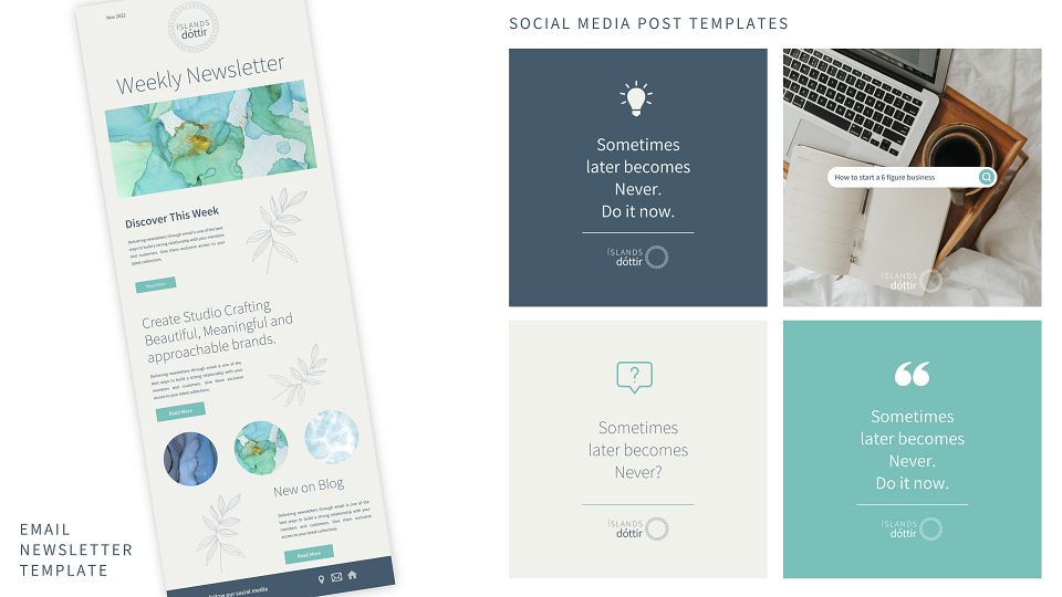
Customised templates for social media, email newsletter and workbooks were also created in these sessions, and were based on available design templates to save time.
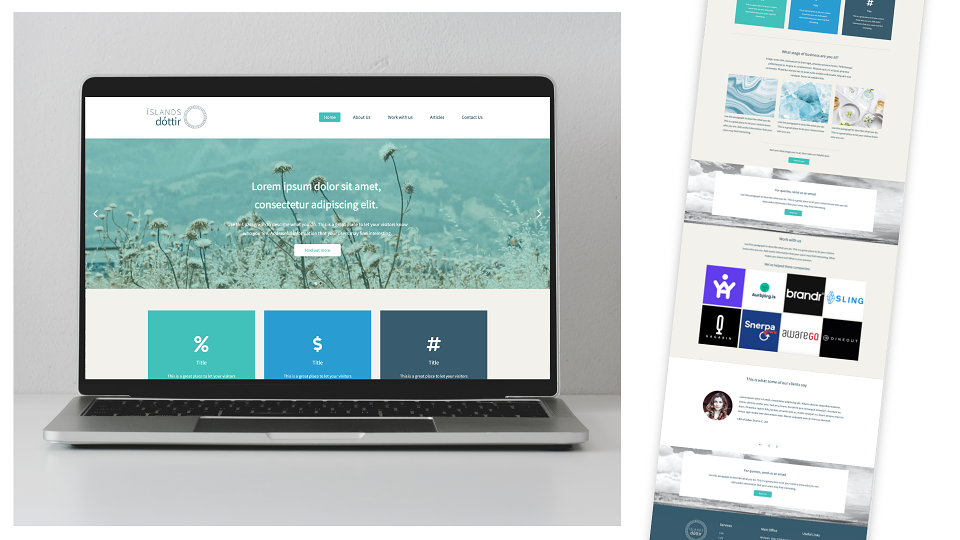
The website for Íslandsdóttir is in the early stages, mapping out content and adding in imagery. We've started with a website theme, but continue to adapt the design, building in more personalised sections and touches.
Once the Íslandsdóttir logos were nearly finalised, we then created the sub brand, Styrkumsóknir. This literally means 'grant applications'. This area of her business focusses on her online courses and resources for businesses starting out or with a smaller budget. The Styrkumsóknir brand is simpler and no frills, with only the core colours of turquoise and dark teal/grey.
Both of the Íslandsdóttir and Styrkumsóknir brands are built to work together side by side and independently of each other. It will be interesting to see how the design aesthetics and branded items develop as we continue to work with the client over the coming months.
AWARDS
Indigo Design Awards 2023