Mang Sánchez Studio
Valencia
ABOUT
Visual Identity for a Norwegian holding Hospital
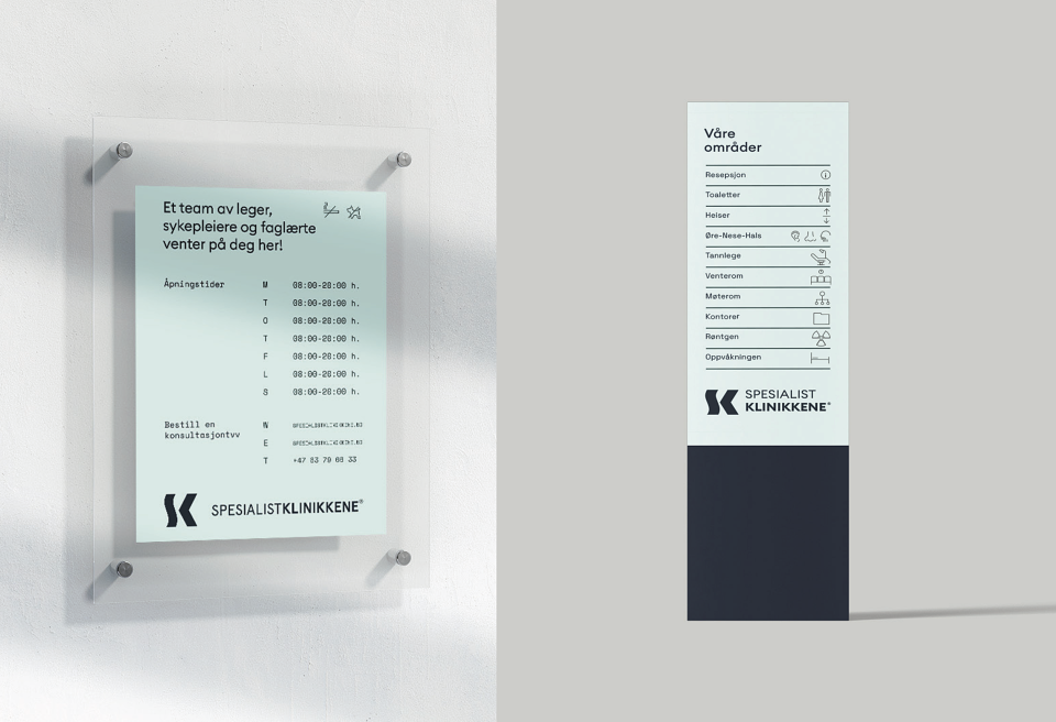
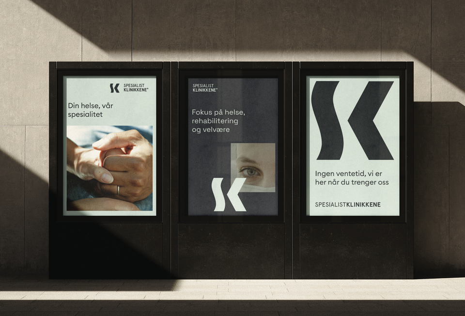
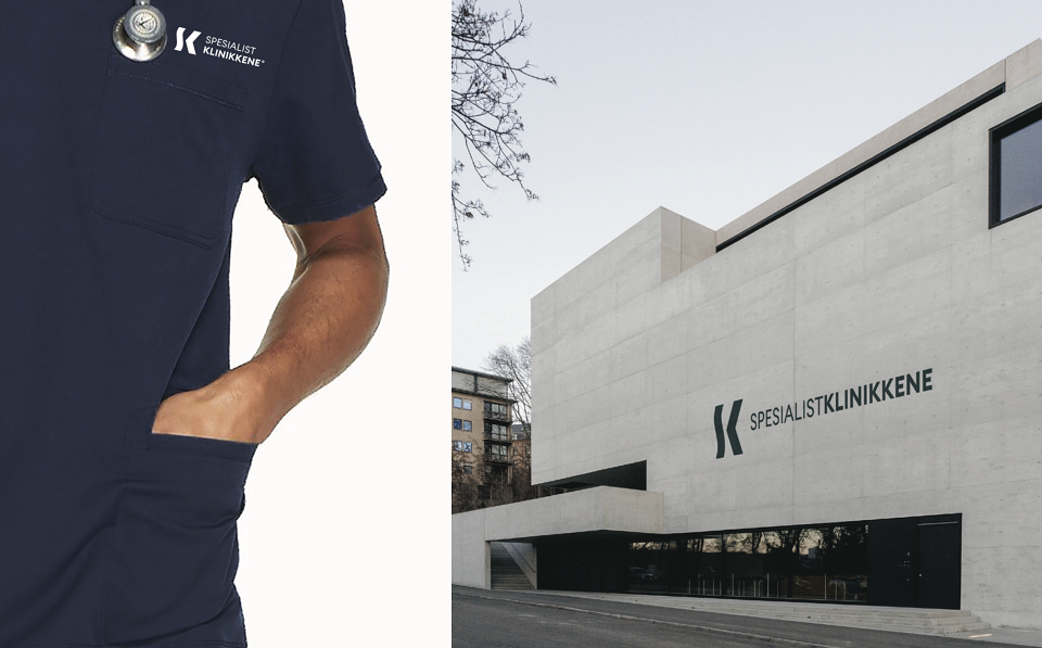
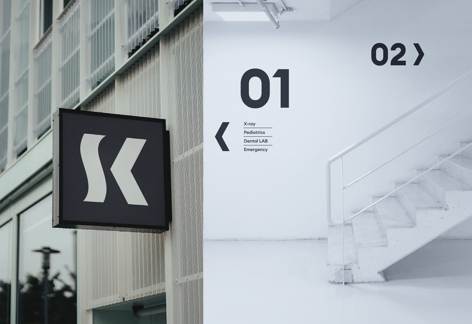
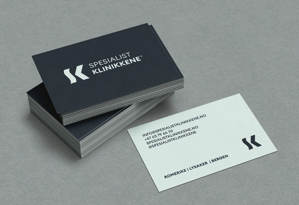
A brand where design speaks both care and action. The S, inspired by soft waves, represents human touch, empathy, and the calm of the hospital environment. The K, shaped like an arrow, symbolizes decisiveness, solutions, and progress toward well-being.
Together, they form a symbol that balances sensitivity and efficiency: healthcare with purpose.
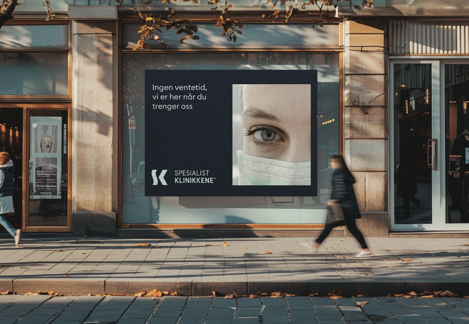
Your health can't wait.
That's why we have optimised our processes to provide you with fast and efficient care, without compromising on quality. Here, you'll get the diagnosis and treatment you need in the shortest possible time.