

From Aman and Bottega Veneta to Louis XIII and Loro Piana, the most luxurious brand identities don’t just look expensive. They build entire worlds through philosophy, craft, restraint and consistency. Here’s what the smartest examples of luxury branding can teach the rest of the industry about building something genuinely premium.
The best luxury branding never seems to be trying especially hard. That’s partly why it’s so seductive. In a market full of brands desperately telegraphing premium cues through serif wordmarks, muted colour palettes, wide tracking and tasteful beige photography, the real thing tends to feel almost suspiciously calm. It doesn’t oversell. It doesn’t wave for attention. It doesn’t explain itself to death. It simply behaves as though its value is already understood.
That’s what makes true premium branding so much more interesting than the endless parade of brands trying to look expensive. At the highest level, luxury branding design isn’t about a polished surface treatment or a reassuringly upscale campaign. It’s about a system of belief made visible. It lives in the product, the service, the pacing, the materials, the architecture, the codes, the omissions, and the standards a brand refuses to compromise. The strongest luxury brand identity examples don’t just look refined. They feel governed by something deeper.
Christine Natalia, Associate Creative Director at Lonsdale, puts it brilliantly: “For me, the most luxurious brand identities are the ones that never need to prove themselves. They don’t rely on logos or campaigns, they build a world so complete and so considered that the identity speaks entirely through experience, craft, and conviction. What separates truly enduring luxury brands from others is their commitment to the philosophy rather than aesthetics of brand identity. Not how something looks, but what it believes.”
That’s exactly the right way into this subject because it strips away a lot of the nonsense. Luxury isn’t a typography choice. It isn’t a premium stock shot. It isn’t a product photographed on marble with a sentence about craftsmanship floating nearby. Luxury, when it’s convincing, is structural. It is what happens when the brand’s values are so deeply embedded that every touchpoint seems to know the rules without needing to announce them.
That is also why the best luxury brands often feel unusually coherent. They don’t tend to have one glamorous bit doing all the work while the rest of the experience quietly falls apart. Their communications, products, environments and service all seem to belong to the same worldview. In lower-involvement categories, brands can sometimes get away with a mismatch between identity and reality. In luxury, the gap shows almost immediately. If the story says one thing and the experience says another, consumers feel the fraud.
The most instructive luxury brands understand this instinctively. Aman has built a global hospitality identity around peace, place, privacy and intuitive service. Bottega Veneta has made a woven leather technique so recognisable it often doesn’t need a visible logo at all. Louis XIII has turned time itself into a brand philosophy. Loro Piana has built immense equity through an almost unnerving confidence in material excellence. Different sectors. Different audiences. Different business models. The same central principle: identity built from the inside out.
And that, really, is why this category remains so useful to study. The best luxury brand examples don’t merely show how to make something look premium. They show how luxury branding design can become an operating system. They prove that the strongest premium branding examples are not louder than the competition. They’re more certain. That certainty is what gives them their gravity.
What Defines Luxury Branding Today
Дарья Соколова
Luxury branding used to lean more heavily on obvious signals of expense. Crest-like marks. Heavy packaging. Heritage flourishes. A lot of gold. A lot of script. A great deal of visual ceremony. Some of that still has its place, of course, but it no longer guarantees very much. The modern consumer has seen too many brands borrow the signifiers of luxury without building any of the substance underneath them.
That’s why luxury branding today is less about visible opulence and more about coherence, control and confidence. The strongest luxury brands no longer need to scream “premium.” They create a premium image through behaviour. They control the conditions in which they are experienced. They create standards that can be felt in product, service, pace and space. They edit. They resist overexposure. They understand that luxury, unlike mass marketing, often becomes weaker when it is too eager to explain itself.
Aman is a useful place to start because it represents a form of luxury identity that doesn’t depend on constant visual assertion. Aman’s own brand story explains that the name derives from a Sanskrit word for “peace,” and says the business was founded with the goal of providing a level of service and experience that is “peerless in every way.” Its wider brand language repeatedly emphasises privacy, intuitive service and a setting-specific sense of calm.
That’s not just positioning copy. It’s the operating principle. The thing that makes Aman so effective as a luxury brand is that the philosophy appears to govern everything else. Properties vary hugely in geography and architecture, yet the emotional register remains consistent. You don’t experience Aman as a chain in the ordinary sense. You experience it as a worldview translated through different places. That’s much harder to do than creating visual uniformity.
Luxury branding today is also defined by what a brand chooses not to do. Does it refuse over-distribution? Does it avoid endless promotional noise? Does it reject constant reinvention for its own sake? Those absences matter. Scarcity is not only about product quantity. It is also about attention. A brand that appears everywhere, says everything and reacts to every passing trend starts to erode its own mystique.
This is where Natalia’s point about philosophy over aesthetics becomes especially sharp. Aesthetic cues can be copied in a morning. Philosophy cannot. Philosophy shapes decision-making. It determines how a product is made, how a space feels, how a customer is treated, how quickly or slowly a brand evolves, and what compromises are considered unacceptable. That is where the real distinction lives now.
The market, after all, is full of brands that know how to look premium. Far fewer know how to remain premium under pressure.
Key Elements Behind Premium Branding and Luxury Design
Saboteur
If luxury is built from the inside out, what are the actual elements that make it work?
Restraint
Real premium branding rarely feels frantic. It doesn’t usually over-communicate or pile on proof points. It understands that value can be diminished by too much pleading. This is one reason Bottega Veneta remains such an interesting case. The house’s intrecciato weave has functioned as a recognisable signature since 1975, and Bottega’s own site describes it as a house code preserved through “meticulous know-how and collective human dedication.” The identity lives in the making. That matters because it shifts branding away from overt naming and into crafted recognisability. The weave is the signal. You either know it or you don’t. That kind of confidence is one of luxury’s most powerful tools.
Material Truth
Premium identity becomes flimsy very quickly when the materials don’t justify the story. Loro Piana has built enormous authority around rare fibres and obsessive sourcing, with its own site explaining that baby cashmere is collected when the kids are less than a year old and yields only around 30 grams per animal, while its vicuña storytelling emphasises rarity, careful stewardship and softness. That is a brand built around the belief that extraordinary material quality is itself a sufficient argument.
Time
Luxury has always had a complicated relationship with time because time functions both as a production reality and a symbolic asset. Louis XIII Cognac is one of the clearest examples of a brand turning that fact into identity architecture. The brand’s own materials say that time is at the heart of Louis XIII and describe each decanter as the life achievement of generations of Cellar Masters. Its official legacy pages note the succession of Cellar Masters since 1874, while its decanter history roots the object in a distinctive form inspired by a historic flask found in Jarnac.
Recognisability Without Explicit Branding
This is one of the best tests of whether a luxury identity is truly strong. If the logo disappeared tomorrow, would the brand still be legible? Aman’s stillness, Bottega’s weave, Louis XIII’s decanter, Loro Piana’s fibre obsession: these are identities that survive beyond the mark.
Consistency Without Flattening
This is especially difficult for global luxury brands. To feel recognisable across markets without becoming repetitive requires a stronger internal philosophy than a mere visual template can provide. Aman’s own storytelling around omotenashi and “the spirit of the setting” shows how seriously the brand takes this balance, framing service through anticipation, respect and setting-specific sensitivity rather than rigid sameness.
Omission
Luxury brands often gain power from what they refuse. Refusal to over-discount. Refusal to over-distribute. Refusal to chase every social trend. Refusal to fill every inch of a product with branding. In many categories, the instinct is to add. In luxury, subtraction is often where the real authority appears.
Luxury Brand Identity Examples That Define High-End Branding
Natalia’s four examples are strong because each represents a different route to luxury identity, while still proving the same broader point.
Aman: philosophy as identity
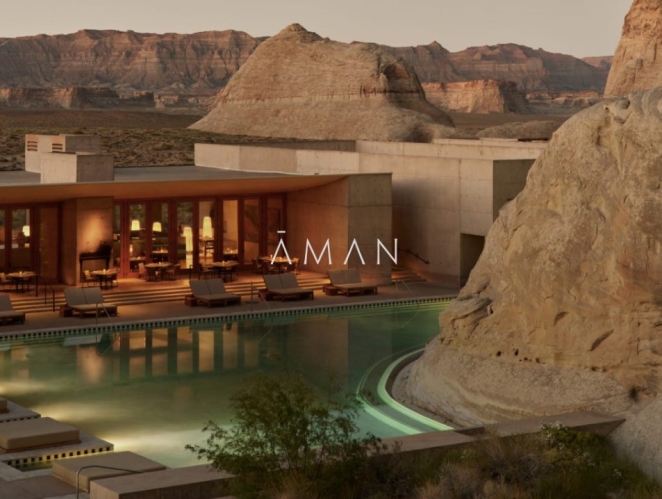
“Aman,” Natalia says, “does it not through visual rules but through a shared philosophy. Every property feels completely local yet completely itself. That’s incredibly rare.”
It is. Aman’s own language repeatedly returns to peace, privacy, intuition and place, describing a global collection of properties united by service philosophy and a deeply considered approach to setting. That makes Aman one of the most sophisticated examples of luxury identity because it is held together less by obvious graphic repetition than by emotional and behavioural consistency.
Plenty of hospitality brands can create consistency by standardising aesthetics. Aman’s accomplishment is more subtle. It allows each property to remain rooted in local architecture, landscape and culture, but preserves a very specific psychological temperature. That temperature is the brand. The stillness is the brand. The refusal to clutter is the brand. The space between actions is the brand.
This is why Aman is such a useful answer to the question of how luxury brands create a premium image. They don’t always do it by adding more visible luxury cues. Sometimes they do it by removing noise so thoroughly that the whole experience starts to feel almost ceremonial.
Bottega Veneta: craft as the logo
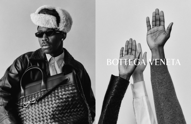
Natalia’s second choice is equally revealing. “Few brands are instantly recognisable without a name or logo displayed, but that’s the case for Bottega Veneta. The intrecciato weave – their signature hand-woven leather technique – is the identity and you either recognise it or you don’t.”
Again, exactly right. Bottega Veneta has one of the clearest non-logo recognisability systems in fashion because the weave itself functions as the house code. The brand’s own site treats intrecciato not as decorative trim but as an ongoing field of technical and aesthetic experimentation rooted in handcraft.
That’s what gives the identity so much strength. The recognisable feature is not an applied surface asset. It is structurally bound to the making of the product.
Natalia also points to the Daniel Lee era, when Bottega pushed that philosophy of restraint even further. That interpretation fits with the brand’s 2021 decision to delete its social media accounts, which was widely reported by outlets including Vogue and The Guardian. The significance of that move wasn’t just publicity or mystique for mystique’s sake. It reinforced an identity based on confidence, control and selective visibility.
A lot of brands say they want to be quiet luxury. Very few have the asset strength to go genuinely quiet without disappearing. Bottega did.
Louis XIII: time as a brand system
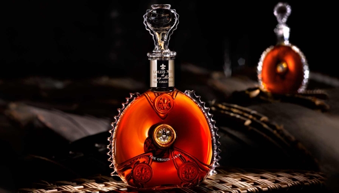
Natalia’s third example may be the most conceptually elegant of the group: “Four generations of cellar masters work on each decanter of Louis XIII Cognac, knowing they will never taste the finished blend because it takes one hundred years to make. The entire brand flows from that single truth.”
The brand’s own materials support the larger point even if phrasing varies in different places. Louis XIII consistently frames time as its core philosophy, emphasising generational transmission between Cellar Masters and positioning the Cognac as something shaped over a century-long horizon. Its decanter, too, is part of that same system, with official pages tracing the object back to a historic flask discovered in Jarnac and revived in 1874 as the house vessel.
What makes Louis XIII such a powerful luxury identity is that the central belief is so total. Time governs the product, the storytelling, the symbolism, the object, the mythology. Even its much-discussed “100 Years” collaboration with Pharrell Williams extended that logic by creating a song intended for release in 2117, contingent on environmental survival.
That is branding at a very high level because it avoids the trap of scattered luxury storytelling. Everything points back to one core truth. Nothing feels bolted on.
Loro Piana: product as identity
AKQA
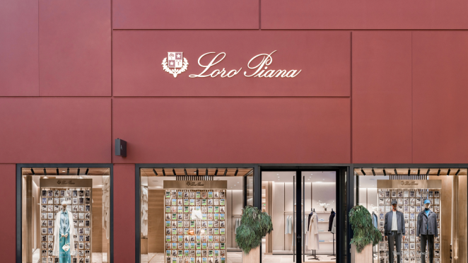
Natalia’s final example is perhaps the quietest and, in some ways, the most revealing. “The fact that it commands the highest prices in luxury fashion while saying so little is remarkable. It’s the ultimate example of letting the product be the identity.”
Loro Piana’s official storytelling repeatedly foregrounds fibre rarity, technical handling and material excellence, whether discussing vicuña, baby cashmere or other exceptional textiles. This is not a brand that relies on high-drama communication to maintain its status. On the contrary, its strength comes from treating the material itself as a sufficient source of authority.
That’s extremely difficult to do well because understatement only works when the substance can withstand it. Quietness without excellence is just invisibility. Loro Piana escapes that problem because the products, pricing and sourcing story all reinforce one another.
It is also one of the best answers to the question of what elements define premium branding design. Sometimes the answer is not more expressive design. It is design confident enough to let the material do more of the speaking.
Premium Branding Examples Across Industries
JSR Agency
One of the more useful myths to kill in this conversation is the idea that luxury branding belongs only to fashion houses and five-star hotels. The principles travel far more widely than that.
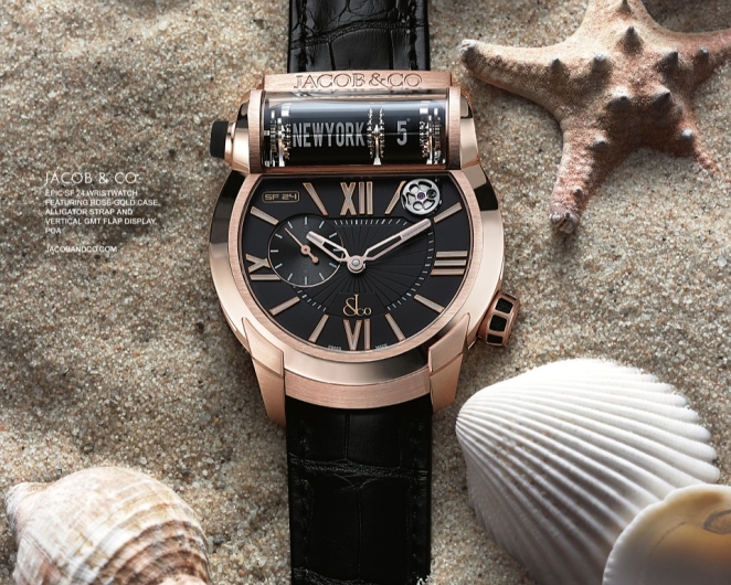
In watchmaking, Rolex remains a classic premium-brand case because it has fused recognition with a relentless emphasis on quality, durability and long-term watchmaking expertise. Rolex’s own corporate language describes the company as an integrated and independent Swiss manufacture recognised for quality and expertise, underscoring how central technical seriousness remains to the identity.
In leather and saddlery, Hermès offers another compelling route. The brand’s own materials describe the saddle stitch as an Hermès signature and frame the transmission of craft skills and values as fundamental to the house.
But as Simon Manchipp, Founder at SomeOne, points out, Hermès’ real genius may be even simpler: “Hermès. Most ‘luxury’ brands try too hard—they’re all gold leaf and desperation. Hermès is different because it’s centered on the orange box. A color that was originally a wartime necessity became the ultimate signifier of ‘if you know, you know.’ It’s a brand that trusts its craftsmanship so much that the logo is almost an afterthought. That’s real power: when the color of the cardboard does all the talking.”
It’s a brilliant observation, because it shows how luxury identity can harden around something as apparently modest as packaging. In Hermès’ case, the box isn’t an accessory to the brand. It’s part of the brand’s mythology, proof that a single asset, repeated with enough confidence, can become as powerful as any logo.
In automotive, Rolls-Royce shows how luxury identity can be built around commissioning rather than simple ownership. The marque’s Bespoke pages describe its cars as hand-made, highly personalised works of art, created in collaboration with craftspeople and designers. That moves the brand away from standard product marketing and into a rarer territory where authorship and singularity become part of the experience.
In beauty and personal care, Aesop is a particularly useful premium branding example because it proves sophistication does not require ornamental excess. Aesop’s own philosophy on design says that well-considered design improves lives and that intelligent, sustainable design extends across formulations, spaces and utilitarian containers. That is premium identity built not on overt glamour, but on intellectual consistency and considered restraint.
Across all of these industries, the common thread is straightforward. Premium brands are strongest when the identity grows from an actual operating principle. Craft, time, service, rarity, technical discipline, discretion, authorship: the specifics may differ, but the mechanism is the same.
What Makes These Luxury Brands Stand Out

brand&deliver
The answer is not simply heritage, although heritage helps. Nor is it just price, since there are plenty of expensive brands with shaky identities. What makes the most luxurious brand identities stand out is that they are internally complete.
Aman stands out because peace, place and service philosophy feel fully integrated rather than marketed on afterwards. Bottega Veneta stands out because its craft signature is legible without explanation. Louis XIII stands out because its whole universe is organised around time and succession. Loro Piana stands out because material excellence isn’t one message among many. It is the centre of gravity.
They also stand out because they understand the value of omission. Luxury is often damaged by overstatement. The best brands in this space know when to stop. They leave room. They trust implication. They don’t rush to democratise every code or overexpose every symbol.
Another reason they stand out is that each brand has something stronger than a campaign thought. It has a belief system. That might sound grandiose, but it matters. Campaigns change. Creative directors change. Platforms change. Trends change. A brand with no belief underneath its aesthetics becomes fragile the moment the market shifts. The brands discussed here feel more durable because the philosophy is doing more of the work than the styling.
This is why Natalia’s phrase “built from the inside out” is so useful. It doesn’t just describe luxury. It explains why so many brands miss it. They start at the outside.
How to Apply Luxury Branding Design to Your Own Brand
Might and Matter
The question most readers will have at this point is obvious enough: all right, but what does any of this mean for a smaller brand without a century of heritage, a cellar master lineage, or a global hospitality footprint?
Quite a lot, actually.
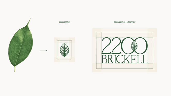
The first lesson is that a small brand can create a luxury brand identity by choosing a principle specific enough to shape decisions. Not “quality.” Not “craftsmanship.” Everybody claims those. A real principle. Radical discretion. Material transparency. Obsessive fit. Slowness. Quiet service. An unusual making process. A single-minded sourcing philosophy. The point is that it must be precise enough to govern actual choices.
The second lesson is that premium branding depends on hierarchy. Everything cannot be important at once. Luxury signals are often created by selectivity. Fewer product lines. Fewer stronger assets. More deliberate packaging. More careful channel choices. More controlled environments. The premium impression often comes from what has been edited away.
The third lesson is that luxury branding design tends to get stronger when it becomes more subtractive. Remove clutter. Remove jargon. Remove unnecessary claims. Remove trend-following that weakens recognisability. The visual surface should feel governed, not decorated.
The fourth lesson is to make the product or service do more of the identity work. Bottega Veneta and Loro Piana are both useful here. If the logo vanished tomorrow, what would remain? Could the customer still recognise the brand in the material, the structure, the proportion, the finish, the ritual or the experience? If not, the brand may be relying too heavily on graphic shorthand.
The fifth lesson is to build patience into the system. One of the hardest truths in branding is that luxury identity cannot be manufactured instantly, no matter how expensive the launch is. It is accumulated through repetition, standards and refusal. That is awkward news in a culture obsessed with velocity, but it remains true.
And finally, the biggest lesson is this: premium brands do not become premium by adding more “premium cues.” They become premium when they know exactly what they believe and behave accordingly.
The most enduring luxury branding and premium branding examples show that true luxury brand identity is never just a matter of upscale styling. It is a worldview expressed through product, experience, craft and conviction. That is what makes the best luxury brands examples so valuable to study. They don’t merely show how to look expensive. They show how luxury branding design can become something rarer, stronger and much harder to imitate: a philosophy people can feel before they ever need to read the logo.