

There are shirts people wear, and then there are shirts people recognise. That’s the difference. Plenty of tees have sold in huge numbers. Plenty have looked good for a season. Plenty have ridden a trend, caught a slogan, borrowed a logo and quietly disappeared into charity-shop limbo a few years later.
But the most iconic shirt designs don’t behave like that. They don’t merely belong to fashion. They escape it. They become visual shorthand for a band, a mood, a decade, a political instinct, a film scene, a city, or a version of cool that people still want access to years later. That’s why the real history of iconic shirts isn’t just a story about clothes. It’s a story about symbols people decided were worth carrying around on their chest.
The best shirts feel almost suspiciously simple
And if that sounds a little dramatic for a bit of printed cotton, well, tough. T-shirts have earned it. No other garment has done quite so much cultural heavy lifting with so little physical complexity. They’re cheap to print, easy to wear, easy to photograph and, crucially, easy to read. That makes them perfect containers for myth.
The most popular shirt designs and famous shirt designs aren’t always the most intricate or even the most beautiful. Usually, they’re the clearest. A zonked-out smiley face. A pulsar trace. A cartoon mouse. A superhero crest. Four near-rude letters. A parody presidential seal. A deadpan campaign slogan from a film about social awkwardness and tetherball.
The best of them feel almost suspiciously simple, as if the world should’ve arrived at them sooner. But of course, that’s the trick of great design: once it exists, it starts to look inevitable. To that end, here I’ll be celebrating the shirt designs that crossed the difficult line between merchandise and mythology and proved a T-shirt could be more than just a product.
What Makes a Shirt Design Iconic?
Mahmud Hasan
An iconic shirt design usually does three things at once.
- First, it’s instantly legible. You don’t need to walk closer, squint, or decode it. It lands in a second.
- Second, it carries pre-loaded meaning. The design plugs into something people already care about: music, politics, a character, a city, a joke, a tribe.
- Third, it’s durable enough to survive being reproduced to death.
In fact, many of the very best shirt designs get stronger through repetition. What might feel overexposed in another medium becomes part of the point on a T-shirt. That ubiquity is how the design stops being merely printed and starts becoming social language.
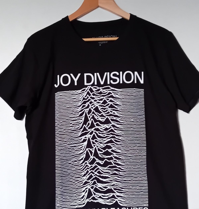
That’s why iconic shirts are so often built around stripped-back graphics or bold typography rather than elaborate illustration. Peter Saville’s Unknown Pleasures cover became an immortal shirt because it’s stark, strange and unforgettable. Experimental Jetset’s “John & Paul & Ringo & George” design became wildly influential because it reduced the band shirt to a list of names and some ampersands. FCUK became a phenomenon because it understood the power of four letters arranged with just enough plausible deniability.
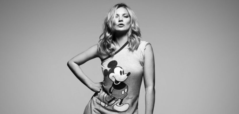
Even Mickey Mouse, one of the most commercially exploited characters on Earth, remains powerful on a shirt because his silhouette is so graphically robust that he can survive almost any treatment.
There’s also a useful distinction to make between branding and culture. Are iconic shirt designs driven more by branding or by cultural moments? The answer is both, but not evenly. Branding gives a shirt its shape and distribution. Culture decides whether it lasts. French Connection could market FCUK aggressively, but if the mood hadn’t been right for that particular strain of laddish provocation, it would’ve looked desperate.
Nirvana could stamp a smiley face on a shirt, but if Nirvana hadn’t come to embody a whole strain of generational disaffection, the design would never have become the ghostly, grinning badge it is now. A shirt becomes iconic when the design and the moment lock together so tightly that they’re difficult to imagine apart.
Most Iconic Shirt Designs of All Time
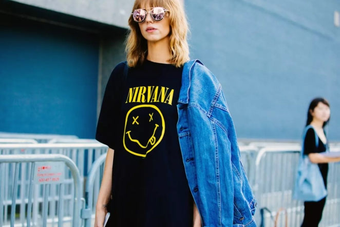
The Nirvana smiley face belongs near the top of any list of the most iconic shirt designs of all time because it manages something rare: it looks casual, careless, even stupid, yet it’s almost perfectly calibrated. The crossed-out eyes, the crooked grin, the loose hand-drawn feel. It doesn’t look like corporate merchandise or polished design. It looks like the sort of thing that emerged from the same exhausted, sarcastic universe as the music itself.
That’s exactly why it stuck. Even the long-running legal dispute around the logo’s authorship has only reinforced its mythic status. However it originated, the result is what matters: one of the defining shirt graphics of the last thirty years, and one that still signals grunge-adjacent scepticism with absurd efficiency.
Joy Division’s Unknown Pleasures is almost the opposite sort of icon. Where the Nirvana design is loose and lopsided, Unknown Pleasures is icy and exact. The original graphic derived from radio pulsar data and was used by Peter Saville, in inverted form, on the 1979 album sleeve with no band name or album title.
That absence is part of its genius. The shirt doesn’t shout fandom in the usual sense. It signals taste, mood and a certain kind of graphic literacy. It feels intellectual without being smug, moody without being melodramatic, iconic without seeming to chase icon status. Plenty of band shirts are popular. Very few have become shorthand for design-conscious cool in quite the same way.
The Ramones logo tee deserves its place because it helped set the rules for what a band shirt could be. Arturo Vega’s design, based loosely on the U.S. presidential seal, transformed a punk band into something like an anti-establishment national institution. It was funny, blunt, proudly reproducible and, crucially, easy to wear even for people who weren’t active participants in the New York punk scene.
Queens Museum has noted how central Vega was not only to the logo but to the broader visual language around the band, including the T-shirts that helped spread it. Eventually the Ramones tee became so common that it reached people who couldn’t identify a single track. That’s often presented as a kind of cultural failure. It isn’t. From a design perspective, it’s evidence that the image fully detached from its source and became a symbol in its own right.
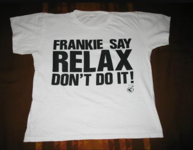
FRANKIE SAY RELAX is one of the great proof points for typography on T-shirts. The phrase is bold, blunt, slightly absurd and just suggestive enough to feel naughty without tipping fully into explanation. Holly Johnson has said the original shirts were created by the record company as promotional giveaways, before demand turned them into a phenomenon. That accidental quality matters.
The best shirts often feel as though they emerged before anyone had time to overthink them
The best iconic shirts often feel as though they emerged before anyone had time to overthink them. FRANKIE SAY RELAX captured a pop moment, yes, but it also tapped into something more durable: the pleasure of wearing a phrase that feels both commanding and unserious. It’s merchandise as social provocation, and it still works.
Then there’s Mickey Mouse, who proves that not all iconic shirts are built on irony, protest or rock mythology. Mickey works because he is one of the most stable graphic characters ever created. The Walt Disney Family Museum has documented both Mickey’s rise to worldwide fame and the early explosion of Disney merchandising that helped make him more than an animated character.
On a T-shirt, Mickey can do almost anything. He can read as childhood nostalgia, American pop history, tourist culture, vintage cool, camp, kitsch, or even fashion-world appropriation. That flexibility is a huge part of his staying power. The design never really exhausts itself because the cultural tone around it keeps changing. The face stays the same. The meaning shifts.
The Superman shield is another design that seems almost too obvious to include, which is usually a sign that it absolutely must be included. Its simplicity is the achievement. The emblem first appeared with Superman in 1938 and became the template for superhero chest symbols that followed. That matters because the Superman logo wasn’t just a successful character mark. It helped establish an entire visual grammar: heroic identity as a symbol worn openly on the body.
On a T-shirt, the shield works even if the wearer has never read a comic. It communicates strength, optimism, recognisability and a kind of timeless Americana. That’s why it remains one of the most durable graphic shirts in circulation. It doesn’t require context. It is the context.
Che Guevara’s face, usually drawn from Alberto Korda’s 1960 Guerrillero Heroico photograph, is a stranger case because its iconic status is inseparable from contradiction. The image became one of the most reproduced photographs in the world, helped by Guevara’s later martyrdom and the visual force of the portrait itself.
On a T-shirt, the image turned revolution into a portable symbol. Sometimes that meant real politics. Sometimes it meant generic rebellion sold through market logic that would’ve horrified the man in the picture. But that contradiction is part of what made the shirt so culturally sticky. It allowed people to wear dissent in a form that was instantly legible even when the meaning had become vague. It remains one of the most famous shirt designs ever printed, even if it’s also one of the most argued over.
Famous Shirt Designs That Shaped Fashion
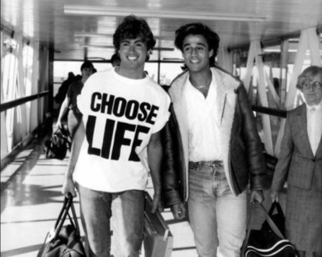
Some famous shirt designs matter not just because they were widely worn, but because they changed what the graphic T-shirt could be. Katharine Hamnett’s slogan shirts are crucial here, even if the most famous examples blur the line between fashion piece, protest object and pop merchandise. London Museum notes that Wham! helped propel Hamnett’s CHOOSE LIFE tee into global visibility in 1984, while Hamnett’s later slogan work made the all-caps text shirt a serious vehicle for politics and public messaging.
That legacy hangs over everything from FRANKIE SAY RELAX to endless contemporary statement tees trying, with mixed success, to borrow some of that charge. Hamnett proved that the T-shirt could operate like poster design with sleeves.
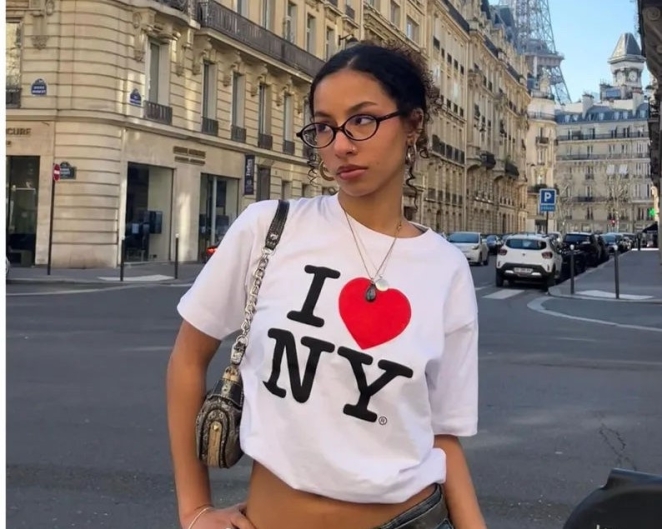
Milton Glaser’s I ❤ NY shirt did something equally important from a branding perspective. The logo originated in the late 1970s as part of a state tourism campaign, with Glaser sketching the famous mark in a taxi, and it soon escaped into souvenir culture. The Museum of the City of New York describes the design as something now woven into the fabric of the city’s identity, and that isn’t an exaggeration.
The plain white I ❤ NY tee became one of the purest examples of a civic brand turning into a wearable emotional statement. It wasn’t merely a campaign asset. It became a ritual purchase, a sign of support, a tourist cliché and a legitimate design icon all at once. Few shirts have done more to prove that logos on T-shirts could be affectionate rather than purely commercial.
Most famous shirts blur the line between fashion piece, protest object and pop merchandise
The Experimental Jetset Helvetica-list shirt shaped fashion in a more indirect but arguably broader way. The brilliance of the design is that it looks like fan merch while also being conceptual design commentary. It reduces a legendary band to four names connected by ampersands, stripping away imagery and biography until only structure remains.
Once that logic was visible, it became infinitely adaptable. Whole industries of derivative list shirts followed. It became one of those rare designs that didn’t just become iconic itself, but also generated a design template the rest of culture kept mining.
Vote for Pedro belongs in this section because it shows how a joke shirt can become a genuine fashion artefact when timing and tone align properly. The tee was a late-stage addition to Napoleon Dynamite, inspired by plain reunion tees and school-campaign aesthetics, before becoming a runaway hit that helped define the film’s afterlife as a cult hit.
That matters because the design is incredibly ordinary on paper. White block letters on a ringer tee. That’s basically it. But the shirt works because it perfectly captures the film’s sincerity, awkwardness and underdog energy. It didn’t need polish. In fact, polish would’ve ruined it. Its awkward plainness is precisely what made it one of the most memorable pop-culture T-shirts of the 2000s.
Best Shirt Designs Ever Created
The best shirt designs ever created aren’t always the ones with the most obvious visual sophistication. Sometimes they’re the ones that understand the T-shirt medium most clearly. That’s why FCUK has to be taken seriously, however annoying that may feel in retrospect. French Connection’s campaign, launched in the late 1990s, turned a reordered corporate acronym into a national attention machine.
Whatever anyone thought of the tone, the mechanism was brilliantly suited to a T-shirt. It was provocative, economical, instantly readable and endlessly repeatable. Four letters did all the work. That’s good T-shirt design in the most ruthless possible sense.
That same ruthlessness is part of what makes the Nirvana smiley, the Ramones seal and the Superman shield so strong. None of them wastes effort. They all understand distance, impact and memorability. The shirt doesn’t need to tell the full story. It just needs to trigger the story in the viewer’s head. That’s a crucial distinction. A mediocre graphic tee tries to contain meaning. A great one releases it. The wearer supplies the rest. That’s why these designs travel so easily across demographics and decades. They invite projection without collapsing into emptiness.
The loudest shirt in the room isn’t always the one people remember
Unknown Pleasures deserves to be called one of the best shirt designs ever created for a different reason: it trusts ambiguity. Band T-shirts often depend on explicit recognition. This one risks mystery. It asks the viewer to meet it halfway. That choice gave it a lifespan beyond normal merch cycles. The image still feels sharp because it doesn’t seem to be begging for attention. It earns it through composition and mood. There’s a useful lesson there for any designer making apparel now. The loudest shirt in the room isn’t always the one people remember. Sometimes it’s the one that leaves just enough space for interpretation.
Mickey Mouse, oddly enough, belongs in the same league of design excellence. Not because every Mickey tee is good, obviously, but because the underlying character system is extraordinarily resilient. A good Mickey shirt can be flat, distressed, monochrome, oversized, childlike, ironic, painterly, vintage or aggressively commercial, and the design still holds.
That kind of elasticity is rare. Most icons break once you distort them too far. Mickey doesn’t. He just changes register. That’s a sign of an exceptionally strong core design and one reason character shirts remain such a rich category for fashion brands mining cultural memory.
Most Popular Shirt Designs Across Decades
The most popular shirt designs tend to reveal what each era wanted from culture. In the late twentieth century, people increasingly wanted shirts that did more than advertise a product. They wanted affiliation, irony, attitude and readability. Music shirts captured that especially well. Ramones and Joy Division offered different flavours of credibility: one loud and emblematic, the other cerebral and cold. Nirvana then added an exhausted grin to the mix and gave the 1990s one of its defining visual signatures. That progression tracks a broader cultural shift from overt identity into more layered, self-aware modes of self-presentation.
At the same time, the world got better and better at turning characters and logos into lifestyle objects. Mickey Mouse never left. Superman never left. I ❤ NY never left. Each design found ways to keep circulating because each was simple enough to survive format changes. Tourist tee, high-street tee, vintage tee, runway reference, streetwear reference, bootleg. It hardly matters. Once a design becomes culturally frictionless, it can slide across all those spaces without losing itself. That’s a huge part of why these shirts remain among the most popular shirt designs long after their origins should, in theory, have dated them.
The 1990s and 2000s also made a virtue of strategic cheek. FCUK thrived in that environment. Vote for Pedro did too, though in a softer, goofier register. Both succeeded because they turned language into public performance. One flirted with offence. The other with awkwardness. Both understood that a T-shirt can function like a one-line script the wearer gets to deliver all day without saying a word. That’s one reason text shirts remain so powerful. They turn clothing into timing.
"You don’t need a Premier League budget to have the best-looking brand on the pitch"
And while we're mostly talking about graphic T-shirts rather than sportswear, there’s a natural point where the conversation widens. Shirt iconography doesn’t stop at merch. It spills into football, especially when club identity is sharp enough to feel like a fashion proposition.
Our regular contributor Simon Manchipp, Founder at SomeOne, puts it neatly: “For me, it’s the Dulwich Hamlet 2023 pink and blue stripes. It’s the most fashionable kit in non-league history—maybe any league. It’s bold, it’s unapologetically vibrant, and it has turned a local South London club into a global style signifier. It proves that you don’t need a Premier League budget to have the best-looking brand on the pitch.”
That point lands because the 2023/24 Dulwich Hamlet home shirt deliberately leaned into the club’s traditional pink and blue in a three-stripe design with historical references, while the club’s colours had already become some of the most recognisable in non-league football. It shows that icon status can come from a coherent visual identity as much as from mass-market licensing.
Why Certain Shirt Designs Become Timeless
Why do some shirt designs stay popular for decades while others fade quickly? Usually because they carry more than one kind of meaning at once. The Nirvana smiley is about Nirvana, yes, but it’s also about slacker cool, damage, irony and anti-polish. The Superman shield is Superman, but also heroism, nostalgia, Americana and optimism. Mickey is Disney, but also childhood, pop art, softness, kitsch and brand history. When a design works on several levels simultaneously, it has more routes into the future.
Typography helps here too. FRANKIE SAY RELAX can outlive the exact circumstances of the single because the words themselves still crackle. FCUK survived because the tension between what it says and what it nearly says doesn’t really expire. The Experimental Jetset list shirt remains alive because its structural idea is endlessly reusable. Timeless shirt design often depends less on a single fixed meaning than on a powerful format that can keep generating meaning under new conditions.
Truly timeless shirts offer their wearers something stable
Another part of timelessness is reproducibility. Some designs weaken as they spread. Iconic T-shirt graphics usually do the opposite. I ❤ NY became stronger through souvenir repetition. Ramones became stronger through endless reprinting. The Che image became stronger, or at least more globally embedded, through massive over-circulation. This is one of the great paradoxes of T-shirt culture: rarity can make a garment desirable, but ubiquity is often what makes a design iconic.
And then there’s emotional usefulness. Truly timeless shirts offer their wearers something stable. A joke. A stance. A memory. A tribe. A little bit of borrowed charisma. The shirts that fade quickly tend to be tied too tightly to one campaign, one meme cycle, one designer’s temporary cleverness. The shirts that last keep solving small social problems. They help people signal taste, allegiance, irreverence, longing or identity in one glance. That function doesn’t really go away. It just changes audience.
How Iconic Shirt Designs Influence Modern Trends
STUDIO BLUP
Contemporary fashion still owes a lot to the old greats. Streetwear’s fixation on logos, chest graphics and brand affiliation didn’t come out of nowhere. It followed decades of people happily wearing bands, cartoon characters, city slogans and confrontational wordmarks. Likewise, today’s flood of slogan tees still operates in the wake of Hamnett and FRANKIE SAY RELAX, whether it realises it or not. And the continued popularity of clean, design-literate shirts owes something to the long shadow cast by Unknown Pleasures and the Helvetica-list school of reduction.
There’s also a deeper lesson here for brands. The most influential shirt designs tend not to over-explain themselves. They find one strong idea and let repetition build the myth. Modern fashion often makes the opposite mistake. Too many tees try to look “designed” in a self-conscious way, as if complexity were proof of value. But the real masters of the form understood economy. One symbol. One phrase. One image. One attitude. That’s enough. Often it’s more than enough.
The most influential shirt designs tend not to over-explain themselves
That’s why the conversation around the best shirt designs never really ends. Every few years fashion rediscovers the same truth and tries to package it as novelty: people like wearing meaning. They like shirts that tell a story quickly, that connect them to a band or character or city or joke or politics or memory. The shirts that endure are the ones that understand that desire without talking down to it. They don’t merely decorate the body. They activate recognition.
And that, really, is why the most iconic shirt designs of all time still matter. Not because they’re collectible. Not because they’re retro. Not because high fashion occasionally rediscovers them and charges three figures for a washed-out version. They matter because they prove that the humble T-shirt is one of the greatest graphic design stages ever invented.
The famous shirt designs that survive do so because they say something instantly and keep saying it long after the original moment has passed. They became bigger than the fabric they were printed on. And once a shirt does that, it’s no longer just merch, or fashion, or branding. It’s culture with sleeves.