

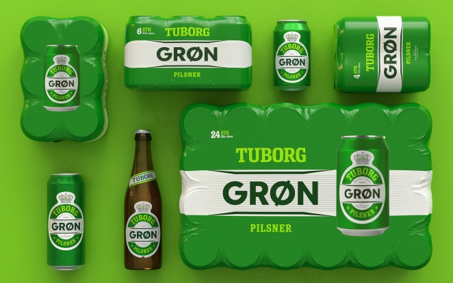
Robot Food has refreshed the branding for Danish beer brand Tuborg. The Leeds-based strategic branding gave the iconic beer a refreshed design look to emphasise Tuborg as a “proud parent brand,” harmonising the primary packaging around the brand’s ‘clockman’ device — a well-known icon in Denmark.
The agency also introduced a redrawn Tuborg wordmark, which was created with assistance from typographer Rob Clarke.
Prior to this refresh, Tuborg hadn’t undergone a holistic brand refresh for decades, which had led to something of a mishmash of different styles across individual products, packs, touchpoints, sizes, and variants. The new rebranding hopes to create something more consistent and timeless.
To learn more, we caught up with the team at Robot Food to discuss how they worked with the brand to deconstruct the original branding.
What was the brief for the rebrand?
![]()
The brief was all about making category leader Tuborg more relevant to all Danes today — by showing the brand was moving with the times. Part of this was about building meaning into the brand (and align everything with its new positioning – ‘fællesskab’ or community in English ) the other part was about developing a new design system that would improve shelf standout, recognition and consistency.
It was also vital that any final development managed to retain existing loyal consumers while recruiting new consumers into the category.
How did the initial pitch/brainstorming phase go?
After winning the project following a three-way pitch, we set about ‘deconstructing’ the incumbent Tuborg designs, looking at everything from shapes to colours, fonts, placement of design elements, and the architecture of individual labels, ultimately boiling everything down to a set of iconic assets.
Working closely with the client we examined which elements to amplify and which to pare back to create the strongest, most recognisable, and iconic imprint possible.
Describe the purpose of the brand and its target audience
In Denmark Tuborg is the beer category. An institution. But like other beer brands, it’s had to address changing consumer behaviour, particularly with those who are new to the category who are drinking less, not drinking at all, or looking at alternatives to beer.
This chimes with the broader global trend among drinkers aged 18-25 of a more ‘all or nothing’ mentality rather than the ‘little and often’ approach of older generations. Tuborg, like other brands, was losing favour with that demographic. Drinking the beer your dad drinks can feel like the antithesis of cool.
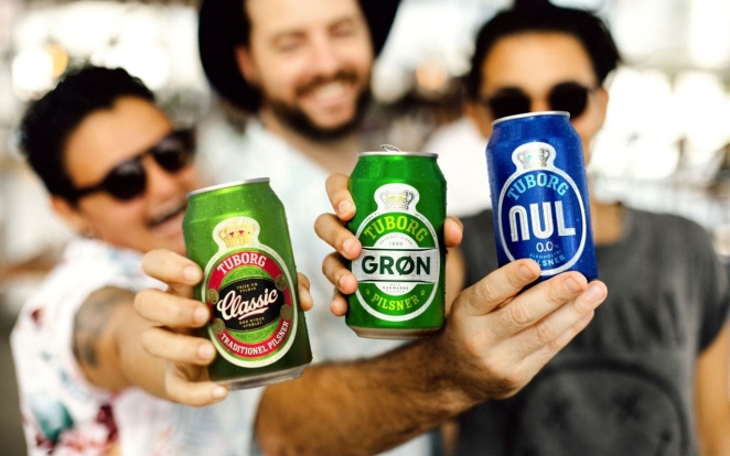
For us, this meant amplifying what makes Tuborg great, enhancing the individual personalities of their beers then visually uniting them around this prouder parent brand. Our refreshed brand works to unify and strengthen the entire brand world to ensure its relevance for all consumers.
What was your thinking behind the rebranding solution?
Alongside creating the new packaging design system, we also built a full brand world for Tuborg that extended across on and off-trade communications, photography, merch, and digital platforms. This brand world needed to unite the various Tuborg ranges under a prouder Tuborg flag that felt more relevant to modern consumers, while allowing each range to be expressive and distinct to its individual personality and usage occasion.
The brand positioning was based around the idea of “fællesskab”, or community, with the beer shown to play a vital role in uniting people from all walks of life. This was brought to life for the brand world executions through a creative idea that our team dubbed “in the action” – placing the consumer at the heart of the moment through reportage-style photography with an unfiltered, spontaneous aesthetic that celebrates togetherness in a way that’s unique to Tuborg.
Our refreshed designs look to emphasise Tuborg as a proud parent brand, harmonising the primary packaging around the brand’s ‘clockman’ device — a well-known icon in Denmark. We also introduced a redrawn Tuborg wordmark for the packaging, which was created with assistance from typographer Rob Clarke, allowing it to sit proudly on the curve at the top of each pack.
Off-pack we united the Tuborg wordmark with their ‘clockman’ device for the first time — helping build a bridge between on and off-pack worlds and strengthening brand recognition.
By consistently applying these two assets we created headroom to express the individuality and often longstanding personality of each beer, whilst never losing the link to the parent brand.
Did you learn anything new during the project?
We worked closely with the local Tuborg team and partner agencies throughout the process, and a combination of their insight and that of consumers helped us understand just how much Tuborg means to the Danes. This was key in ensuring we found the sweet spot to the redesign, that amplified each beer and it’s personality in the right way, both on and offpack, and brought existing consumers with us on this journey.
What was the biggest challenge? How did you overcome it?
We were aware that as a British agency approaching a Danish icon, ultimately it was about listening to the brand team and the consumers themselves. We were brought in to offer a fresh perspective and not be led by what they had before, but you’ve always got to be respectful.
A great client is one who’s really open and listens to what you’re saying and loves to be challenged, but who knows the consumer really well and helps you find that sweet spot. As the category leader, this project was never about throwing the baby out with the bath water.
The assets and system we’ve been able to establish helps strengthen and consolidate Tuborg’s position for today and set them up for a really progressive future as well.
What visual influences fuelled your solution?
This project has been less informed by external influences and more by Tuborg’s rich heritage, it’s visual equity and assets, and it’s long standing place in the hearts and minds of Danes.
While we’ve tweaked colour palettes, and evolved typographic choices in the name of modernization or simplification, it’s really been much more about amplifying what makes Tuborg Tuborg, and doing that more coherently, more consistently, and more impactfully.
What do you hope it achieves for the brand?
Tuborg is a Danish cultural icon — it’s more than just a beer brand. The system we’ve put in place for both the packaging and brand world is intended to enhance and celebrate that, and sets them up for a realty exciting progressive future.
There’s new brews in the works, new campaigns underway — it’s just generally a really exciting time to be involved with Tuborg. Prior to this refresh Tuborg hadn’t really been considered in totality for decades — if our design system can stand the test of time and last them the next few decades then we know we’ve done a good job.
What would you do differently if you could do it over again?
The whole project happened over lock down which meant all the teams involved were unable to meet physically throughout the process. We had to find a different way of working which strangely ended up being far more integrated and collaborative than we ever would have expected, but who doesn’t want to go to Copenhagen in the name of research!
Credit list for the work?
Ben Brears — Creative Director
Martin Widdowfield — Creative Director
Chris Shuttleworth — Design Director
Richard Robinson — Senior Designer
Craig Lindsay — Designer
Matt Reid — Studio Production Manager
Dave Timothy — Managing Director
Libby Goodyear — Senior Account Manager
![]()