Brand design agency Free the Birds has collaborated with cult beauty brand, Sunday Riley to elevate its in-store retail experience for customers.
The agency has created a cohesive brand vision that ensures the brand is recognisable to its core fan base, as well as encouraging newcomers to “trial” products.
Sunday Riley is a hugely successful brand, but it needed a recognisable, seamless brand aesthetic in its physical retail spaces. This is common when growth happens on such a fast and vast scale.
Free the Birds have provided Sunday Riley’s in-store design teams with a strong “North Star” to work with, so that there is synergy across the in-store retail architecture and promotional materials.
To learn more, we spoke to Account Director Lindsey Figarol and Design Director Matt Gilpin.
What was the brief for the rebrand?

While the brand continues to expand presence around the world, there was not a distinguishable or consistent way the brand showed up consumer in physical retail spaces, leading to:
- Disjointed experiences from the overall brand
- Underdeveloped presentations
- Lack of brand and product awareness
It was identified that there was a need to consider how to create a stunning, holistic and unified visual style for Sunday Riley’s visual merchandising that was both fresh and cohesive, but also that would remain recognizable to the core consumer base.
We needed to provide the brand with a strong visual identity which could translate across multiple mediums and had a core seam running throughout.
Describe the purpose of the brand and its target audience
We're inspired by the power of positive change. Sunday Riley skincare doesn't focus on "NO" lists.
That's because we have a fundamental belief that YES is a more powerful word.
We believe that:-
YES, you can transform the way you feel about your skin.
YES, you can have visible and fast results.
YES, you can feel good about the products you are putting on your skin, because you trust that they are made to the highest quality.
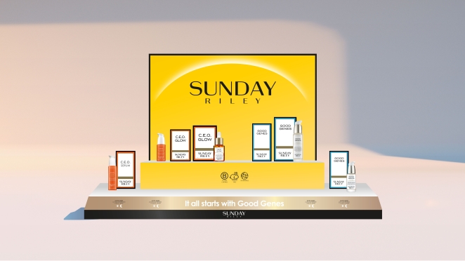
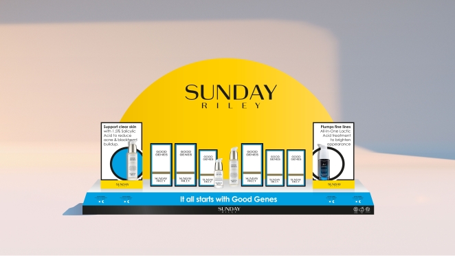
We harnessed this positivity and product end benefit (glowing skin) using the colour yellow which acts a beacon in the retail environment.
What was your thinking behind the rebranding solution?

We took a step back and assessed the overall brand fundamentals to ensure we created a set of visual principles that could be used by the Sunday Riley team when creating instore and promotional materials, that translated across brand touchpoints and visual merchandise.
Primarily, standing out in a crowded fixture was of huge importance, especially in this busy category - but crucially, also making sure we conveyed the soul and spirit of this cult brand and it’s charismatic founder.
What was the biggest challenge? How did you overcome it?
A lot more detail on Visual Merchandising and its cohesion across the board, especially the US market – it is competitive and therefore important to stand out, especially in store. Understanding the need to revitalise and give a new energy to the brand was key, whilst remaining relevant to a core fan base.
From a design perspective, it was a great challenge to create design principles which addressed the needs from retailers with a stricter uniform design architecture to those where there is more freedom.
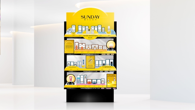
Defining the fundamental elements colour, shape, texture was crucial to ensure there was a consistent holistic approach, no matter the size or scope. Creating something that functioned in a number of environments was key to this project.
What details are you most proud of and why?

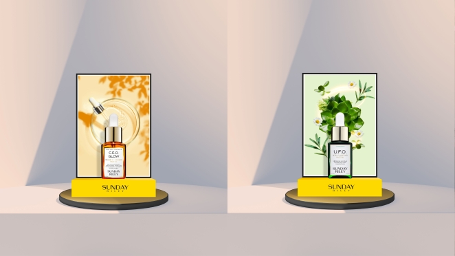
How beautiful and stunning it looks in the retail environment as well as in digital spaces, it really stands out against some of the other brands and it's amazing how well it works across the platforms.
Establishing a strong headline colour, the warm and joyful sunshine yellow really sets the scene for the brand. In combination with adapting the logo to be more attention grabbing and immediate in a busy in store environment that works so well for this brand - and is something the design team are really impressed with.
What visual influences fuelled your solution?
The warmth of the sun on your face and the glow you feel after using the SR products was an important message to translate into the visual merchandising.
Alongside yellow we added gold, complementary brights and black, a chic palette of colours and finishes. Put together these elements really capture the warmth of the brand and the energy of its founder Sunday Riley.


