


Designhouse has crafted a bold new identity for leading investment bank Numis, to align with a new phase of strategic growth as Numis shake off legacy perceptions that it was “just a corporate broker”.
The identity is centred around a corner-stone ‘doorway’ logo, symbolising how the investment bank opens doors to capital investment and Numis’ limitless potential across geographies. This design system can be manipulated and flexed across all brand touchpoint to create playful and dynamic abstract visuals.
Designhouse was tasked with creating an identity which reflected where Numis is today, and where it will grow to in the future; an investment bank which delivers fresh thinking to truly unlock the potential within companies disrupting the status quo.
Underpinned by extensive strategic analysis of Numis’ competitive landscape, the new identity comprises a fresh tone of voice, visual style, brand strapline, logo, internal and external communications and marketing collateral.
At the heart of the brand is a bold new logo. Rendered in a bespoke typeface, its lower-case form confidently differentiates Numis and more accurately reflects the personal approach delivered by the investment bank.
The logo is inspired by a hero graphic created from the distinctive ‘doorway shape’ of the negative space within the lower-case letter ‘n’ – symbolising how Numis opens doors to capital investment for those who want to innovate, but also the limitless potential of the firm’s own diversification across geographies.
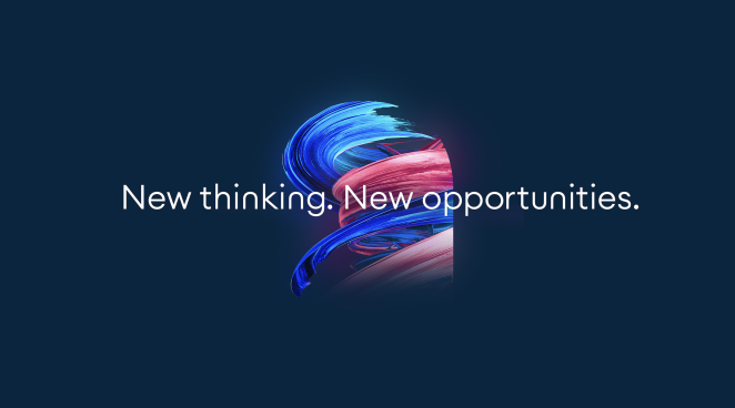
Also acting as a flexible design system, the door device appears across all brand touchpoints, accompanied by a new strapline: ‘New thinking. New opportunities.’
Numis’ unique approach is further reflected in the colour palette of the new brand identity. A dark navy blue has been replaced with a bold and optimistic cobalt, supported by fresh white, sophisticated midnight blue, and a secondary palette of bright colours such as ice green, flamingo, and tiger.
This palette keeps the brand firmly anchored within the familiar ‘blue space’ of the finance sector while providing greater flexibility to express its more colourful, forward-thinking personality when needed.
To gain further insight into the rebrand, we spoke to Matthew Gillman, Design Director at Designhouse.
What was the brief for the rebrand?
Our brief was to completely refresh the UK’s leading investment bank, Numis, with a new brand identity that allows them to achieve bold brand differentiation within a crowded space, whilst still remaining firmly grounded within the finance sector.
How did the initial pitch/brainstorming phase go?
We wanted to fully understand Numis’ boundaries, so the pitch and brainstorming phase was extremely collaborative, thought provoking and experimental. We spent a significant amount of time and effort devising, expanding, and developing a wide variety of creative ideas before coming up with the perfect solution for Numis.
Describe the purpose of the brand and its target audience
A key focus of Numis is the ambitious and creative approach they have to investment banking, partnering with the most agile clients from ambitious start-ups to corporate giants.
Prior to the rebrand, they could already boast a strong track record of providing strategic advice and raising capital for industry-defining companies. However, Numis needed to realign itself with its positioning, shining a light on their creative thinking, as it is one of the reasons why they are one of the UK’s leading investment banks.
The rebrand works to support this message as the investment bank expands into new markets, enabling it to build on its existing track record in the UK investment sector; in turn, expanding their target audience.
What was your thinking behind the rebranding solution?

We wanted to create an identity which did justice to Numis’ unique approach to investment banking. The ‘doorway’ brand hero graphic is a memorable and distinctive device that underpins the whole identity. Shown in full, the ‘doorway’ leads to colourful abstract visuals and animations, symbolising the dynamic business opportunities that Numis creates for clients.
We visualise these opportunities by playfully revealing the doorway’s architecture – encapsulating Numis’s mission of working together, finding new ideas and new opportunities, and new doors to open. The doorway acts as a flexible design system and appears across all brand touchpoints, accompanied by a new strapline: ‘New thinking. New opportunities.’
We further reflected Numis’ unique approach through a refined colour palette. A dark navy blue has been replaced with a bold and optimistic cobalt, supported by fresh white, sophisticated midnight blue, and a secondary palette of bright colours such as ice green, flamingo, and tiger.
This palette keeps the brand firmly anchored within the familiar ‘blue space’ of the finance sector while providing greater flexibility to express its more colourful, forward-thinking personality when needed.
What was the biggest challenge? How did you overcome it?
The biggest challenge was crafting and creating the doorway graphics, not only as stills, but also as motion assets. It proved difficult to strike the perfect balance between seeing enough of the doorway’s form to intrigue and create continuity throughout the brand, while cleverly revealing the opportunity through abstract artworks and forms.
With both time and collaboration from everyone in our creative team, we found the creation of various iterative versions of the artworks to be crucal in overcoming this challenge.
What kit/tools/software were used to create it?

We used a range of software in the development of Numis’ new brand, including: Adobe Creative Suite, Figma, C4D, Octane and Microsoft Office.
What visual influences fueled your solution?
Our solution was driven by extensive strategic analysis of Numis’ competitor landscape and neighbouring sectors, as well as taking inspiration from sculpture. Additionally, we were inspired by a range of illusion artists including MC Esher and Felice Varini.
What do you hope it achieves for the brand?
We hope Numis’ refreshed brand can be used to support them as the company continues to diversify its business and expand globally. The new identity eloquently reflects where they are today, and where they will be in the future - an investment bank which delivers fresh thinking to truly unlock the potential within companies by disrupting the status quo.
All the components of the new identity, including: a fresh tone of voice, visual style, brand strapline, logo, internal and external communications and marketing collateral, are critical elements that will continue to support Numis as a continuously growing brand.