

Creative agency ico Design was recently tasked with bringing niche fragrance brand Commodity into the mainstream by amplifying a new core product philosophy to appeal to a global audience.
It first started by addressing what the brand stood for, with Ico focusing the rebrand around three core pillars: ethical, elemental and atypical, a nod to the brand's no-frills past.
Being American was also important to the brand. In keeping with their atypical approach, it seemed strange to use European terminology like 'eau de toilette', 'eau de parfum', or 'absolut' to describe the fragrances, especially in light of consumer research that suggested buyers find these terms confusing.
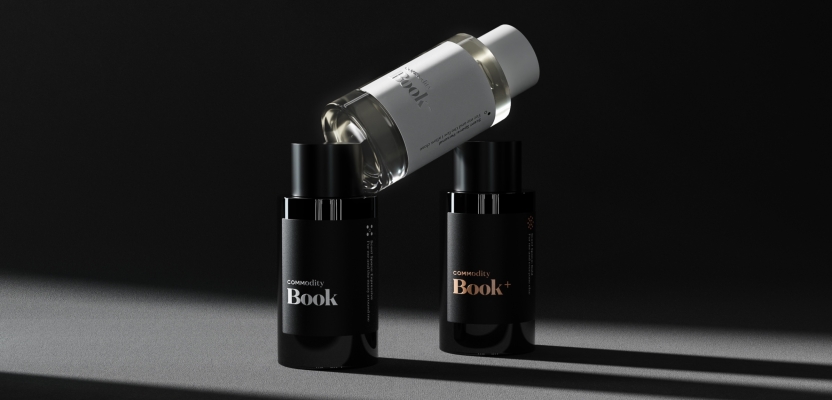
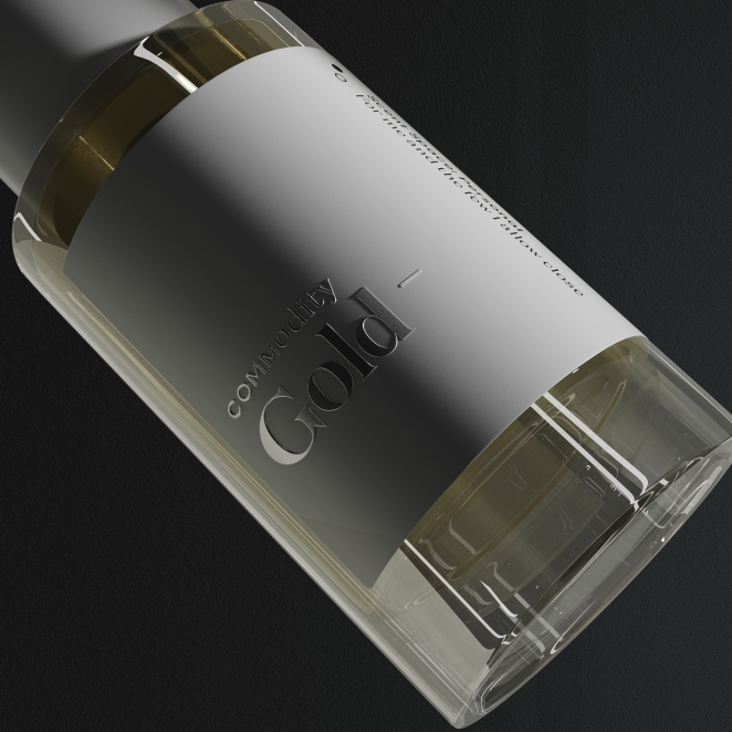
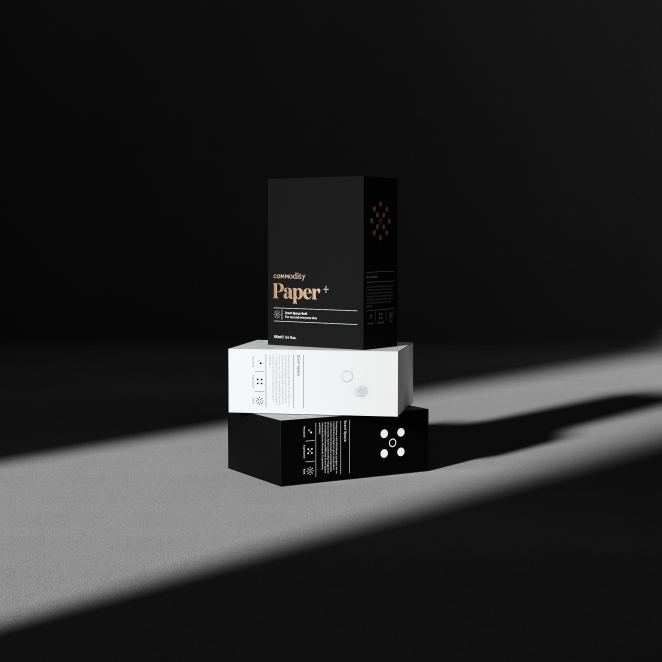
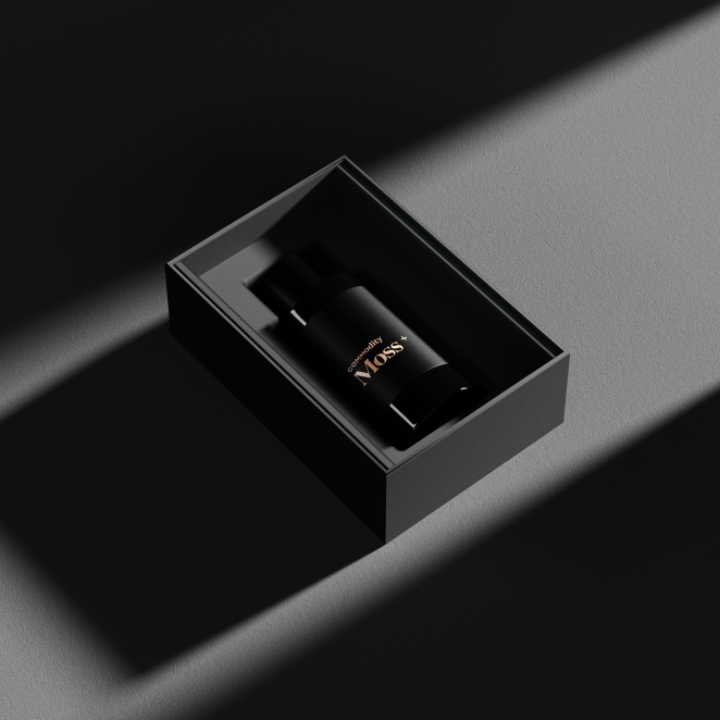
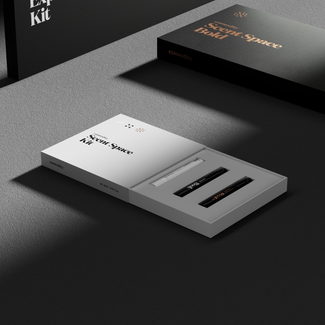
This led to the creation of Scent Space – a radical new way of visually and verbally classifying the potency (or strength) of any given fragrance. Each fragrance would be available in three different scent space concentrations – personal, expressive, and bold, with personal being the least potent, and bold the strongest.
To learn more about the project, we spoke with Vivek Bhatia, Creative Director and Partner at ico Design.
What was the brief for the rebrand?
Background: Commodity is a US niche fragrance brand with a cult following. It was originally founded in 2013 in San Francisco after a kickstarter campaign. After being bought and sold a couple of times, the brand became confused and ran into financial difficulty. It was then bought in 2020 by Vicken Arslanian, the president of Euro Perfumes, a fragrance distributor.
Brief: Vicken had a new vision for Commodity as a digital first-fragrance brand and was keen to reframe how concentration and projection is communicated. His 20-years-plus industry experience had given him the insight that it’s often the projection of a fragrance that is disliked as opposed to the fragrance itself. This is particularly apparent in different territories such as the US compared to the Middle East.
While the fragrance industry is saturated, the last two years has changed consumer behaviour and expectation. Now consumers are willing to explore and try before even smelling a fragrance and look for scent to lift their mood and break gender stereotypes as well as being part of their identity.
Our brief was to make sense of this in order to bring clarity to the brand and position it as a distinctive niche fragrance brand. Beyond this, we evolved the visual and verbal brand so it could communicate new ideas – appealing to a wider audience whilst not alienating an existing one.
How did the initial pitch/brainstorming phase go?
There was no pitch. Vicken was keen to partner with us as we had already done some work with the previous owner. He wanted to keep aspects of this whilst taking the brand in a new direction.
We worked in a very collaborative way, having initial workshops to further understand Vicken’s vision for Commodity as a digital-first fragrance brand. Workshops explored the brand’s position as an artisanal fragrance, the use of language, and design treatments that would be true to the brand philosophy.
At ico we have a fluid framework that follows certain principles, but isn’t overly prescriptive as each founder, relationship, journey, and context is different. In Commodity’s case, we explored strategic and creative work in parallel to express what was true, compelling, and distinct about the brand – short sprints of creative work around messaging, articulating Scent Space and bringing the brand to life under the umbrella of ‘making the exceptional accessible’.
Together we reached conclusions and a consensus, which was crucial as Vicken as ‘the refounder’ had to own the creative direction just as much as ourselves.
Describe the purpose of the brand and its target audience
‘Making the exceptional accessible’ is an outward-facing point of view that underpins the whole brand direction and philosophy. The purpose of the brand is to make fragrance easier to understand and enjoy.
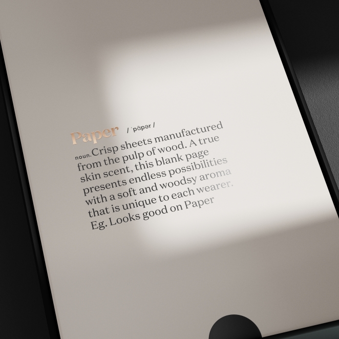
Commodity does away with existing industry jargon that few people understand – eau de toilette, eau de parfum, absolut, extract etc. It also has a very transparent approach to communicating how a fragrance brand works and what it is trying to achieve.
Scent Space is the core idea that gives consumers an opportunity to explore fragrance at different concentrations in a straight-forward way – Personal, Expressive and Bold form the terminology for a trilogy of fragrances that runs across six collections.
The brand has an existing fanbase that is taken on the journey of the rebrand through what we called Commodity TV, a docu-series that can be viewed on the website and across social channels. However, Commodity is also trying to reach a wider audience who are more likely to buy online and tap into a brand that is doing things in a refreshing new way.
Commodity, like many niche, artisanal brands, doesn’t have a specific demographic in the way a more established brand might. It has an out-facing point of view that is in line with cultural trends and behaviours and seeks to create a fanbase as opposed to targeting a specific demographic.
However, a psychographic would lean towards fragrance buyers who are curious about niche fragrance, digitally-savvy with an appetite for a brand that is breaking the mould in a way that is accessible as opposed to esoteric (like many niche fragrance brands).
What was your thinking behind the rebranding solution?
Commodity is a great, and slightly loaded, name for a fragrance brand. In keeping with the overarching philosophy behind the brand, we defined three core pillars – ‘elemental, ethical and atypical’.
These all inform how the brand is expressed, particularly the idea of being ‘elemental’ where less is more – from the one word ‘commodities’ that become the names of fragrances: Book, Gold, Velvet for example, to the packaging that is restrained and monochromatic.
The Scent Space identity that communicated projection was inspired by the simplicity of a dice, the language and story of the fragrance descriptors by dictionary definitions. The result is a fragrance brand without smoke and mirrors and extraneous design treatments. It endeavours to create desire through its simplicity, transparency, design, and the quality of its products.
Commodity’s positioning was also key – a modern American perfumery is an authentic articulation of what the brand represents – English not French terminology, and a wider view not one rooted in a location such as Brooklyn or New York.
Did you learn anything new during the project?
That there is always space, even in the most saturated of markets. The Commodity project validated our view that brands have to be authentic and have an outward-facing belief or point of view. Without this, it’s very difficult to create something that is differentiated.
The product of fragrance/perfume is nothing new but having the view that fragrance consumers would like a simpler, easier and more accessible way to explore fragrance reframes the conversation. Also, that the conviction, taste and open-mindedness of the founder is fundamental to a successful collaboration and creative partnership.
What was the biggest challenge? How did you overcome it?
I think the biggest challenge was to clearly articulate the concept of Scent Space and fragrance trilogies – these are the heartbeat of what makes the brand distinct in a very saturated market, but with anything new there needs to be a level of education.
Balancing this education and clarity whilst creating desire through design and words wasn't easy – there was a danger it could appear over-complicated when the ambition is to simplify. The process of continually exchanging ideas, editing, and the rigour of an elemental design approach and transparency across applications and channels – from packaging, website and to social content – helped achieve this.
What kit/tools/software were used to create it?
The usual ones – a combination of Adobe Creative Suite, Figma, and video all played a part in the prototyping and delivery of the final solution.
What details are you most proud of and why?
I think as an ongoing project it has been quite a rare one. There is complete faith in the collaboration and a space in the client’s mind for exploration that may not be the right answer but is worthy of discussion.
The design craft behind the packaging and website is pleasing, but what I am most proud of is the level of collaboration and partnership across the team. It’s how memorable and effective brand creation happens.
What visual influences fuelled your solution?
As mentioned, we had an elemental reference point for the design – reductionist but not minimal which is great as we believe in that. This was borne out from the name and the brand’s heritage – as such inspiration came from functional references that had a graphic, often mono-chromatic quality to them – dice, the dictionary, a structured form, even a conveyor belt for our collaboration on the retail store.
What do you hope it achieves for the brand?
Ultimately, success will be building on an existing fanbase and bringing the Commodity vibe and fragrances to a wider audience. This will help the brand grow commercially as a nice independent fragrance brand doing things differently.
What would you do differently if you could do it over again?
Probably very little. There are always things you would do differently when it comes to specifics and details, but those things are often the brand owner’s final decision, and as they are driving the brand, you have to respect that.
Credit list for the work?
Vivek Bhatia – Creative Director
Akira Chatani – Senior Creative
Tom Hoare – Copywriter
Ludo Cesetti – Designer
Kwong Li – Senior Digital Designer
Harry WIlson – Digital Designer
Alex Hatton – Project Manager