
Studio Output create design-savvy logo for the BBC Connected Studio
BBC Connected Studio Idents
Studio Output has redesigned the visual identity for the BBC Connected Studio, BBC’s digital research arm, in order to make it more design-focused. The studio is aimed at designers and developers who want to take part in events and workshops where they can pitch and develop new ideas for digital platforms. Successful pitches will then be developed into concepts, where they can be showcased on BBC Taster; a public-facing website where digital concepts are published in pilot stage. The new visual identity is being applied online, to event marketing and to in-house presentation materials. Studio Output, which is part of the BBC design roster, was chosen for the project after putting together a proposal. The consultancy has created an intertwined “C” and “S” as the icon, using a colour palette of orange and purple, replacing the previous logo of a simple line drawing of a lightbulb.
“The Connected Studio is pushing what digital content could be, so we've elevated their identity to something that was more appropriate and as exciting as the workshops they put on” Studio Output Design Director, Stewart McMillan
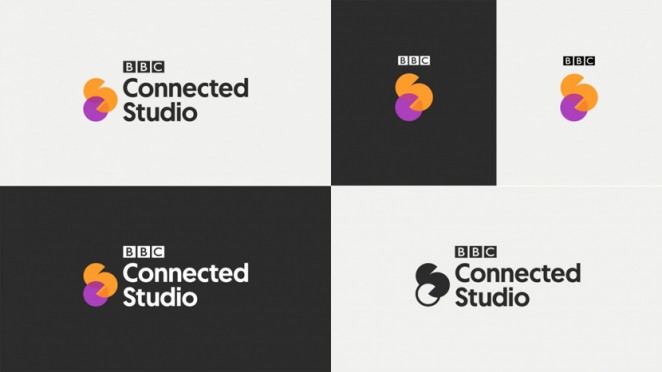
The Geomanist typeface has been used for the logotype because its circular forms tie in with the circular shape of the logo, which aims to show two contrasting sides to the personality of BBC Connected Studio. Complimentary orange and purple colours have been used because orange is already heavily used throughout the main BBC site, while purple is also used on BBC Taster. The new branding includes magnified, 3D rendered images of the logo by Studio Output’s sister company, Found, which are used as flexible backgrounds and within animated idents. Pictograms were also created, and will be used for supporting information around the brand.
Time out and Adam & Eve/DDB get to the point with new branding
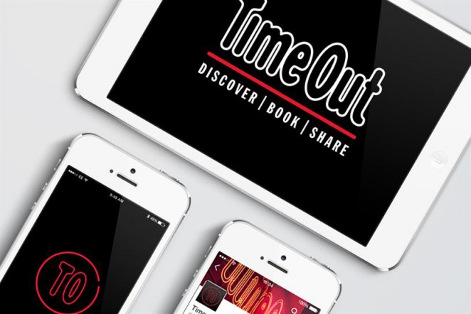
Time Out, the listings guide and lifestyle title, is rebranding with a contemporary look as it aims to push its digital offering and introducing a strap line to its logo. The logo will change to the less formal “TO” for its app and social media profiles, and the publisher is also adding the “Discover book share” tag to its logo for use in advertising, in order to highlight that people can use Time Out to discover what to do in a city, book an experience and then share it. The new branding from adam&eve/DDB shows the letters TO in red and in a circle on a black background. The new look is designed to work seamlessly across digital, social and print channels. There will be a global print and digital campaign that will coincide with the rebrand, which will highlight the different products the brand has to offer including its live events and the Time Out Card, which offers discounts at bars, restaurants and access to popular attractions.
“This project was a rare opportunity to refresh a nearly 50 year old, iconic global brand. The new visual identity gives Time Out global consistency and flexibility across their increasingly diverse channels” Tammy Einav, Managing Director at Adam & Eve/DDB
United by Design claims prestigious design award for pint sized rebrand
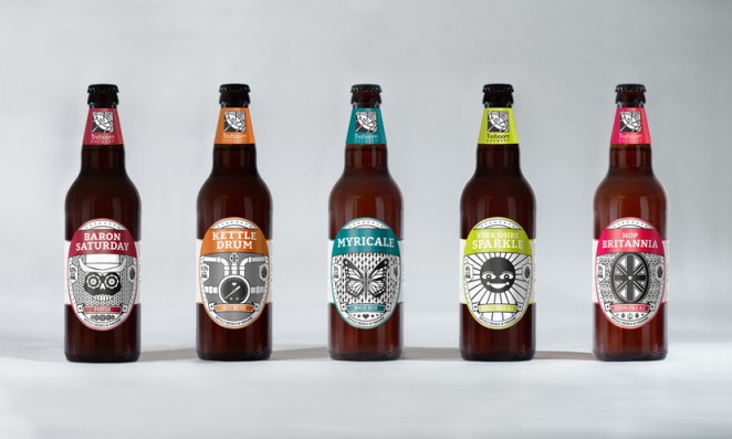
The small, York-based design and branding agency United by Design, is raising a pint glass to success after its packaging designs for a North Yorkshire-based Treboom Brewery's beer range were awarded Silver at the Design Business Association (DBA)'s highly-esteemed Design Effectiveness Awards. United by Design picked up the silver award in the Branded Drink category at the awards ceremony on Thursday, February 11th. The designs for the brewery's new range of bottled beers and pump clips for cask and keg have been hugely successful, with the recognisable packaging lauded within the beer and brewing industries and the brewery's bottle sales beating monthly targets by an astonishing 122%.
“We're so pleased and proud to have won such a prestigious award - to have our work recognised and commended by such an esteemed panel of judges is really a turning point for us” UBD's Managing Director, Owen Turner
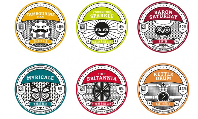
Established by the Design Business Association and now in its 27th year, the Design Effectiveness Awards ceremony brought together more than five hundred design and business leaders at London's prestigious Tobacco Dock. The coveted awards celebrate the design industry's top talent, rewarding design work that has had a tangible effect on the business success of the client. According to the criteria outlined by the judging panel, UBD's silver award demonstrated “Excellent examples of design effectiveness which have led to significant business results for the client.”
The Liminal Space create a fictional, but timeless brand to raise awareness about IVF

A team of designers has created a fictional brand with the purpose of helping teach young women about IVF and fertility. The Liminal Space worked with graphic designer Laura Gordon, 3D designer David MacDiarmid and illustrator Jonny Glover to create the fictional beauty brand, “Timeless,” which aims to spark debate about assisted conception and egg freezing. The consultancy has also worked with a board of clinicians, including the head of assisted conception at Guy’s Hospital in London, and perfume maker Sarah McCartney. The project has been funded by grants from the Wellcome Collection and the London School of Economics. The hypothetical brand features fake beauty products such as perfumes and anti-ageing serums, and will be launched at a pop-up shop at Old Street station in London later this month.
“We wanted to engage with women in thinking about this topic in a disruptive way, using a medium that would engage them with the ideas” Sarah Douglas, Director at The Liminal Space
Base Design rebrand New York's Museum of Sex
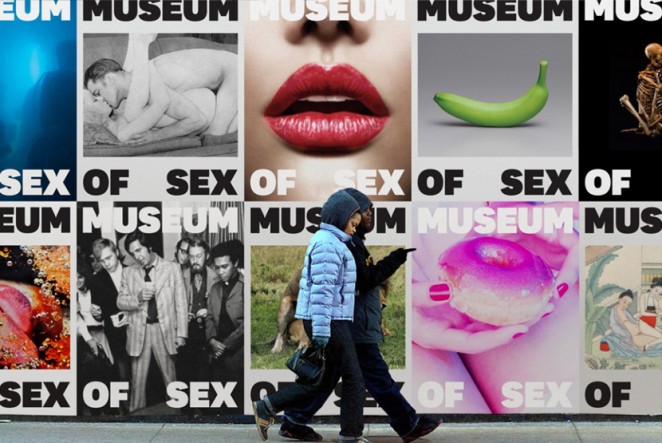
New York’s Museum of Sex has been building a bold reputation in the city’s heavily saturated museum landscape since 2002, but after 13 years of focus on growing the institution, founder Dan Gluck and his team have decided to introduce a new visual identity that could challenge misconceptions of what a museum of sex is and could be. The museum partnered with international branding firm Base Design, acclaimed for its work with La Fondation Vuittonto, the Museum of Modern Art, and Pantone, among others. After some internal exercises that helped the museum define what it’s about, Base created a visual representation that positions it as a culturally multi-faceted and must-see destinations for both tourists and locals. It highlights the museum as a diverse and exploratory space that pushes boundaries and captures the essence of the museum through an iconic, consistent communication system.
“This branding platform is a crucial moment in our evolution and we now have the means to get the word out there” Dan Gluck
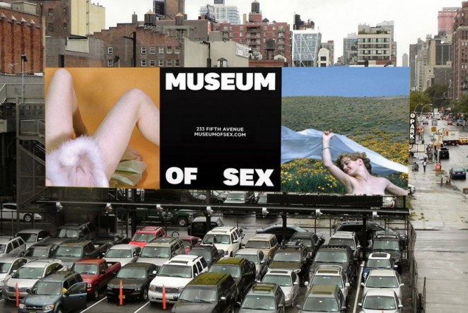
Seeking to establish that the museum is the work of talented academics, artists, and scientists, Base developed bold and impactful typefaces that express the soul and the power of the museum’s brand, and frame thought-provoking imagery related to the history, science, and culture of its exhibits. The rebrand hits on multiple touch-points including OOH advertising, signage, and the museum website, and NYC Subway riders might have already noticed the ads on their daily commutes. Base Design Partner and Creative Director, Min Lew, said: “The Museum of Sex is a creative breeding ground, for those who seek a deeper understanding of sexuality. It explores the frontier of the sexual landscape through the creation, curation and presentation of ideas and experiences. The new visual identity aims to express this very notion and positions the importance of those conversations found within the museum for the public.”
Crossrail gets patriotic new name

The new cross-London train line, which is due to open in 2018, has officially been renamed in honour of Queen Elizabeth. The rebrand of the Elizabeth Line was announced by Transport for London at Bond Street Station, where the Queen was presented with a commemorative Elizabeth roundel, and met those involved in the construction of Crossrail. The idea for the rebrand was generated by the in-house marketing communications and design teams with no external agency support. Discussions with Buckingham Palace took two years before the name was formally approved in September 2015. Reaction to the name change was mixed, contrary to the recent Uber logo change, which was met with general negativity.