
In an effort to draw attention to its new climate campaign against excessive carbon consumption, The Guardian has essentially covered its global homepage for 24 hours. The dark and dirty graphic that is seen covering the website and print publication for the “Keep it in the Ground” campaign, aims to make people stop in their tracks and sign a petition encouraging organisations to remove their money from the top 200 fossil fuel companies. Indeed, in the print campaign, the ink covering the paper actually comes off on the reader's fingers, adding an element of interactivity to the design. The campaign, which was set up by the paper's editor-in-chief Alan Rusbridger, is particularly directed at the Gates Foundation and the Wellcome Trust, both of which are organisations said to be investing heavily in fossil fuels.
In an effort to draw attention to its new climate campaign against excessive carbon consumption, The Guardian has essentially covered its global homepage for 24 hours
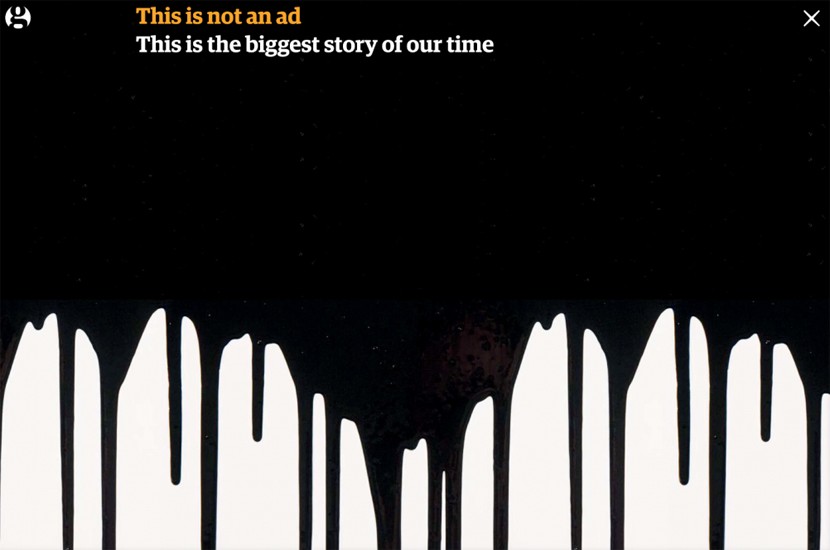
The grimly dark graphic, which resembles an oil spill, was designed by the paper's in-house design team and pops up when visitors click on to the Guardian homepage. The screen is covered by the graphic and the tagline; “This is not an ad, this is the biggest story of our time.” The design team's creative director Alex Breuer, said they wanted to produce something that would “Make sure everybody who comes to the site stops in their tracks.” He adds that “On a busy news website that’s very dynamic and changes a lot, so the only way to stop people doing what they normally do is to take everything away.” Of course, they also had to “Negotiate the intrusion of advertisers with commercial messaging through the text on the page,” which was a particular challenge, and probably explains why they could only afford to upload the graphic for 24 hours.
The screen is covered by the graphic and the tagline; “This is not an ad, this is the biggest story of our time"
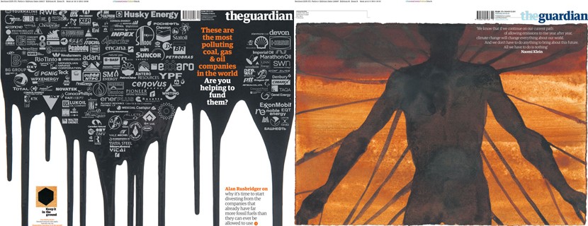

Once the graphic has had time to make an impression, it falls away to reveal a shape made up of various fossil fuel company logos. Breuer said they “Started with a beautiful array of the companies’ logos, all in full colour, arranged in a hexagon shape to represent the logo,” but after discussed it with Rusbridger, they thought it was “Very beautiful, but felt corporate and over-designed,” so they “Started to deconstruct that shape, and do something starker with the background graphics.” The resulting logo was designed by Breuer and sculptor Antony Gormley and is pretty stark indeed, with a black hexagon on an orange “Mottled, oil-based background” symbolising both the carbon chemistry behind the story and a lump of coal itself. Gormley, who has written for the Guardian on climate change in the past, was invited to work on the project Breuer said “His work emotionally provokes, there’s a sense of vulnerability and fear, and context; it’s something he’s very passionate about, and is a complex issue which presents as a challenge for the individual.”
The grimly dark graphic, which resembles an oil spill, was designed by the paper's in-house design team
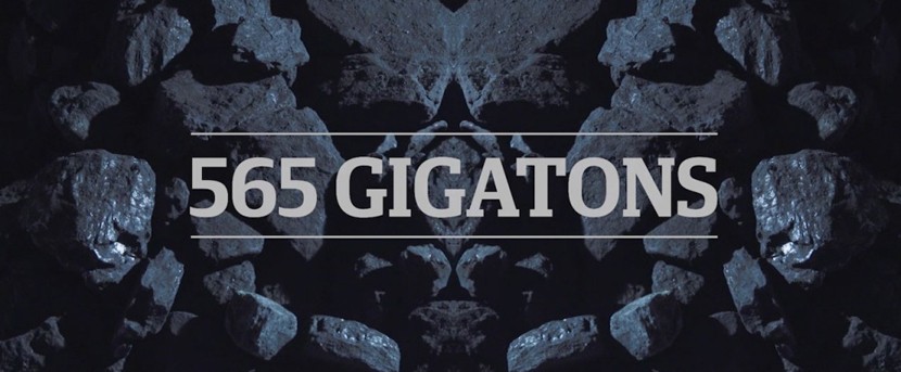
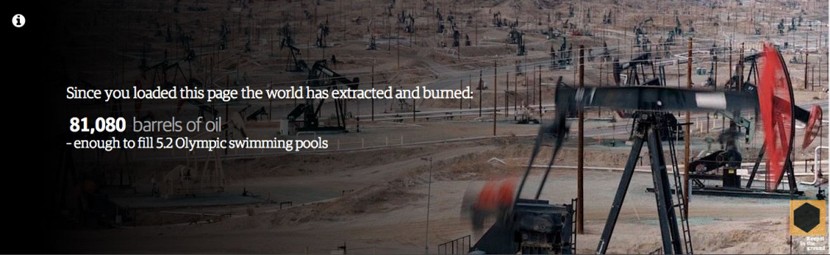
The logo is also present in a range of “Carbon tickers” designed to supplement the main graphic, which depict facts and figures on carbon consumption based on when the page is loaded. The figures are genuinely sobering. Breuer said of these interactive tickers that “When we have the tools available to us for digital presentation and live data, it’s really important to move beyond the transposition of text and use these mediums to bring stories to life.” He feels that “The numbers flicking on and off, while not intrusive, go that little bit further at being visually disruptive enough to keep the point hitting home.”
The logo is also present in a range of “Carbon tickers” designed to supplement the main graphic, which depict facts and figures on carbon consumption

The graphic arrives hot on the heels of three artist-commissioned newspaper cover wrap artworks that were featured in the printed publication last week in preparation of the campaign, which began in earnest on Monday (16 March), and whilst it was initially intended to only be in place for 24 hours, Breuer is hopefully it will return. He said they will “Gauge how effective it is, then do it again or adapt it,” but either way, he would “Like it to appear again at some stage.” He also has high hopes for the future of the campaign in general, calling the online graphic just “The first punch point.”