
Rufus Leonard – ODEON
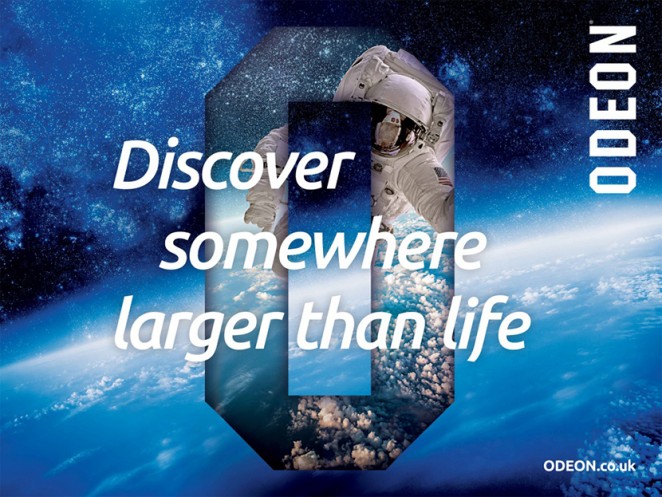
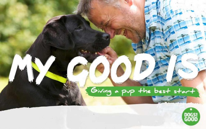
ODEON, the European cinema chain, has been given a glamorous brand revamp courtesy of Rufus Leonard, all based around the franchises iconic “O” motif, which the design consultancy have said they have aimed to position as a portal through which to transport the imaginations of viewers. Heady stuff perhaps, but then we are talking about the often histrionic world of cinema. The ODEON brand was founded in 1928 by Oscar Deutsch, with the name actually an acronym derived from the phrase “Oscar Deutsch Entertains Our Nation,” though I honestly always assumed it was some distant moon or fictional planet I'd simply never heard of. The original ODEON logo was created by Deutsch himself and was used up until 1997, when it was replaced by a new identity designed by Wolff Olins. ODEON now operates over 2,200 screens at 240 sites across Europe as a whole, including 120 sites across the UK and Ireland.
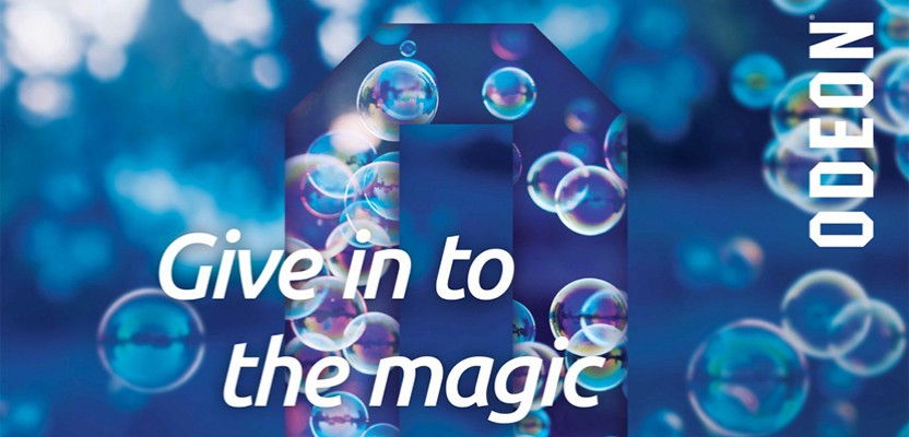
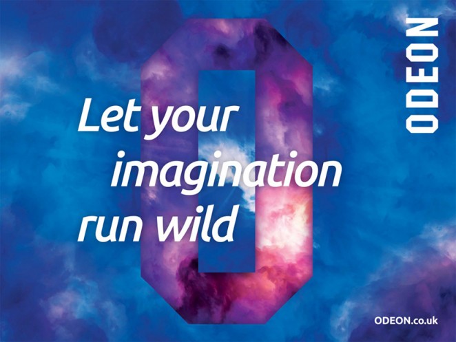
ODEON cinemas have been given a glamorous brand revamp courtesy of Rufus Leonard
The new look, which will be launching both on and offline, aims to create a cohesive, definitive brand experience that sets it apart from the competition, which generally tend to favour less elaborate branding. The “O” visual branding, however, is anything but plain, with the primary portal backed by emotive imagery such as a dramatic birds-eye view of space. Rufus Leonard also developed a new colour palette, which takes ODEON’s signature blue and adds a few brighter and more (aptly) cinematic tones, and a brand new digital-first typeface has also been produced for the chain. James Ramsden, executive creative director at Rufus Leonard, said: “For years, people have been choosing where to see their favourite movies based on how close they are to their local cinema. The time has come for customers to expect something more individual, special and magical from a cinema brand. The work we have created nods to what we all know and love about ODEON; it has a wonderful sense of heritage as an iconic picture house. But what’s crucial is we use design and creativity to unlock the potential and future of cinema in a creative and emotionally engaging way.”
ODEON is also set to open a unique new 4D “iSENSE” cinema in Charlestown, Ireland
The company is also set to open a unique new 4D “iSENSE” cinema in Charlestown, Ireland, soon, which will feature floor-to-ceiling HD screens and the latest Dolby Atmos sound-systems. These are systems designed so that the audience doesn't just experience the movies, but actually feels the movies, through a spectacular sound system that effectively envelopes the audience in sound from all directions. As part of the opening, Rufus Leonard has created a unique immersive experience for the cinema, which will see customers move through an audio-visual sound and projection tunnel before arriving at the iSENSE screen. Sounds pretty exciting to me, though I'm still getting my head around IMAX so I'm not sure I'm quite ready to 'feel' the movies just yet.
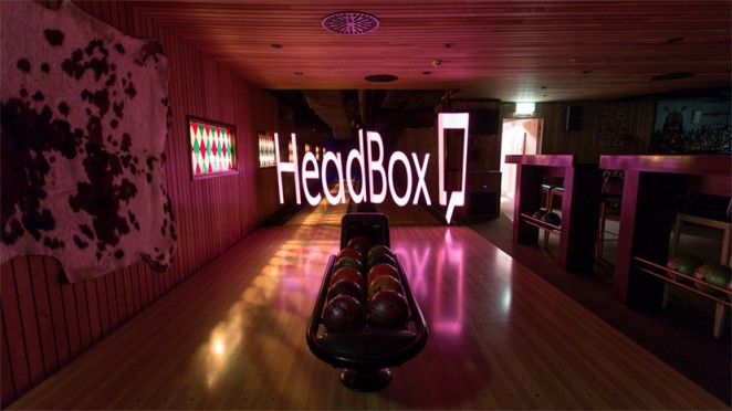
Karoshi – HeadBox
Design consultancy Karoshi has created the visual identity for a new website, which allows people to hire out spaces and venues. HeadBox is a unique online marketplace allowing people to book unique, off-site meeting spaces for company events such as workshops, brainstorms, training, production and company meetings, which sounds like a wonderful idea to me, as it's sometimes difficult to alter your mind-set in the manner required for such events if you're stuck in the office. The new logo is a two-dimensional, red, open square, with the brand name next to it, which the consultancy has said is a “Fusion of a floor plan and a speech bubble,” representing the physical spaces that the company provides to help catalyse conversation and inspire a different way of thinking. Ben Vincent, creative partner at Karoshi, said: “The concept of a floor plan literally references the venue or host. The speech bubble contained within the negative space is a nod to the guest’s conversations and the sharing of ideas within these inspirational spaces. The square box format becomes a visual mnemonic for the brand name, and the open door represents the unlocked venues.”
Karoshi has created the visual identity for HeadBox; a unique online marketplace allowing people to book unique, off-site meeting spaces for company events
Karoshi has also helped to develop the brand positioning with the tagline “Sharing Inspiring Spaces,” and has designed HeadBox’s membership packs, and exhibition and launch event graphics. The consultancy was appointed to the project in May this year, after being approached by HeadBox’s founding partner Andrew Needham. The HeadBox website, meanwhile, which uses the logo’s red colour scheme, was designed by consultancy Brilliant Basics. If your company is interested in the prospect of holding a meeting in a more individual space, HeadBox currently has more than 1,000 available to book across London, and plan to expand nationally and internationally over the next 12 months.
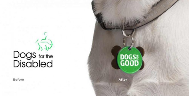
Fishburn - Dogs for Good
I love dogs, and am a firm believer in the fact that a good snuggle with a willing hound can help soothe even the most substantial ills. Yes, even if you're a cat person. So I was delighted to learn of the “Dogs for the Disabled” charity, which does pretty much what it says on the tin; provides training assistance, activity and therapy dogs for people with disabilities, and for schools and communities. The actual name and the branding, however, left a lot to be desired, so the Fishburn consultancy has been brought in to revitalise the now almost 20-year old charity with a new name (it now goes by the easier to digest and less oddly specific “Dogs for Good”) and a sparkly new visual identity, with the aim of bringing more positivity and inclusivity to the brand.
“Dogs for the Disabled” has been rebranded as the easier to digest and less oddly specific “Dogs for Good” by Fishburn, who also lent the charity a visual makeover
The new visual identity replaces the icon of a person in a wheelchair and a dog, with a more elegant and universally relatable green dog tag. James Beveridge, executive creative director at Fishburn, said: “We wanted a strong, confident symbol that would be universally recognised and which could be worn by volunteers, the people they help and even the dogs themselves.” The logotype has also been changed from black to white, and is now incorporated within the imagery, rather than next to it. Beveridge added of the overall rebrand: “With this project, we were looking to create a brand identity which focused on the positivity of the charity’s cause. Research discovered that people with disabilities felt than the name Dogs for the Disabled cast them in a negative light. They felt they had the capability to live normal lives, and with a specially trained assistance dog, their lives would be even better.”
The new identity also aims to better reflect the individuality of the charity's patrons, and the wider range of people it supports
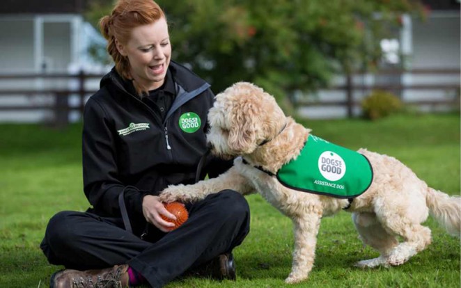
The new name aims to put a more approachable, (ironically) human face on the charity and disabled people, who deserve to be seen not just as disabled people, but as individuals. The new identity also aims to better reflect the wider range of people the charity supports. Dogs for Good hope that the new name will increase the charity’s visibility to the public, and increase its donations and fundraising ability. The new branding has been applied to marketing collateral, merchandise, fundraising materials, events and online touch-points, and has started rolling out across the UK.
Angus Hyland – The William Morris Society
The William Morris Society has teamed up with Pentagram partner Angus Hyland to craft a new visual identity to mark the 50th anniversary of the organisation, which is dedicated to promoting the work of the great Victorian poet, novelist, and designer of the same name. Morris lived the last 18 years of his life (he died in 1896) at Kelmscott House in Hammersmith, West London, where the society is now based. It publishes a newsletter, a journal and a website, and organises a programme of talks, events and visits throughout the year. As well as marking its semi centennial, the organisation also wanted to unify its communications, which had previously featured four different logos with 11 different variations.
The William Morris Society has teamed up with Pentagram partner Angus Hyland to craft a new visual identity to mark the 50th anniversary of the organisation
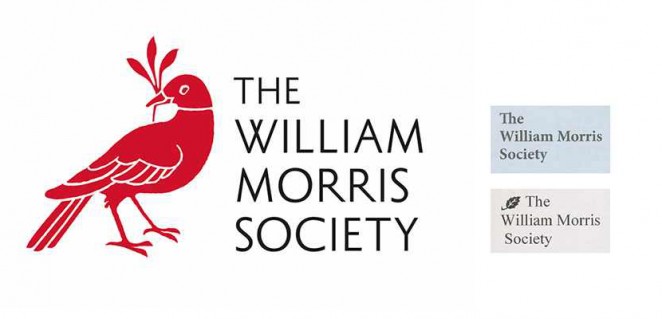
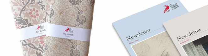
For the new identity, Hyland’s team has created a single logo made up from a bird emblem and featuring the society’s name. The emblem is hand-drawn and derived from Morris’s famous Bird print. The emblem aims to bring together Morris’s work into all communications, thereby complementing the society’s organisational goal. The new identity’s colour palette is also inspired by Morris’s work. There is a primary colour palette of red and black and secondary colours have been taken from Morris’s Jasmine print, which is also part of the society’s archive. The consultancy says the logo is particularly fitting for use on journals and newsletters, as it “Evokes the visual language of a publisher’s colophon.” In case you were wondering (because I know I was), a colophon is “A brief statement containing information about the publication of a book such as the place of publication, the publisher, and the date of publication.” You really do learn something new every day!
Benjamin Hiorns is a freelance writer and struggling musician from Kidderminster in the UK.