Paul Belford Ltd – YO! Sushi

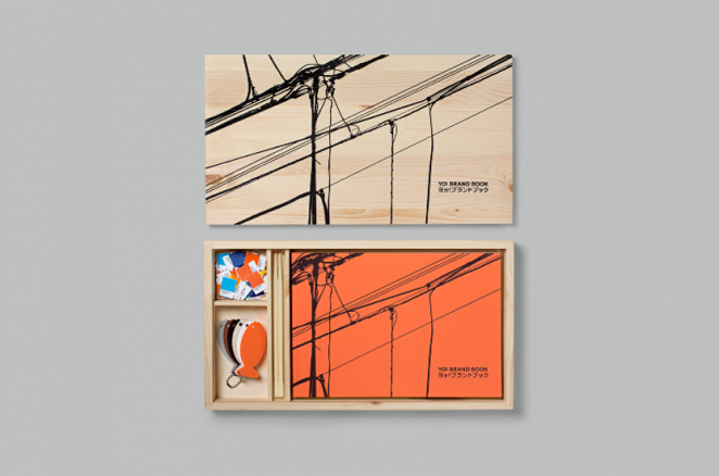
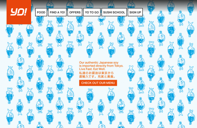
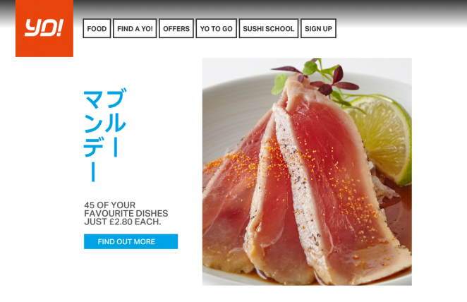
YO! Sushi has unveiled a pretty bold rebrand, which actually goes so far as to drop “Sushi” from the main logo. Elsewhere, it also takes on a decisively simpler, and more illustration-inspired look. The rebrand was engineered by Paul Belford Ltd, and marks the first time the logo has been changed significantly since the brand was launched back in 1997. The new branding replaces the Japanese anime-inspired graphic design system, which was designed by &Smith and launched just six months ago. The new logo retains the italic logotype, but sees a cleaner, more stripped back look, removing the outline and using a simpler typeface which is more uniform in width. It retains YO! Sushi’s signature orange colour, but the shade is a touch darker and the pink from the logo has been dropped completely. The new graphic system uses a primary colour palette of light orange, dark orange, pink, yellow, light blue and dark blue across print and online communications, with a single colour often used for flat graphics and illustrations, set against a white backdrop. A secondary palette of green, blue, purple, orange, pink, yellow, red, light grey and dark grey is being used for colour-coded plates in-restaurant, synonymous with the YO! Sushi style. The new graphic system also takes influence from Tokyo-based iconography, and an alternative shorthand version of the logo has been produced, which doubles as a Japanese character that translates to “Active.”
Illustrations have also been created to reflect life in Tokyo, which are featured alongside pictures of the brand's meals in a new 200-page brand book, which is presented in a traditional, wooden Japanese bento box. The minimal branding has been extended to merchandise too, with block coloured fish icon key rings. YO! Sushi has not confirmed why the branding has been changed only six months after a new graphic system was launched, but a spokesperson from YO! Sushi has said that the new logo is an “Evolution” of the restaurant’s branding rather than a rebrand. They also clarified that, despite the logo dropping the “Sushi,” the chain would still be known as YO! Sushi, not simply “Yo.” The new branding has already rolled out on YO! Sushi’s online platform, but the company has not yet confirmed when it will roll out in-store, on print collateral or on merchandise at the time of writing.
White Bear Studio – UKNY Music
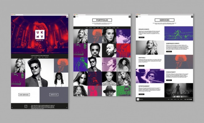


White Bear Studio, the London-based design studio run by the creative partners Kelly Mackenzie and Martyn Garrod, which posits itself as a “multidisciplinary studio,” has worked on the rebrand of UKNY Music, making use of a saturated version of the brand’s own photography in bright colours. The images have been contrasted with high contrast black and white profile shots. The refresh is currently rolling out across all touch points, and utilises a clever mix of bold, contrasting colours and shots of the famous faces who use the event production and talent booking service.
Coley Porter Bell – Jordans
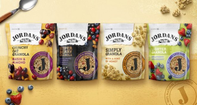
Breakfast cereal brand Jordans has revealed the new packaging design for its iconic Granola range. Hitting the shelves this month, the original British Granola manufacturer tasked award-winning branding consultancy Coley Porter Bell to develop the new look. Charged with bringing to life the brand’s proposition, Coley Porter Bell implemented its proprietary 'Visual Planning' approach. Jordans wanted to build on its heritage and straightforward approach to making Granola with the best tasting natural ingredients, whilst keeping the brand essence of being no-nonsense. The pack design features an updated version of the famous Jordans’ mill that has been used as a mark of quality assurance. The new pack also features a larger window, allowing consumers to see the delicious ingredients and showcasing the pride and confidence the brand has in their product. The range features Crunchy Oat Granola, Super Berry Granola, Simply Granola and Lighter Granola.

Richard Clayton, Creative Director at Coley Porter Bell, said: “Through our proprietary Visual Planning approach (that looks to engage the system one and system two of our brain through design) we hope to engage a whole new audience. Jordans really cares about its consumers and how its products are portrayed, which makes our partnership really enjoyable.” Elliot Harris, Senior Brand Manager at Jordans, added: “We are honest about the product and ingredients and want this to be reflected in the design. Coley Porter Bell has done a fantastic job of achieving this whilst conveying the classic Jordans feel throughout each flavour’s specific design.”
Rbl – World Sailing
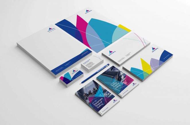
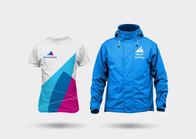
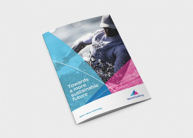
Global sailing governing body World Sailing has revealed a new brand identity, completed by Rbl. The new logo includes an abstract sail, created out of two semi-translucent, curved triangular shapes with a curved-edge typeface. The overall branding, meanwhile uses a colour palette of navy blue, pink, light blue, white and purple. These shapes and colours were chosen to allow the identity to adapt and animate for digital animations. The abstract sail icon is used as a framing device across brand communications, to create backdrops for text and images across platforms such as business cards and merchandise. The rebrand also sees a name change from the International Sailing Federation (ISAF), to the more succinct World Sailing. The new identity, which took three months to complete, is currently rolling out across digital platforms and will roll out across merchandise, print and marketing collateral later this year.
In-house – Pandora
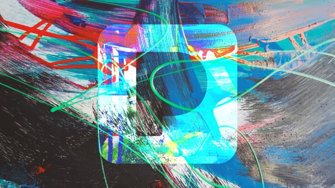
Pandora, the internet radio app, has just undertaken its first rebranding in 11 years, which looks to be a step in the right direction to help it stay competitive. It arrives as the streaming service not only announces a slew of new products, but a new paid version of the service, Pandora Plus. Pandora launched its new look and feel as it continues its transition from internet radio app to an on-demand music streaming service (more akin to Spotify). The company’s Creative Director, Julie Scelzo, was tasked with coming up with the new branding internally according yo a blog post by VP of Creative Services, Tony Calzaretta on the company website. The new branding is a bold departure for the brand. The new “P,” with a thicker text and a fading blue colour wash, reflects a new logo, with a more vibrant scheme, that signals a fresh new look and feel for the service. The new logo reportedly went through over 1,000 iterations before the new one was finally announced.

The initiative for the new look was for the company to develop a design language that was able to present what music looks like. What the design team decided was that music doesn’t look like one thing and that it could be colourful, so they made a promotional video and artistic iteration that goes through many colours, styles and moods while staying true to the new original Pandora “P” branding. Calzaretta said: “Our new look embraces the dynamic range of sound and colour, visualising the energy and emotion that artists pour into the creation of music, and that we feel as listeners. Our dynamic brand is composed of form, colour and pattern, which we implemented into the new P icon and serves as your portal into the unique and diverse range of music you love.”