

Wolff Olins – New York's Metropolitan Museum of Art
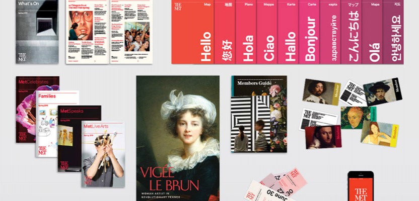
Wolff Olins has created a new identity for New York’s Metropolitan Museum of Art, to replace the existing branding which has been in use since 1971. The new identity will be launched on 1 March, and will be part of a clearer graphic language that will create greater clarity and consistency in The Met experience and communication across all its locations and online. It's reportedly the result of a two-and-a-half year collaboration between Wolff Olins and a team at The Met, which included Head of Design, Susan Sellers. The new identity will replace the existing logo which has been in use since 1971, and is based on a letter “M” adapted from the 16th century book De Divina Proportione by Luca Pacioli, an associate of Leonardo da Vinci. Wolff Olins says that audience research revealed a set of principles which became the starting point for the design process. The combined teams then developed a strategy focused on making the Museum more open and accessible to users, and more coherent as a holistic experience across the soon-to-be three locations (The Met Fifth Avenue, The Met Cloisters and The Met Breuer, opening March 18) and online.
“There may be debate about the logo, because it involves change, but the museum chose it because it represents something simple, bold, and indisputable: The Met is here for everyone”
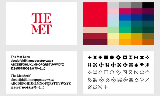
A decision was made early on in the process to lead with the museum’s “Common use” name of The Met, and that this would then be used in the museum’s new logo. Of the new logo, the design consultancy said: “The mark is a unique drawing inspired by the idea of making ‘connections’ — helping users connect ideas across time and culture, across the collection, between themselves and the art they interact with. The letterforms are connected together in bespoke ways and combine both serif and sans-serif letterforms, a deliberate move to incorporate both classical and modern ideas, a nod to the fact that The Met spans 5,000 years of art.” It chose red as a key colour for the new identity, meanwhile, because they felt it embodied “Passion and vitality, and has done across time and culture.” The Met added of its new identity: “There may be debate about the logo, because it involves change, but the museum chose it because it represents something simple, bold, and indisputable: The Met is here for everyone.”
Wolff Olins – Zocdoc
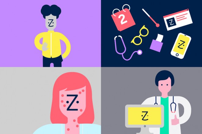
Wolff Olins also created a new identity for US medical brand Zocdoc this week, which aims to present the online service, which helps people find doctors and book and manage medical appointments, as “The face of healthcare,” with a logo that literally depicts a face. For the rebrand, the agency developed a new logo which is a line-drawing of the letter Z with two eyes representing an ever-changing patient face. The rebrand also introduces a warm, yellow-led colour palette, which eschews the traditional blues and greens and common cross and staff symbols of healthcare design. It has also brought in a new word mark, which simplifies the company’s identity by dropping the capital D, and has introduced new “True-to-life” imagery, as well as a redesigned website.
“Zocdoc looks at home with the digitally attuned, mobile-first brands that people interact with today”
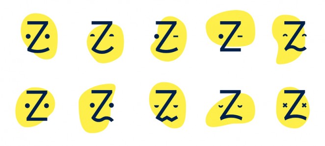
Wolff Olins said: “Zocdoc now looks at home with the digitally attuned, mobile-first brands that people interact with today. It was crucial for the team to ensure each step involving the user would be both joyful and rewarding. Rigorous testing went into ensuring the brand would shine – from the most serious encounter to the smallest screen.” Richard Fine, President of Marketing at Zocdoc, added: “The new face of Zocdoc looks the way healthcare should – friendly, simple and, most of all, reflective of patients and real life.”
Spin – Google Jigsaw
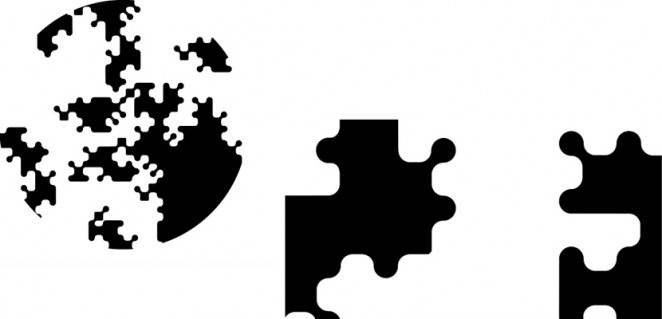
The Spin design consultancy has rebranded the think tank originally called Google Ideas as Jigsaw in order to reference the problem solving and collaboration the platform represents. This marks the latest effort by Google to differentiate its 'other' businesses, following the creation of the Alphabet master brand last year. The new identity system features a lower case word mark and an abstracted puzzle piece in a roundel. The motif can also be used to show global collaboration allegorically. According to Alphabet's Executive Chairman, Eric Schmidt: “The name acknowledges that the world is a complex puzzle of physical and digital challenges, and that collaborative problem-solving yields the best solutions.” He added: “The world is as complex as ever, but we believe that a unique combination of principled research and technology expertise can help put the puzzle together – one piece at a time.”
“The name Jigsaw acknowledges that the world is a complex puzzle of physical and digital challenges, and that collaborative problem-solving yields the best solutions”
Google Ideas was established in 2011 as an in-house think tank, setting itself the target of looking to see how technology might help people coming online for the first time, particularly in places where there are issues around censorship, corruption or violence. It has expanded its remit to include combating all sorts of cyber crime. Current projects include: Project Shield, which looks to protect news services from being hacked; uProxy, which is an open internet; and Password Alert, which helps to protect against phishing. Other work includes working to help tackle money laundering, organised crime, police brutality and human trafficking and terrorism according to Jigsaw, which recently produced this visualisation showing global digital attacks in real time.
Production Type – Renault
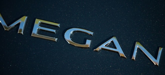
Renault introduced a (quite literally) standout new typeface system by Production Type this week, which has been designed specifically to be visible on car nameplates when the car itself is in motion. The very aptly named “Renault Carname” typeface will be used on nameplates on the back of vehicles and in some cases on the interior. The new fonts are rolling out now on all vehicles including the Megane, as well as other models on the European market, a car named Kwid on the Indian market and a variety of concepts including the Alaskan, while more will follow. The typeface has been designed with flexibility in mind, so there are different widths, weights and slopes to create different visual expressions for anything from huge trucks to tiny cabriolets. The consultancy sought a down-to-earth solution by matching a minimum typeface weight to the viscosity of a glue, and also considered that thickening and rounding small stems and spikes can be hazardous in the case of an impact.
“Although head-up displays and speedometers are set in various type and the Renault brand identity another, everything else is now Renault Carname”
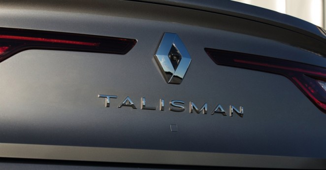
Jean-Baptiste Levée, Production Type President and Lead Designer on the project, said: “Although head-up displays and speedometers are set in various type and the Renault brand identity another, everything else is now Renault Carname. Chrome letters have their own peculiar way of behaving. Receiving and reflecting light elegantly is one of the key roles a chrome letter is expected to play; their shapes need to interact closely with the environment and their lines and curves must perform seamlessly with sun rays.” Production Type is still working with Renault’s in-house graphics department to reconcile design choices with industrial possibilities as the typeface rolls out.
Corke Wallis – The Hague Convention Bureau
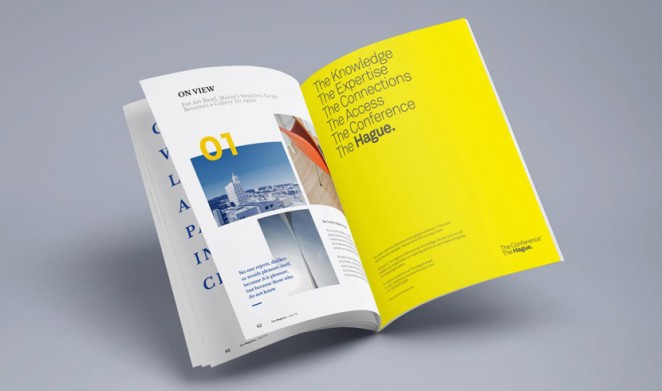
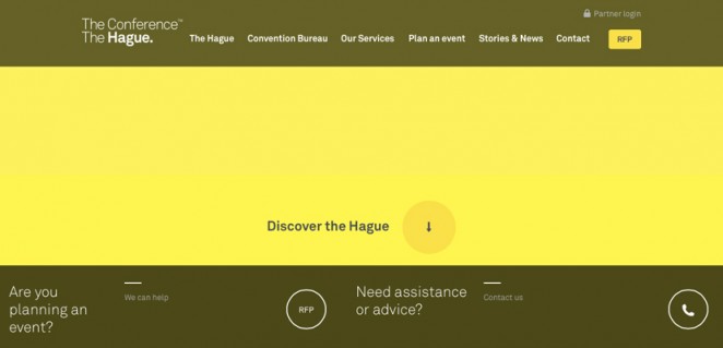
Design agency Corke Wallis unveiled a bold rebranding of The Hague this week as “The” conference destination for global organisations looking to access the city’s international knowledge infrastructure. Following its appointment by The Hague Convention Bureau, the agency has created a global identity and campaign that will highlight the dutch city's strengths as a location for international congresses and conferences. The new work was launched to city stakeholders on the 4th February and will run globally across all media, including digital channels. It focuses on the unusual use of “The” in the city’s name, marking this out as a n interesting differential. Corke Wallis used this determiner across the design and campaign idea to promote The Hague as not just “A conference” destination but “The conference” destination.
“It took us a while to spot the solution, but once we did, everything fell into place”
David Bodor, Strategy Manager at The Hague Convention Bureau said, “The response from our staff and stakeholders has been universally positive. The solution Corke Wallis arrived at could only have been created by someone outside The Hague. It takes something obvious and creates a simple system that helps us tell our unique story to the world.” Michael Wallis, Creative Founder at Corke Wallis, added: “It took us a while to spot the solution right under our nose, but once we did, everything fell into place and we delivered a tool our client can use to unite its partners and deliver meaningful, benefit focussed messages.”


