

Spring – Browns Fashion


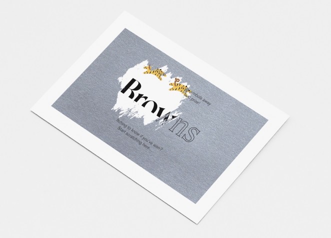
Spring has rebranded fashion retailer Browns, including a redesigned logo, packaging, store design and website. Founded in 1970, this marks the London-based retailer’s first rebrand in 40 years. The aim is to reflect the history of the company, whilst also emphasising the future. Store signage and packaging including shopping bags, swing tags, boxes and gift cards have all been updated with the new branding, placing the redesigned serif logo at the bottom of the packaging to create a “cut-off” effect. The interiors of the flagship Browns store on South Molton Street, London have also been updated to include a new shoe area, and the relaunched website puts more emphasis on editorial, social integration and functionality. The rebrand has now rolled out across all touch-points.
“The logo sitting unexpectedly at the bottom of the bag represents the idea that we are a container for brands and provide a foundation” Browns CEO, Holli Rogers
Pearlfisher – Driscoll's
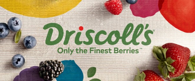

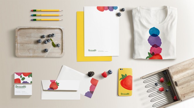
Driscoll’s, the fresh berry brand, has joined forces with Pearlfisher to boost their global brand identity. Driscoll’s has historically focused on the functional qualities of their produce, specifically fresh and delicious berries. Going forward, the opportunity was ripe for the brand to elevate their identity by forging deeper emotional connections and building stronger bonds with their consumers. Pearlfisher were tasked with capturing and expressing the unique brand of Driscoll's berry joy. The new brand positioning embodies the unique role Driscoll’s berries play; that when their berries are added to the mix, ordinary moments are made more special. The idea is that, by connecting the functional with the emotional, Driscoll’s and their berries will live even more powerfully in hearts and minds of everyone they touch. These potent brand ideas have been brought to life with a playful and appealing new visual identity system.
“Driscoll’s berries are universally loved, and wherever they are they make everything better” Karen Schnelwar, Pearlfisher's Head of Strategy
This visual identity system incorporates a series of custom prints and patterns of graphic berry forms. Joyous and visually arresting, the patterns marry with the library of custom berry and lifestyle photography to create a cohesive and compelling whole. The ‘Driscoll’s Dot’ over the ‘i’ changes colour within a custom berry-inspired palette, which represents both the berries and the moments of joy they bring to consumer’s lives. The logo, meanwhile, uses hand-crafted cursive typography to reflect the hand-picked care that goes into their berries and the brand’s unique attributes: approachable, joyful and fun-loving, without being artificially perfect. The typography is a more natural green, inspired by the berry plants themselves. The identity incorporates a backdrop of historic and iconic yellow, symbolising sunshine that makes Driscoll’s brand and packaging distinctive and recognisable.
INITIALS – Fit Kit
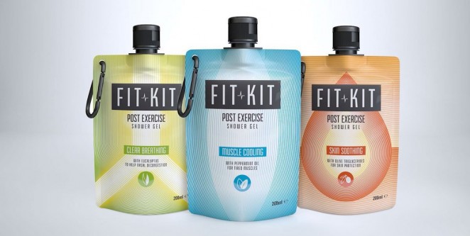
Fit Kit, a new shower gel for post-exercise recovery, is rebranding with creative agency INITIALS. Carving out a new category altogether, the life hack product range combines recovering from exercise with showering, as an innovative solution for time-poor consumers. It will be listed in Whole Foods Market, Swedish retailer Gymgrossisten stores, As Nature Intended and bodybuilding.com. Fit Kit’s updated look marks a move away from its original 100 Bodycare name. The bold new identity created by INITIALS is designed to showcase Fit Kit’s unique concept and appeal to day-to-day exercisers of both sexes. Fit Kit’s three variants (which come in orange, green and blue) hone in on solving the problems that come after exercising. Targeting dry skin, fatigue and muscle soreness, the three specially designed formulations include: olive triglycerides to moisturise, eucalyptus to help nasal decongestion and peppermint oil to cool tired muscles. Unlike other gym products, which generally come in bulky bottles or jars, Fit Kit sports a convenient, light, eco-friendly pouch container.
“With our design we wanted to help Fit Kit reach as wide a range of consumers as possible” Simon Callender, Creative Planning Director at INITIALS
Pentagram Partner (Paula Scher) – The Heart & Stroke Foundation of Canada
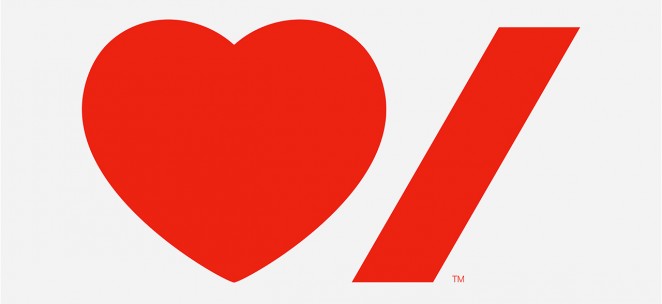
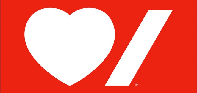

Pentagram partner Paula Scher has redesigned the visual identity for The Heart & Stroke Foundation of Canada, a national charity whose mission is to prevent heart disease and stroke. For the charity’s first rebrand in over 60 years, Scher was briefed to create an identity that would connect more deeply with Canadians and reignite passion for the cause. After unifying to become a national organisation in 2011, Scher says Heart & Stroke needed a cohesive visual system, which would help group its various initiatives and programmes together under one identity. The charity also wanted to make the design more dynamic, modern and relevant in order to inspire younger generations to fundraise for the cause and view it as an investment in their own future.
“I used Neue Haas Grotesk as the typeface in several different weights to communicate urgency and empathy” Paula Scher
Heart & Stroke’s new identity features a simple new logo which pairs two bright red graphic icons – a heart and stroke symbol; to represent the charity’s focus on two of the human body’s most vital organs: the heart and the brain. The symbols used within the logo are also designed to transcend languages, making it suitable for French and English-speaking areas of the country. The new system allows for “Heart & Stroke” to be incorporated into the logo in both languages by stacking the different names on top of each other. Scher used a colour palette of red, black and white, which may be expanded to include additional colours in the future. Graphic guidelines have been designed so the identity can be implemented across all touch-points, including publications, campaigns and for the charity’s various divisions, such as community events, corporate sponsorships, gifts and the lottery. The new identity system has now been rolled out across the brand.
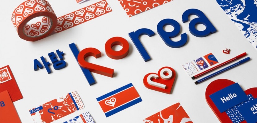
SNASK – North Korea

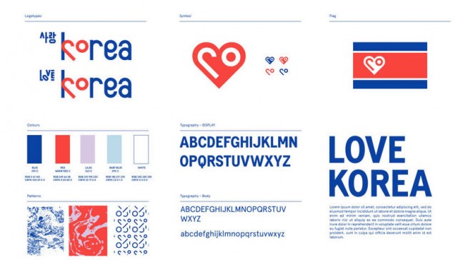

Closing this week on something a little different. Sweden design firm SNASK, recently put together a (completely hypothetical) rebranding package for North Korea to help the much maligned country turn itself around in the eyes of the world. The idea came to the firm after ICON Magazine asked them if they wanted to do a rebrand of any existing brand in the 'Rethink' section of the design and architecture focused online and offline tome. How could they possible resist? The package includes a new logo, typography, business cards, uniforms and even a redesigned currency and a new flag. Of course, the North Koreans didn’t ask for it, and won't use it, but SNASK has kindly offered it all at no cost to the reclusive state on one condition: They must first prove to the world that they are a free democracy. Now that, ladies and gentlemen, is how you made a statement!


