


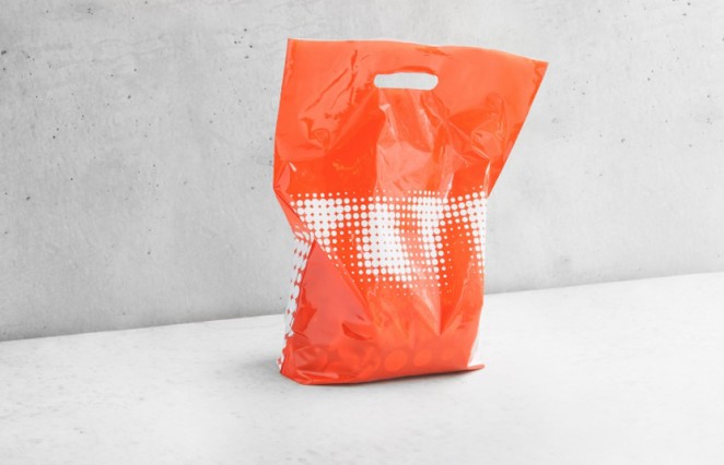
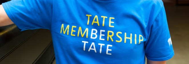
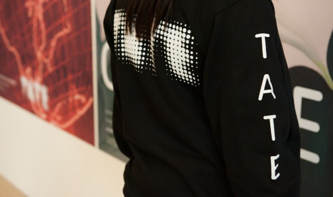
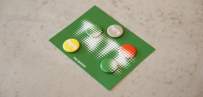
In an effort to not only unify the numerous galleries, but to engage a younger audience with the museums, North has refreshed the logo for cultural organisation (and institution) the Tate. The new visual identity is being rolled out across all touch-points, including print and digital communications, merchandise and uniforms. The updated logo is being rolled out to coincide with the Tate Modern’s new Herzog & de Meuron-designed Switch House building, which was unveiled last week, and saw the consultancy working with the in-house creative team, the Tate Design Studio, to refresh the main visual identity, which is constructed of thousands of dots.

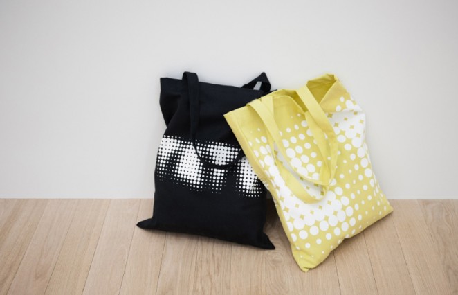
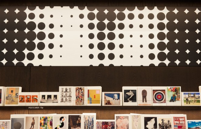
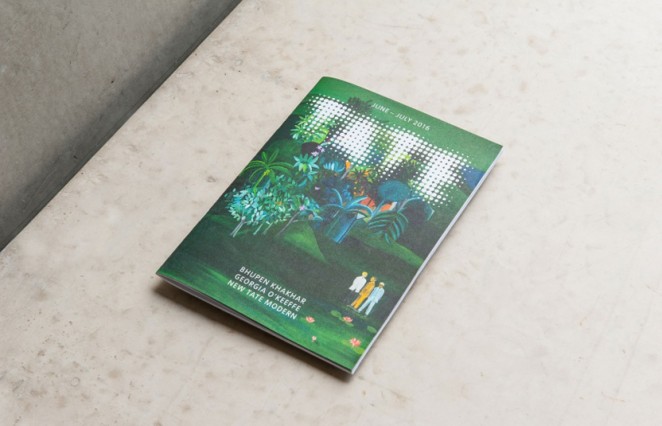
The new logo retains the dot concept, as North wanted to build on and strengthen the existing visual identity, rather than start from scratch. The refresh has also eliminated multiple variations of the Tate logo, which meant there were 75 different designs to choose from in total including slightly different versions of dotted or blurred logos. The same dotted logo is now being used across all four of the Tate galleries, and the number of dots has been reduced from 3,000 to 340, which aims to make it more functional and approachable across all mediums such as digital, print materials and embroidery. More control was also placed on the use of typeface Tate Pro, narrowing down the weights from 15 to just two, Tate Regular and Tate Thin.

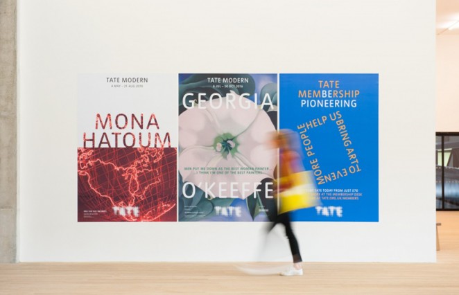
The branding for the four existing Tate galleries; Tate Modern, Tate Britain, Tate Liverpool and Tate St Ives, have also been unified. The gallery name has now been removed from the main logo body, and their names all use the same typeface in all caps. When used across print and digital communications, North's intention was to make it clear which exhibitions take place at which galleries, by placing the name of the gallery at the top of posters, and including the dates of the exhibition next to it. The consultancy has also created animated versions of the logo, which aim to give it personality and flexibility and make it feel more dynamic. This includes the dots of the logo moving around like planets or stars in a universe, then coming together to form the logo.
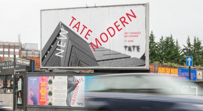
The dot emblem also provides versatility, to suit a number of different exhibitions or events. Different activations will be used to suit different exhibitions and events, allowing the logo to constantly evolve. For example, the opening of the new Tate Modern building last week resulted in a logo variation where the dots were redesigned as individual bricks. The colour scheme used also links up the visual identity with specific art on show at the museums. North has used 10 different colours, which are inspired by an art installation created for the Tate Modern by artist Martin Creed. A different installation is commissioned every two years, so the visual identity will continue to evolve, with colours changing to correspond with the new installation.
North founder Sean Perkins, said of the logo: “It was about making the logo playful and bringing it alive. You can press a button and transform the logo to a piece of coding, a series of numbers, or anything to suit a campaign or initiative. The moving dots give off the idea of everybody coming together, which is part of the Tate’s new strategy to activate a younger, more diverse audience.” Of the overall visual identity overhaul, he added “I think it’s really healthy to refresh the visual identity. There will naturally be a period where two colour schemes live alongside each other, but this is a beautiful expression of the Tate.”
Benjamin Hiorns is a freelance writer and struggling musician from Kidderminster in the UK.


