


One of the strange truths about working in the creative industry is how easy it is for your focus to narrow and shut out other people’s exciting projects. It’s a trap that leads to people becoming predictable and something I don’t want to happen to me.
With that in mind, I always get excited when London Design Festival rolls around. It gives me an excuse to indulge in a bit of professional curiosity. With this year’s event wrapping up I wanted to share my best picks.
VOID by Dan Tobin Smith + The Experience Machine
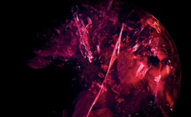
Photographer Dan Tobin Smith has always had a brilliant eye for new perspectives so I was particularly excited to see his VOID exhibition up close. The display shows impossibly close up photographs of gemstones, using a specially adapted gemological microscope. At this distance the gems start to look more like entire galaxies than chucks of rock. The effect is genuinely breathtaking.
However, I think special mention needs to go to the presentation of the work. To get to Tobin Smith’s photographs we first had to work across a pitch-black room, to a single light in the distance, as gentle choral music played. Then you’re confronted with the actual gems themselves, displayed in small cabinets, accompanied by placards outlining all sorts of information about them.
It meant that by the time you saw the exhibition properly you were in a contemplative, almost reverent mood. It reminded me of how we present ideas in pitch decks, building anticipation and creating an atmosphere before the reveal.
The Art of Persuasion: Wartime Posters by Abram Games
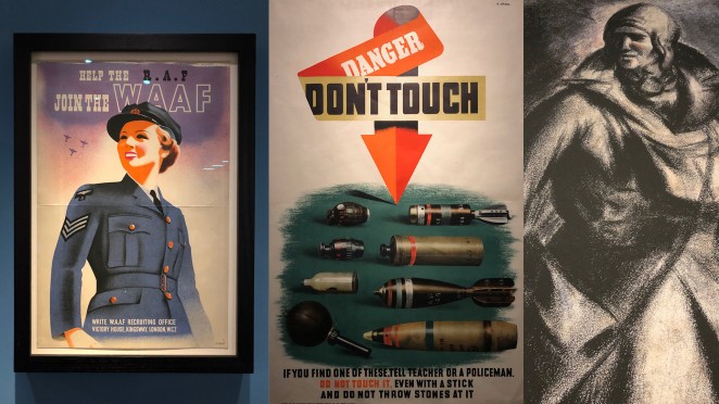
I’ve always been interested in propaganda and its influence on advertising. In fact, I wrote about it a couple of weeks ago so was really excited to visit the Abram Games exhibition at the National Army Museum.
Games’ work was slick, focused and commanding, especially compared to other graphic designers of his time. Visually, his posters use a lot of the same elements found in advertising today, which is hardly surprising. Designers in 2019 will recognise his bold uses of colour, layout and iconography.
It was fascinating to see how messaging changed depending on his audience. Work directed at soldiers – or potential recruits – was frank and full of specific advice (“His rifle will fire. Will mine? Care of arms is care of life.”) In contrast, work directed at civilians was generally broader, urging people to enlist because of their friends or to support soldiers fighting overseas. He’s certainly someone to study when considering how to appeal to a specific segment of the market.
Uniform Wares + Marion Friedmann: Materials – Process & Development
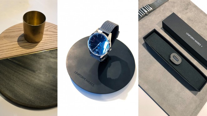
The guys at Uniform Wares create fantastic watches that are as highly detailed as they are minimal in their appearance. The attention to detail that go into their watches is something to marvel at.
And that’s exactly what I did at their small, but perfectly formed exhibition in collaboration with Mexican artist Marion Friedmann. The exhibition focused on the materials that make up the brand, from interlaced metal work to marble textures and leather finishes. Oh, and there was free tequila and tonic from El Reyo, which didn’t hurt.