
The newest colour-coding technology, from WGSN, could change the way we look at colour.
WGSN, the world’s leading forecaster of global trends, recently launched its own colour-coding system, Coloro, in partnership with China Textile Information Center (CTIC) – and it’s a system that could change the way we all talk about colour.
Pantone’s colour matching system dominates – but Coloro is based on and entirely different methodology, and could pose a challenge to Pantone’s dominance.
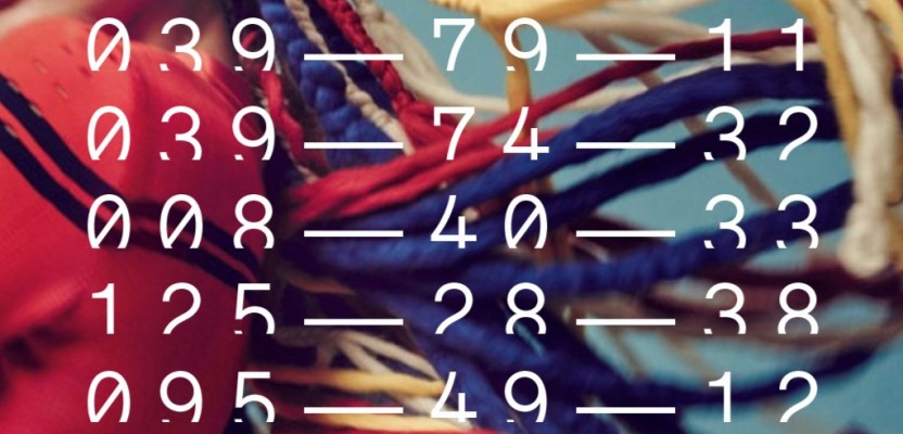
Part of the appeal of Coloro is its extensive library populated with 3,500 colours. But its star feature is a seven-digit unique code that’s given to each colour.
The code is based on a 100-year-old colour methodology pioneered by Albert H. Munsell, who put forward the idea that colour – or rather, how we perceive colour – is based on hue variation, lightness values and chroma values (saturation).
The first three digits of the Coloro code depict the hue (0-160), the middle two depict the lightness (0-99), and the last two depict the chroma (0-99).
“This methodology was really limited at that time [when Munsell first developed it]... But we developed [it] further with our Chinese partner [CTIC] who did 20 years of research [into] how humans sortand see colour,” says Thorsten Traugott, managing director of Coloro.
Coloro created its colour collection after working closely with an 80-strong VIP colour panel to decide which colours to include – out of a possible 1.6 million colours it had originally coded. The panel included representatives from consumer brands like Adidas, Desigual, Schwarzkopf, Volkswagon, as well as department store Macy’s.
“When we reached out to them, they were all open because colour is such an important topic for them,” Traugott says.
He adds: “They also placed [requests like], ‘we need more greys’, because greys are a weakness in other [colour] systems – and we identified 350 greys. Everyone is using grey, even for the standard collection. Sometimes greys are the best-selling products for some companies.”
Coloro has in its arsenal free online and paid offline products and services, which include polyester swatches and colour consultation services for companies and brands.
The jewel in the crown of Coloro’s services is its complimentary online workspace. You can browse through its colour library with a swipe of your mouse, see all the colours mapped out in a 3D spherical view, click through an online version of the Codebook (63 colour-coded pages filled with colour graphs showing different light and chroma variations) and also see what a colour’s closest neighbours look like. Each colour also comes with a corresponding Lab and sRGB numbers.
But what sets [the online workspace] apart is that it’s fun to use.
Browsing through the colours is a freehand experience: swipe your mouse up to increase lightness; down to decrease lightness; left to decrease chroma; right to increase chroma. Scroll down or up to explore more hues. Press the space bar to add it to your own swatch collection.
The 3D function is also a visually stimulating experience. Zoom-in on the 3D colour sphere and before long it starts to feel as if you’ve entered a colourful galaxy.
We caught up with Thorsten Traugott to find out how and why this system could be a game-changer for the consumer industry – and what colours we should be looking out for.
What are Coloro’s biggest advantages?
First of all, Coloro is a real colour system. It is [based] on logic. Other competitors in the market are, for us, more [like] colour dictionaries, which means there is one colour and there is one number to it. But there’s no logic behind the number.
On top of that, if you don’t find your [desired] colour in our 3,500 colours, we can still give you a code for it. Our system works in all industries, over all materials, because we don’t do a colour system for a specific material. [What’s important is] how the human eye perceives the colour. The material doesn’t matter.
How does this differ from other colour-coding or colour-matching systems; for example, the Pantone matching system?
Pantone created [one] system for textiles, one for the printing industry [and] one for plastics – this is based on materials. This is not what we do. We have one unique system for everything – for all materials and all industries. That’s the biggest difference [between Coloro and Pantone].
WGSN is a leader in forecasting trends. Will you launch a colour of the year guide, as Pantone does?
To be honest, we are the new kids on the block. We want to be different compared to everything [else] in the market, so our aim is not to copy anyone. [We] really appreciate the colour of the year; I think Pantone does a great job on this. It’s a great campaign, and we respect it. Of course, if Coloro [were to] do something like that, it would look completely different. Because we want to go our own way, so we have our own vision.
What led to the decision to make Coloro a free online service?
We love fashion, we love creativity, we love colour. And [when] we started to think [about] a new colour system, we started thinking of physical products. Then when we did some research with our VIP colour panel, we identified the need to connect the digital world [with] the physical world.
[We decided to make our online service] free for the industry because we have one vision: we want to improve the world with colour. We want to bring fun back to the world with colour.
Of course we are revenue-driven as well. If you’re using the digital tool, you will be re-directed to our physical products afterwards, especially because in fashion textiles it’s really important to have physical samples. We’re just [enabling] people to create their own colour palettes and so on, and then [when] they need the physical samples, they can buy them from our web shop and e-commerce [store].
What sort of colour consultation will you offer?
This could [cover] a broad range of things. We can help to codify and profile [a company’s] colour area; we can identify [what your colour has been] over the last three or five years; and we can relate that [information] back to sales numbers. So we can [create a sense of] confidence about which areas are the most important [for the company], and if they want to make a safe investment in new colours, we can let them know which [ones] they need to pick for their consumers.
Did CTIC’s connections in China make them more desirable as a partner?
Sure, CTIC has many different kinds of associations, and [its] connections on the manufacturer’s side, into the mills business and fabric companies, are huge.
The language of Coloro is not only for brands and retailers. It has to be for the supply chain. It has to be for the manufacturer’s side. That’s where we don’t have enough knowledge – how to connect with the Chinese supply chain. And that’s why we need our partner CTIC to run that business in China, to grow that business in China, to be very close to the manufacturers and make them to understand and speak the Coloro language. And that’s why again the fit is so perfect, because 65 per cent of production worldwide [for the fashion and textile industry] is still manufactured in China. It’s huge. And the combination that suppliers and brands and retailers are speaking the same language, that’s the important bit.
What colours do you foresee being popular soon?
Blue is the next big thing again. So you will see the blue all over the place, in different shades.
And I see more of a trend in colour combinations. [Because of the present state of the world], people don’t want to see dark colours.
Another colour [now popular] is yellow. [But] companies and brands sometimes don’t like touching yellow [as some have had] a bad experience with yellow in the past.
What do you mean by ‘bad experience’? Were sales of yellow clothes disappointing?
Yes, yellow [has not been] a big seller in the EMEA [Europe, the Middle East and Africa] area over the last 10 to 12 years. Yellow is a difficult colour, normally – but now you see it everywhere. It can also be an accent colour. And you can also see a lot of purples coming.
What colours are considered to be in the ‘safe area’ by companies and brands?
The safe area includes navy colours – navy colours always work. It’s the blue, white and red. These are classic colours. Also grey. Grey is a really consistent colour. You have grey in every season.
Blue is really important I would say. Now it’s coming in new interpretations. Dark blue [and] mid-blue – these were always in the safe area. But now, we want to make blue look modern [and] fresh, so we go into pastel blue and baby blue. The industry is getting braver. Retail is having problems at the moment, and so you need to do something different if you want to survive.
What other colours do you think should we be looking out for?
Metallics and neons. Neons will have a revival again. During our research [at WGSN], especially in the US, [we found that] people were really keen to wear neon colours, [and] that’s been inspired by the sneakers [trend]. And it’s always like that. Consumers get used to [a certain colour trend], even if it’s just [in] accessories or footwear, and then brands get the confidence to bring it out in shirts, pants or bags.
What is the Asian market like?
Korea, Japan, Hong Kong [and] China – these are the [countries] where many trends start, because Asians [have the courage] to move into new areas, and you see this on the streets. Many companies get inspired by the street shots WGSN is doing in Tokyo [and] Seoul.
Seoul is a big upcoming market. It’s [becoming] more and more important for the [fashion] industry. Ten years, 20 years back, no one [outside the Asian market] was interested in what was happening in Seoul. But now people [consider it] a hot spot.