
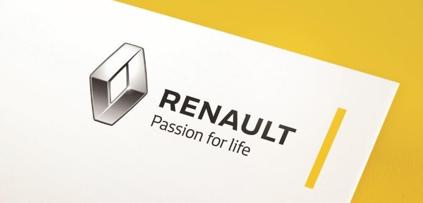

Renault

Renault unveiled a new brand identity this week that was developed by its own in-house corporate design team. The French car manufacturers hope the new identity will give the brand a “Bolder, brighter and warmer” image, with the classic Renault diamond given a sleek redesign to go with a brand new bespoke typeface. This is the first update to the Renault brand since 2007, when the identity was redesigned by French consultancy Saguez & Partners. The rebrand is subtle, but effective, with the new diamond a far more confident design that Renault feel has been “Freed from the confinement of its surrounding outline.” The typeface, meanwhile, is set against a brighter version of the classic Renault yellow in the form of a strip that runs alongside the logo.
Renault unveiled a new brand identity this week that was developed by its own in-house corporate design team
To compliment the rebranding, a new strap-line has also been developed; “Renault, Passion for Life.” According to Renault Group brand director Guillaume Boisseau, the tagline was inspired by the manufacturer's own employees. He said that when they are deciding on new strap-lines: “We do call in brand management firms, but the most valuable source is the input we invite from Renault Group employees. We tested out tag-lines on our customers to evaluate appreciation, memorability and capacity to distinguish Renault from its rivals, but the tagline we decided on in the end was one put forward by Renault employees.”
Of the reworked logo, Boisseau said: “The diamond logo has been reworked, it’s bigger and gives a better impression of quality. We’ve freed it from the yellow box, which lends greater impact. The name Renault is also bigger, which improves legibility, an especially important factor in new markets.” The new identity is rolling out from this month, starting with digital media and advertising, and marks 90 years since the company first started using its now iconic diamond logo in 1925. The last time the diamond was redrawn was in 1872 by Victor Vasarely, who introduced a version which used angular lines to create a 3D effect. The new version is far softer, but is even deeper and more complex, don't you think?
British Bobsleigh & Skeleton
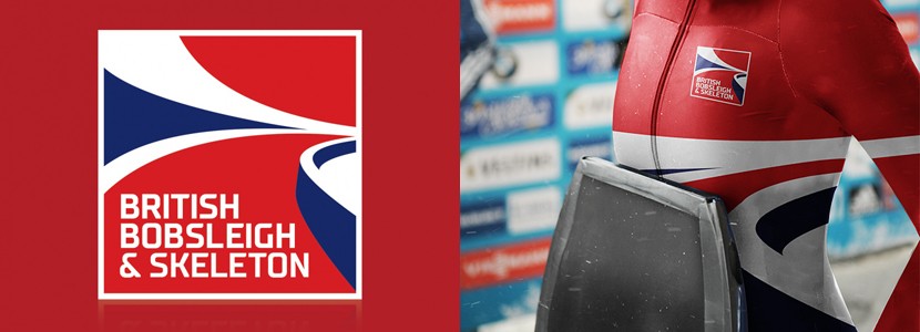
The British Bobsleigh and British Skeleton Associations merged together recently to form the British Bobsleigh & Skeleton Association, and a new brand always needs a fresh identity. Brand & communications agency We Launch was brought in to design an entire brand for the freshly merged organisation, and have provided some incredibly bold work, centred around a delightfully abstract logo, which follows the unmistakable curvature of a bobsleigh track. With recent successes such as Lizzy Yarnold’s gold medal at the Sochi 2014 Winter Olympics, the brand awareness of both organisations has increased, as has the marketability of their leading athletes. As such, the organisation is looking to capitalise on its growing success through advertising and sponsorship opportunities. The association claims that within the last racing season, UK television audiences reached 17.7 million, marking a 750% rise on the previous season!
We Launch was brought in to design an entire brand for the freshly merged British Bobsleigh & Skeleton Association
We Launch conducted research and determined that there were key similarities between both organisations, particularly a love for their respective sports and a passion for speed. They were tasked with inspiring a new generation of potential athletes and instilling a sense of national pride, with a brand that could unite athletes, supporters, sponsors, partners, coaches, designers, engineers and other team members. The identity is inspired by the curves of a bobsleigh track, and features a simple and distinctive shape indicative of both sports. A bold typeface has also been designed to be highly legible at all sizes across all touch points, which include a website, race equipment, and kit.
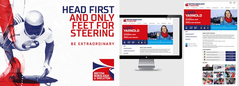
We Launch creative director Stuart Lang said that the consultancy has looked to make the athletes appear “Iconic and powerful,” while also focusing on the “technical and engineering innovation which help the athletes achieve that split second advantage.” He adds: “Armed with a distinctly British colour palette, we combined technical data, stats and drawings with dynamic imagery of the athletes to produce a graphic style that is totally evocative of all that is special about the two sports.”


