


When the news dropped yesterday morning that the man born David Robert Jones (he changed his stage name to avoid being mistaken for Davy Jones from The Monkees) had passed away at the age of 69, I was actually half way through my 7th or 8th run through of his 25th studio album, which had been released just days before. To say I was upset would be an understatement. I'm not usually one to let celebrity deaths runaway with me, but Bowie was a legitimate “Legend” in a world where that word now appears to apply to anyone who returns from the bar with unexpected crisps.
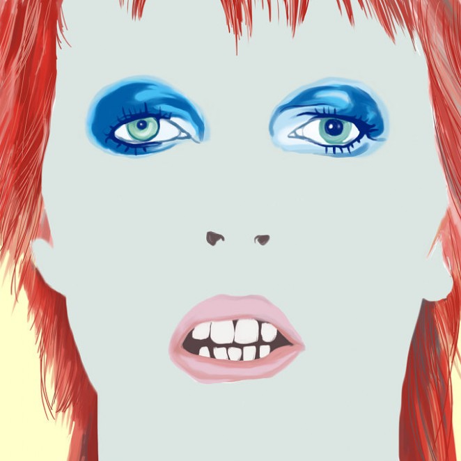
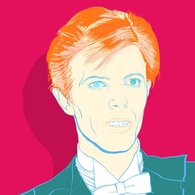
Following news of his passing yesterday, thousands of illustrators and graphic designers lined up to post their images interpreting David Bowie's iconic style and flamboyant fashion online
David Bowie was undoubtedly a musical genius, and if you haven't had a chance to listen to the genuinely phenomenal Blackstar record yet I urge you to do so at your earliest convenience, as it manages to blend influences as far flung as Miles Davis, Scott Walker, Kendrick Lamar, Nine Inch Nails and Death Grips into a gloriously strange and strangely cohesive body of work. Beyond the music though, the late songwriter, actor and icon was a successful chameleon in all other aspects of his life, not least his fashion choices, and his design identity. Yes it might sound sacrilegious to compare Bowie to a brand, but all pop stars are brands first, people second, at least to the public at large, and brand Bowie was a true powerhouse that refused to sit still throughout it's 50-year lifespan.

As if to underline this fact, following the news of his departure, thousands of illustrators and graphic designers from across the world lined up to post their images interpreting his iconic style and flamboyant fashion online. One of the most shared images (and one you're all probably very familiar with by now) was a gif by British illustrator Helen Green, which flicks through Bowie's various and eclectic style reinventions through the years as his head slowly turns. His album covers were also shared en masse, particularly the portrait of Bowie as alter-ego Ziggy Stardust with a lightning bolt painted over his face for the 1973 album Aladdin Sane. As iconic an image as rock and roll ever gifted us.
One of the most shared images (and one you're all probably very familiar with by now) was a gif by British illustrator Helen Green
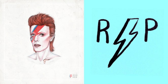
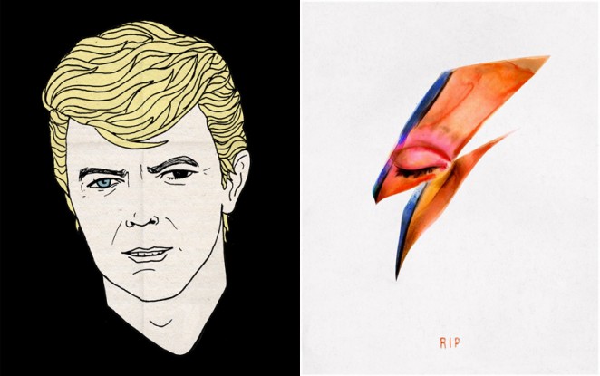
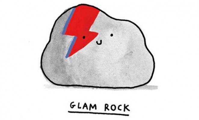
Many illustrators created their own variations of the Aladdin Sane picture in tribute to the fallen idol, including the artist Von, who abstracted the image a watercolour of just the painted area of Bowie's face. Gemma Correll, meanwhile, gave the image a more playful slant by placing the telltale pink and blue bolt on a stone, cheekily named Glam Rock. The lightning bolt also featured in The Guardian deputy creative director Chris Clarke's tribute, which simply read “RIP” against a bright turquoise background.
It wasn't only the one iconic Bowie pose that saw a slew of re-imaginings either. French illustrator Jean Jullien, whose Peace for Paris drawing became the unofficial symbol of last year's terrorist attacks in the city, posted a simple graphic of the musician's different-coloured eyes and a single tear. Craig & Karl, based in London and New York, meanwhile, combined some of Bowie's most recognisable outfits into a geometric cartoon for their tribute and London designer Rich Fairhead drew the singer as a blonde, adding a touch of surprising and unfamiliar innocence to familiar Bowie visage.
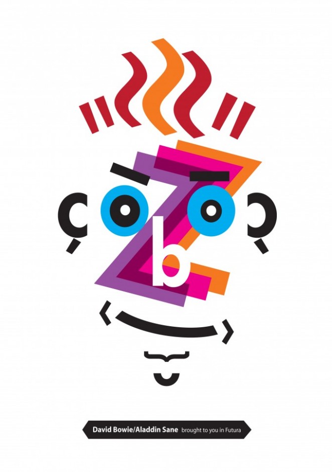
Over the years we have seen a number of projects inspired by this legend. Everything from Typography to Information Design; channels the creative genius of this man who was truely original.
Ryan Hodge: Is there life on Mars?
Joe Buckley
Jamie Ansell: Stay
Many illustrators created their own variations of the Aladdin Sane picture in tribute to the fallen idol

You'll notice that the vast majority of these tributes circle around Bowie's ever-changing profile, and there's a good reason for this; 24 of his 25 studio albums bear his image on the front cover, and act as a reliable snapshot of his mercurial image and sound at the time, both of which were in a constant state of flux throughout his career. Blackstar, however, is the only record to not feature the artist on the cover, and that might be telling, as many have speculated the album was Bowie's way of signing off from this mortal coil, and some have even suggested he might have been leaving us clues! Ever the artist.
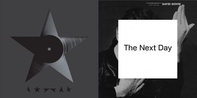
The Blackstar artwork was designed by Jonathan Barnbrook, who created a visual language for the release, which is explored in different ways across formats including vinyl record, CD and digital download. The language uses the “★” symbol in lieu of any wording, and these symbols have also appeared in marketing campaigns designed to create a sense of intrigue and anticipation. Blackstar is the latest of several collaborations between Barnbrook and Bowie. The Next Day (2013) saw the designer subvert the cover image of Heroes (1977). Doing this was deliberately iconoclastic and Barnbrook says that he chose Bowie’s “most revered” record for the project.
The Blackstar artwork was designed by Jonathan Barnbrook, who created a visual language for the release
This symbiosis between his music and the way he allowed the world to see him, was always central to Bowie's intrigue of course, and on the flip-side, he has always had a huge influence on style and popular culture, ever since his self-titled debut album was released back in 1967. During the 1970s, his androgynous appearance became particularly iconic. In 2013, London's V&A Museum even hosted The “David Bowie Is" exhibition of original costumes, set designs, photographs, instruments and other objects from his personal archive. This exhibition underlined just how important the designs behind the duke were, and will continue to be as he joins the annuls of musical history. David Bowie might be gone, but his music, his art, his style, and his substance, remain behind for generations to continue to discover. Because as trends and styles come and go, a talent this big, this beautiful and this vital, will always be cool, no matter who's listening.
Stephen Marek designed an informative poster centred around "boy keeps swinging" for the V&A exhibition.


Benjamin Hiorns is a freelance writer and struggling musician from the UK. His favourite Bowie album is “Low,” which he will now be playing for the foreseeable future.


Hannah-Natalie O'Sullivan January 12th, 2016, in the afternoon
What collection of some of the artwork that now circulating, I can only echo what you say he was a legitimate legend and uncompromisingly creative.