


As part of Icon Magazine's “Rethink” project, the Glasgow-based graphic design and creative agency Warriors Studio were tasked with redesigning something they thought was in dire need of a visual upgrade. So they decided to focus their attention on something that they felt had been badly designed, and was (to be frank) a design problem that needed solving: Wikipedia. The project was published in the April 2015 of the magazine, and if Wikipedia know what's good for them, they might want to consider taking a few notes! The agency, in their own words, attempted to “Take a positive step towards improving Wikipedia's visual identity and offer alternative solutions to how the information could be organised, displayed and navigated.” Considering Wikipedia has barely changed (at least cosmetically) since it first came into being more than a decade ago, it's about time someone took at stab at it, even if the work is only theoretical.

Warriors Studio, who won the Deutsche Bank Creative Award in 2014 and founded the Graphic Design Festival Scotland, consider the work to be little more than an initial proposal (as they acknowledge that actually implementing such a change in a site as vast as Wikipedia would be a mammoth undertaking), but that doesn't make it any less impressive. The logo, typography, colour palette and interface have been redesigned to make the notoriously patchy site more user-friendly, with more logical menu options, a contents section that actually makes sense, and a simplified navigational system. They've also significantly improved image organisation and article readability with a larger, more readable font and an image layout far less haphazard than the original design.
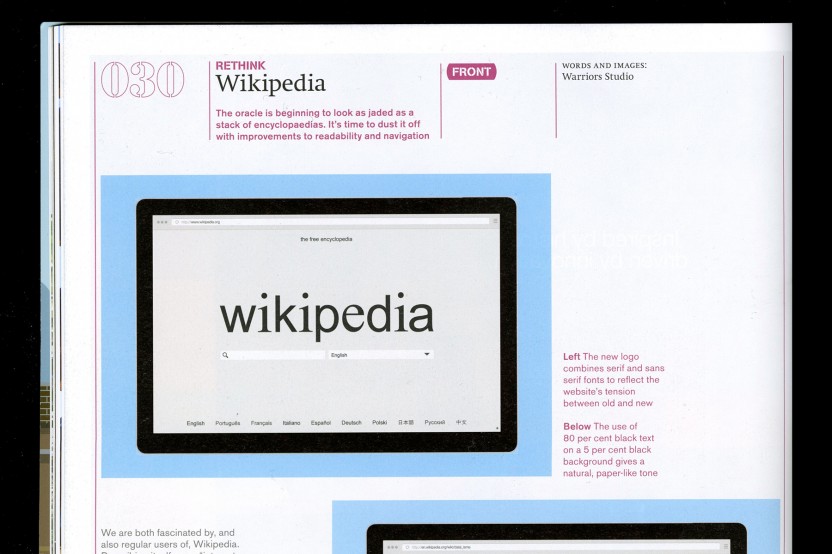
Glasgow-based graphic design and creative agency Warriors Studio were tasked with redesigning Wikipedia for Icon Magazine's “Rethink” project
The agency describe themselves as “Regular users” of Wikipedia, and claim to be fascinated by it. Considering the site's ubiquity and open-source nature, I'm not surprised. Indeed, Wikipedia has become such an important source of information that the concept of doctoring Wikipedia entries has gone from being a harmless prank, to a genuine controversy. Just last week in fact, a Wikipedia official accused former Liberal Democrat member Grant Shapps of doctoring his own profile and the story hit all of the major papers in the UK. Wikipedia describes itself as an “Internet-based free multilingual open-source encyclopaedia,” and a platform where “Timeless knowledge meets modern technology.” The concept of a “Global community” that the site tries to instil through its open-source model, it something Warriors Studio strongly believe in, and the call the collaborative encyclopaedia an “International phenomenon.” Despite this however, and despite the fact that it's one of the most widely read platforms on the internet, it remains a cluttered, maze-like and dated site in serious need of streamlining.

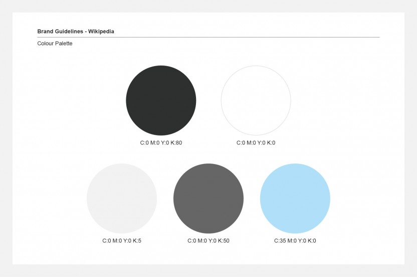
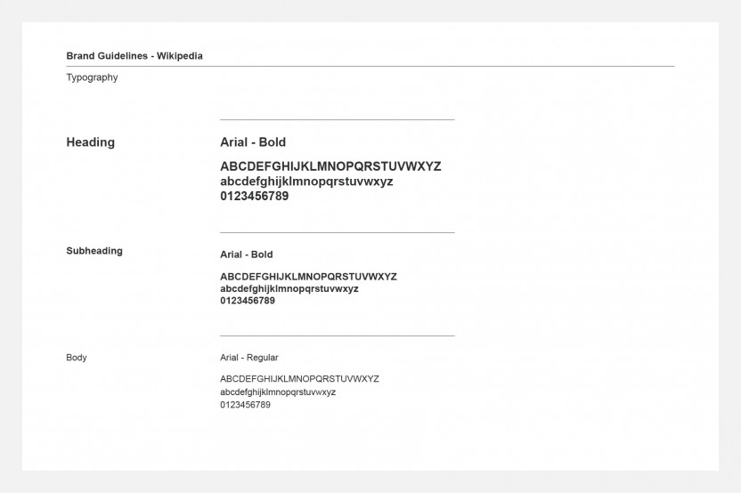
The first step they took was to mirror the look of a paperback book, with 80% black on a 5% black background, rather than the existing black, white and blue configuration. They feel that these softer tones will cause less eye strain, which is especially important on a site such as Wikipedia, which users will typically spend many hours on. Anyone who has ever got caught up in a Wiki spiral will no doubt agree! The idea to aim for a look that was half way between a book and a digital screen was inspired by the Amazon Kindle. The also reworked the logo in Arial and Times, the two most widely supported stock typefaces, to “Instil a sense of familiarity and timelessness,” and used the contrast between the two fonts to create what they call a “Tension between the old and new,” which is certainly something Wikipedia stands for. The felt the current logo was “Imposing, traditional and uninviting,” so employed a lowercase ‘w’ to establish a more approachable personality.
The logo, typography, colour palette and interface have been redesigned to make the notoriously patchy site more user-friendly
With regards to the navigational aspects of the site, they introduced a search bar and a drop-down tab on the first page, which aided by geolocation, hopes to make the search process quicker and easier. The contents list on each page is also more prominent, and has been made “Sticky” for quicker, easier navigation within articles. Whilst it's impossible to state unequivocally that these changes would measurably improve the site's functionality, on paper it all sounds great. So what are you waiting for Wikipedia? Get in touch!
Benjamin Hiorns is a freelance writer and musician from Kidderminster in the UK.


Alice Ralph May 5th, 2015, late afternoon
This is nice and all but I can't help think that Wikiwand (https://www.wikiwand.com) has already achieved this in a much more flexible way - and proved it works in application.https://www.wikiwand.com/en/Dalai_Lama