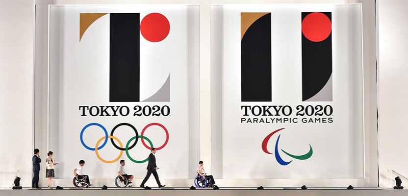

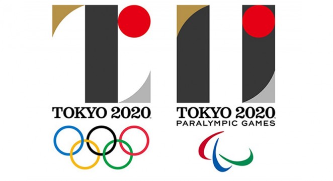
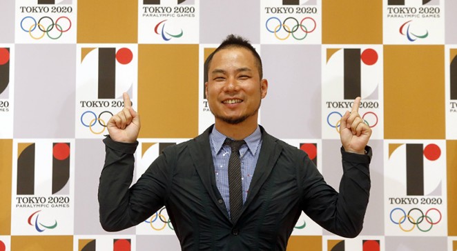
The logos for the Tokyo 2020 Olympic and Paralympic Games were officially unveiled this week to mixed reviews from all and sundry. They were created by Japanese designer Kenjiro Sano, the founder of studio MR_DESIGN, and are both made of elements representing the “Power of unity.” At least according to the The Tokyo 2020 Organising Committee. Both identities are made up of four elements (a black column, a red circle and gold and silver curves) and are based on the use of negative space, which means they are effectively designed as the reverse of each other.
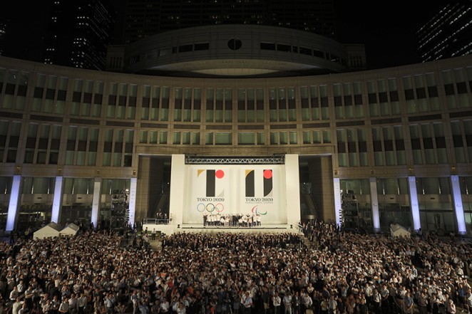
The logos for the Tokyo 2020 Olympic and Paralympic Games have officially been unveiled
The committee says the identities to reflect the Games’ vision of “The full meaning of coming together as one,” with the black columns representing “Diversity – the combination of all colours,” and the red circles representing “The power of every beating heart and an inclusive world in which everyone accepts each other.” It all sounds rather pretentious, but then it wouldn't be the Olympic games without a little pretension would it! The “T” shape of the Olympic logo stands for “Tokyo, Tomorrow and Team,” while the Paralympic logo is inspired by the equals sign, which is generally considered to be the universal sign of equality.
Sano's design résumé prior to this ambitious undertaking is largely made up of local packaging and product designs, which might explain the comparatively subtle approach. Indeed, it’s radically different from the frenetic logos we’ve seen for recent Olympic games in Rio de Janeiro, London, and Beijing. Instead, Sano’s logo is a throwback to logos from the 1960s and 1970s, like the simple gold-and-red icon for the first Tokyo games in 1964, and the rising sun and snowflake combo used for the Sapporo games in 1972.
Introduction to the Tokyo 2020 Olympic and Paralympic Games emblems
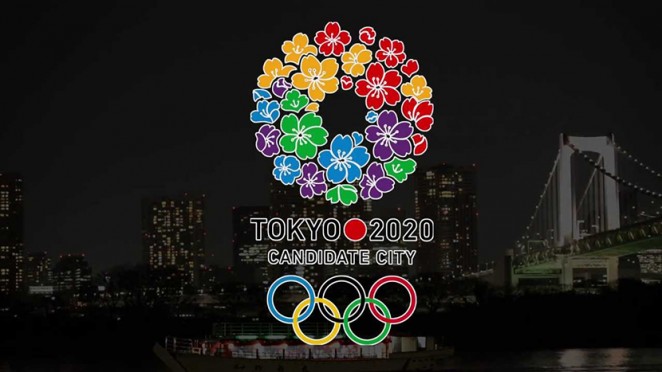
Some online commentators have reacted negatively towards the logo, as they feel the red dot makes it feel too much like the Japanese flag. As such, some have accused Tokyo of trying to personalise the 2020 Olympics rather than celebrating the games as an international showcase. Nevertheless, the organising committee says it believes that the logo instead reflects the vibrant nature of the city and the welcoming spirit of its citizens. The vice president of the International Olympic Committee, John Coates, even stated that “This emblem will have an important influence on the future of Olympic design.” We guess that remains to be seen, but we can say with absolute certainty, that it's at least preferable to the original design used during the city's candidacy campaign.
The logos were created by Japanese designer Kenjiro Sano, and are both made of elements representing the “Power of unity”
IOC Coordination Commission Chair John Coates said of the designs: “By embracing the concept of unity in diversity, [the identities] show the unique ability of the Olympic Games to bring together people from all over the world in peace and harmony. Most importantly, these emblems represent Tokyo and its people. They reflect the vibrant nature of the city and the welcoming spirit of its citizens – two elements that the Olympic athletes in 2020 will fully appreciate.
Yoshiro Mori, president of the Tokyo 2020 Olympic Games, added: “I congratulate the Tokyo 2020 team on their work and believe that these emblems will have an important influence on the future of Olympic. The Tokyo 2020 Games emblems are a wonderful work of art that represent the aspirations and the ultimate goal that athletes around the world aim to achieve – taking part in the Olympic and Paralympic Games.”
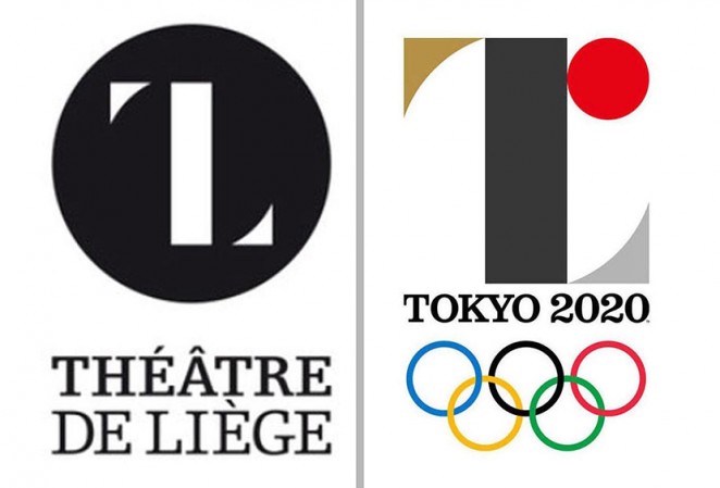
UPDATE: Whilst general public opinion on the logo was divisive at first, it transpires that many have found a distinct likeness between the design and the logo forThéâtre de Liège in Belgium. Indeed, many Twitter users have gone so far as to call it plagerism. As you can see from the comparison below, there is undeniably a similarity there, but to call it abject plagerism might be a step too far. WHat are your thoughts Creativepoolers?