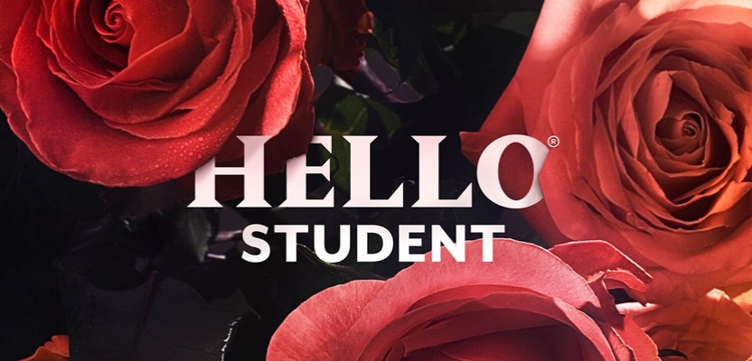

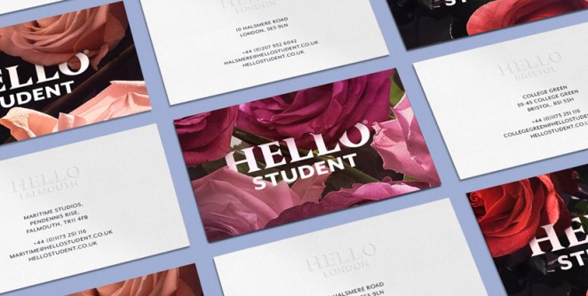
SomeOne create flowery identity for Hello Student
SomeOne has created the new brand identity for a student accommodation service from Empiric Student Accommodation, which aims to provide accommodation and services for student living. The consultancy wanted to create an identity for the “Hello Student” service that steered clear of the brash colours and self consciously ‘hip’ branding that plagues the sector. Instead, the consultancy has focused on a concept built around different flowers, with print work being kept to a minimum, and almost every transaction designed so that it can be undertaken online, with a mobile-first strategy. SomeOne has also developed size-aware iconography and bespoke tessellating illustrations that can be used throughout the branding. The consultancy worked with photographer Simon Warren and writing consultancy Reed Words on the new branding.
“This is an adult brand, for students intent on a more mature approach to learning”
SomeOne Co-Founder Simon Manchipp, said: “This is an adult brand, for students intent on a more mature approach to learning. The new endeavour sets out to talk up to the audience rather than perpetuating the condescending approach taken by so many brands in the student sector.” The new identity uses seasonal flowers to connect the different parts of the communications. SomeOne Lead Designer Tristan Dunbar, added of the flowery design concept: “Starting with roses, the brand will flex and adapt using local blooms for local activities.”
The Beautiful Meme design conflicted identity for D&AD Festival

The Beautiful Meme has designed a dynamic new identity system for the D&AD Festival, which is based around the concept of conflicting opinions. The festival in question is a new three-day event combining talks from the likes of Sir Paul Smith and Sir Martin Sorrell as well as panel discussions. It will directly follow the judging stage of the D&AD Awards. D&AD President Andy Sandoz wanted the brand to transition from judging, so asked The Beautiful Meme to find a way to carry the conversation beyond the jury rooms and into the main public areas. The consultancy also had to convey the energy and passion”of award winning design work and reflect D&AD’s positioning: “Nothing. Matters. More.” The branding is set to roll out as a digital campaign and as a range of environmental graphics to be used on site.
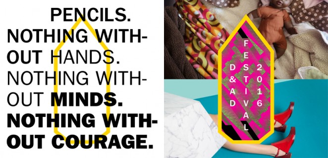
“Our work throughout the festival mirrors the maelstrom of opinions that D&AD instigates”
Tom Sharp, a Creative Director at The Beautiful Meme, said: “We’ve been thinking about all the different voices that will be at the festival. The judges, the visitors, the brands, the speakers and the people showing work. Everyone has a different opinion on why nothing matters more than creativity. We think the debates, as much as the agreements are what makes D&AD such a powerful organisation. Our work throughout the festival mirrors the maelstrom of opinions that D&AD instigates.” The D&AD Festival will take place at London’s Truman Brewery from April 20-22, where visitors can also see pencil-winning work in the 2016 D&AD Exhibition.
After Hours brand a subscription underwear service
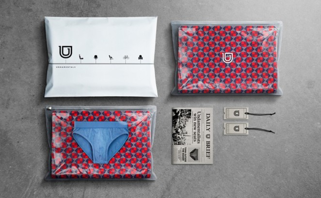
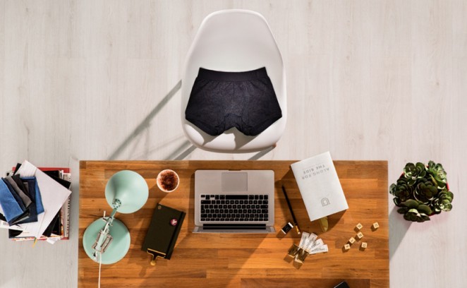
The After Hours design consultancy has created the branding for a new “Premium” underwear service for men called, rather spectacularly, “Undermentals,” which delivers underwear directly to its subscribers front doors. Based on the daily journey of an average pair of underpants, the branding aims to highlight undergarments as fundamental to every day life through photography that sees a pair of pants replace human figures going about their daily business. It's very surreal, but also rather quaint, and as such, I do rather love it. Kelly Bennett, Creative Partner at the consultancy, said: “The new brand was build on the insight that underwear is a humble but fundamental part of every day life but is often overlooked. As such a ubiquitous item of clothing, it deserves to be a considered, comfortable, quality and stylish purchase – our core proposition.”
“As such a ubiquitous item of clothing, underwear deserves to be a considered, comfortable, quality and stylish purchase”
As the brand follows the underwear around its daily routine, it aims to show that wherever you are, your underwear is always along for the ride. The branding draws inspiration from transport iconography, with the logo consisting of a two-dimensional “U” created out of a line, which represents a journey from start to finish, with the label resembling a train ticket. The inner and outer elements of the symbol, meanwhile, also refer to underwear sitting physically underneath clothing, and its hidden necessity. The everyday aspect of the brand has been reflected in subtle, understated branding with colours and textures inspired by jeans and jersey basics. The concept of the everyday journey is also imaginatively extended into the packaging, which includes zipped pouches with photography inserts resembling different seat cushions and surfaces, and information leaflets designed in the style of a newspaper. The consultancy created the whole brand, including name, visual identity, packaging, tone of voice, and online and marketing collateral.
Time Out gets a physical design overhaul to complement recent online rejig
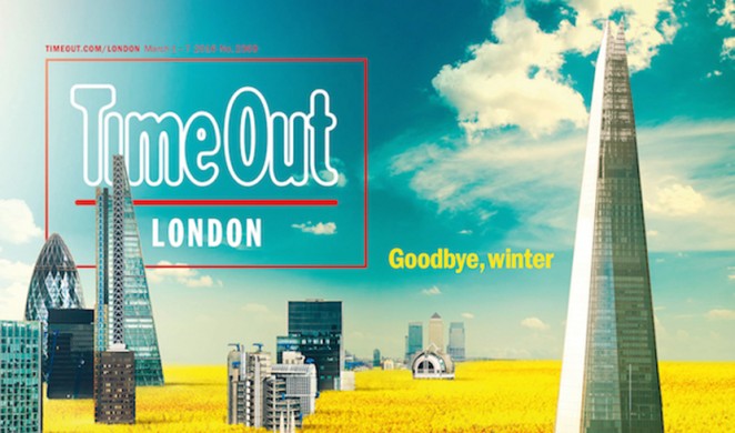
Time Out has completely overhauled its UK and New York editions to create a cleaner look and a punchier, graphic feel as it aims to help readers navigate a new editorial approach with a new design. The design is very much in line with the listing guide and lifestyle magazine's digital overhaul, which involved the iconic Time Out logo being changed to a slightly less formal “TO” for added immediacy on app and social media profiles. In-house art director Mark Neil has led the physical magazine's redesign, working with in-house brand creative director Anthony Huggins. As reported last week, adam&eve/DDB worked on the refreshed visual identity alongside Huggins. Neil said: “We wanted to make it quicker and easier for readers to find the content they want and I was particularly keen to inject a visual personality that mirrors the humour and confidence of Time Out’s tone of voice. The graphic use of colour is key to the new look, with pictures and text creating a poster-like identity for highlighted content in print, on site and across our social media channels.”
“I was particularly keen to inject a visual personality that mirrors the humour and confidence of Time Out’s tone of voice”
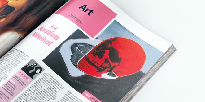
The magazine has been primarily designed so that it better distinguishes between immediate browsable content and longer and richer stories. There have also been a series of typographic changes to the magazine. Franklin Gothic has been retained as it is the design heritage of the publication, but a new serif family has also been introduced in the form of the Tiempos Text by Kris Sowersby, which has been used for longer pieces because it's easier on the eye and more functional. Although the magazine is still based around sections, the new Time Out is more defined by colour and space. The new visual identity of both the physical and digital magazines has been designed to give more flexibility in digital, print and physical channels, which all carry the new strap line; “Discover Book Share.” The brand will roll out across global digital and social channels, corporate communications, advertising and as city-specific logos.
Benjamin Hiorns is a freelance writer and struggling musician from the dark heart of Kidderminster in the UK.