
We reported last month on the ambitious Open Source Design Project being undertaken by Mozilla and the Johnson Banks consultancy and now the first seven potential identities have been revealed. The search for the not-for-profit software company’s new identity was first announced in June, with the non-profit organisation taking feedback from the Mozilla community and members of the public since then.

Seven initial themes were created by Johnson Banks, all exploring different facets of Mozilla’s advocacy for shared and open-source internet access and software. After further refining these themes in response to feedback that suggested upping the positivity and doing more with the whole principle of open source design, seven visual identities and their accompanying assets have been made available to view on the Mozilla Open Design blog. The designs, which we'll examine in more detail below, include everything from a simple typographic mark to a modern version of its former Dinosaur logo, and public comments on them are already coming thick and fast.
Michael Johnson, Founder and Creative Director of Johnson Banks, said: “Our work on the narrative has changed a lot as we learn more about them. It’s debatable whether some of our other clients, either blue-chip or not-for-profit, could handle this – but this is unprecedented as an approach. Perhaps it will push others to be more open.”
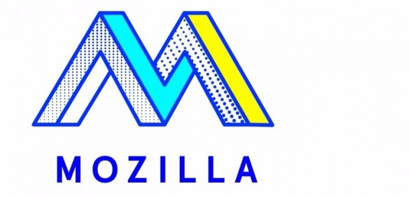
The Eye
This abstract eye design plays on the not-for-profit’s former Dinosaur logo, which is still used internally.
The Connector
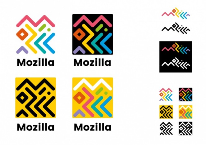
The consultancy has experimented with Mozilla’s name, using intertwining letters inspired by circuitry and tribal patterns.
The Open Button
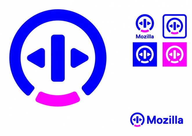
This button pictogram is designed to represent Mozilla’s commitment to making the internet open to everyone.
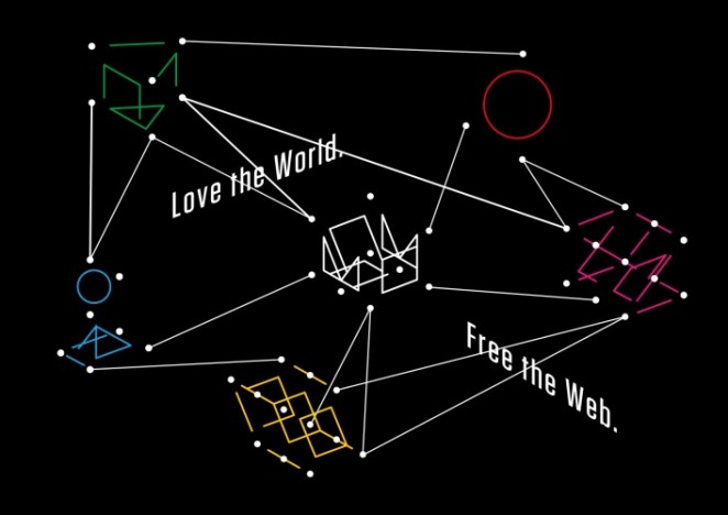
Protocol
Alluding to the not-for-profit’s longevity, this symbol is intended to show that Mozilla is at the core of the internet.
Wireframe World
This concept highlights Mozilla’s place within the enormous internet, forming an “M” symbol out of a series of interlocking 3D grid systems.
The Impossible
Another simple typographical mark, this impossible design gives a nod to computer graphics and optical illusions.
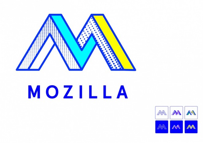
Flik Flak
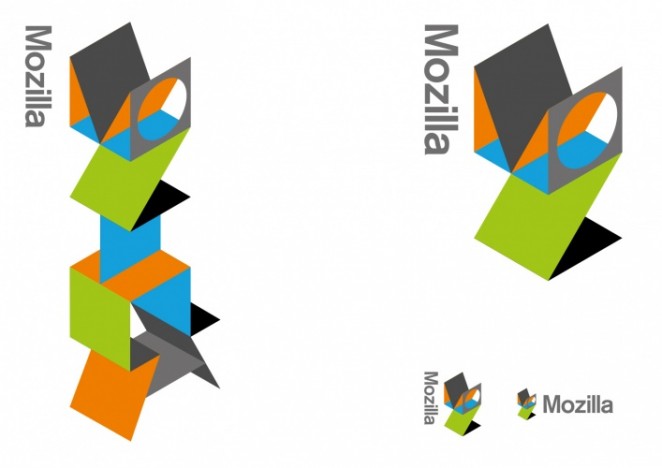
As an extension of the former dinosaur logo, this visual identity builds a character out of isometric shapes, also spelling out the name “Mozilla.” So what's your favourite?