


Google is a company with surprisingly humble origins (it began life back in 1996 as a simple research project) that has evolved in just under 20 years into a global behemoth worth more than $100 billion. Indeed, the word “Google” has managed to wean its way into the global lexicon in a manner almost without precedence. So much so, in fact, that even if we’re using a competing search engine (Microsoft’s Bing for example) we generally tend to refer to it as “Googling;” a term that, until 20 years ago, came with rather seedy implications, but is now a legitimate word in the Oxford English Dictionary!
So whilst a simple typeface change (and a rather subtle one at that) might seem like a pretty superfluous footnote if we were talking about any other company, we’re talking about Google here, so trust me, it’s massive.
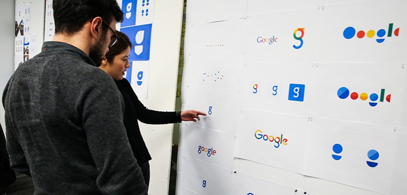
Google has changed its typeface for the 6th time in just under 20 years, less than a month after the major restructuring of the company that gave rise to Alphabet
Less than a month after a major restructuring that saw the larger Google holding company change its name from Google Inc. to Alphabet, the search engine has moved the goalposts yet again by changing their ubiquitous typeface for the 5th time since 1998. The new, slightly more subtle logo uses the same four colour scheme the company has utilised since the late 90’s, but there’s a distinctly more cartoony look to this latest iteration, which some might reasonably presume is part of a conscious move to make the brand more accessible to a younger audience.
It’s the most drastic redesign for the logo since 1999 when the company experimented with an exclamation point, which was (let’s face it) more than s subtle nod to their rival Yahoo. Alex Cook, Jonathan Jarvis and Jonathan Lee tell the story of their process over on the Google Blog and suggest that the new design is meant to reflect the different ways that people interact with Google products across various devices, apps and platforms, as the company is no longer simply a search engine, but an online empire with its fingers in pretty much every pie imaginable (from robot cars and medical research, to wireless networking and internet-delivering drones.
It’s the most drastic redesign for the logo since 1999 when the company experimented with an exclamation point (a sly dig at rivals Yahoo perhaps?)
The post states: “Google has changed a lot over the past 17 years – from the range of our products to the evolution of their look and feel. And today we’re changing things up once again.” It goes on to say that the redesign “Doesn’t simply tell you that you’re using Google, but also shows you how Google is working for you.” As such, the redesign doesn’t just include a new typeface, but new features such as a colourful Google microphone at the far right of the search engine, which will be instantly familiar to anyone who has used the Google app on an Android phone, and will allow users to search using their voice. The familiar small ‘g’ icon has also been replaced with a more prominent, four-colour capital ‘G’ that matches the new logo, and a nifty new four-dot animation now lets you know when Google is “Working.” The broader branding refresh will also find its way to just about all of Google’s properties and services, with thousands of vector-based variants having been created to satisfy just about any situation.

Of the typeface, called “Product Sans,” which looks a little like the company’s own “Android Roboto” font, Google have said: “The typeface design takes cues from that same schoolbook letter-printing style, but adopts the neutral consistency we’ve all come to expect from a geometric sans serif. This allows us to maintain an appropriate level of distinction between the Google logotype and the product name. The character set is complete with numerals, punctuation, accent and alternate characters, fractions, symbols, and supports extended Latin, Greek, and Cyrilli.” So in other words, it’s pretty flexible. It was introduced by an animation which showed the old typeface literally being overwritten by the new one, which is a typically bold statement for Google, who have never been ones to mince their words, even when they’re not technically saying anything.
The new “Product Sans” was introduced by an animation which showed the old typeface literally being overwritten by the new one
Personally, I like it. Quite a lot actually. It’s clean, succinct, and looks as good on my 48” television as it does on my 5” smartphone. However, I couldn’t help noticing that the new identity 'dots' bear more than a passing resemblance to another recent redesign by Studio Moross for a MUCH smaller company; British millinery company Christy’s, and their new range of Crown hats. That has to be a coincidence though. Right?
Benjamin Hiorns is a freelance writer and struggling musician from Kidderminster in the UK who has never once Googled himself.


Silvio Cimenti November 5th, 2020, in the evening
Whilst it could be argued that the old logo did little to communicate the ethos of a company so entrenched in the high-tech world (that’s been around since the internet first started) it did lean towards a more memorable identity.The rounded, clean lines of the new logo undoubtedly communicate a more modern and approachable face to the company, albeit perhaps a bit too childlike. Nonetheless it is in keeping with our times and clearly shows a strategic direction towards a gentle evolution from its predecessor, undoubtedly in a cautious effort to reassure its loyal followers, that Google is indeed the same trusted brand.
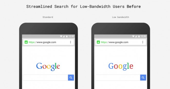
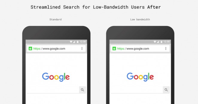
And there are many commendable attributes to the new solution. Originally it was designed to be used mainly on a desktop computer, now however, as reiterated in the article above that same mark has to have the versatility to translate over many different products, platforms, devices, apps etc which were not around before and are constantly expanding. The new logo therefore seemingly appears to have evolved successfully; it is easily scalable, has a four-colour single G icon for apps, has dots that animate harmoniously and morph into a cool microphone or app icon. Most of all it successfully uses a font that can be easily manipulated into whatever is necessary or may be necessary in the foreseeable future – even for low-bandwidth users. Clearly a lot of thought has gone into it to make it function as a ‘system’ and not just merely a logo.
Yet, function, it appears was so high on the agenda that form was overlooked. Agreeably Gropius’ form-follows-function philosophy is one that many designers still subscribe too today, myself included, but it is equally important that the finished result echoes the values of, what or in this case whom, it is to portray.
Google is perhaps one of the world’s most innovative brands and this then begs the question does the wordmark truly reflect that innovation?
A rare opportunity presented itself to evolve Google’s identity yet in the same breath have the courage to make it truly memorable – in my view, that opportunity was missed.
And now ironically the one thing that the new Google identity lacks …is an identity.