


When you think of the things you might find in the River Thames, they’re all pretty much disgusting and a typeface isn’t one of them. But maybe you haven’t heard the remarkable story of the Doves Type font.
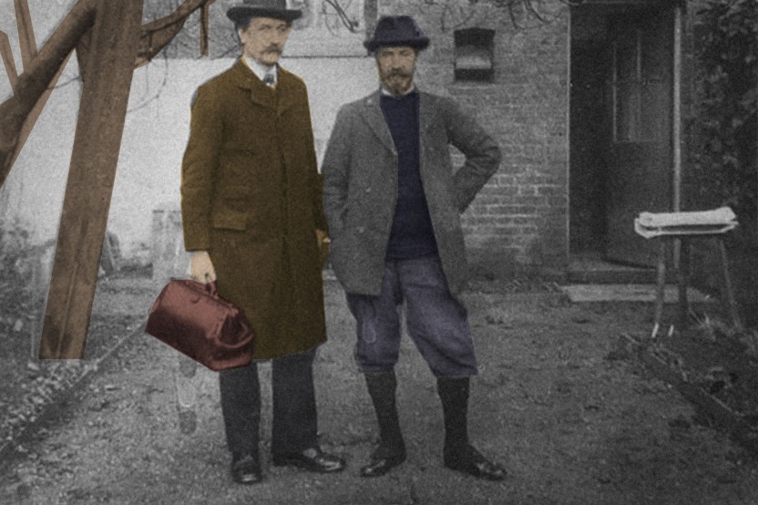
In 1900 T.J. Cobden-Sanderson asked Emery Walker to join his private press, based in Hammersmith. The Press was considered to be a significant contributor to the Arts and Crafts movement, with the founders associated with the likes of William Morris. But things took a turn in 1909, with the two founders in dispute and the partnership on the brink of dissolution. The Doves Type matrices were destroyed by Cobden-Sanderson in March 1913, when he threw them into the Thames from Hammersmith Bridge. He then began to destroy the types, which took him until January 1917, after 170 trips to the river.
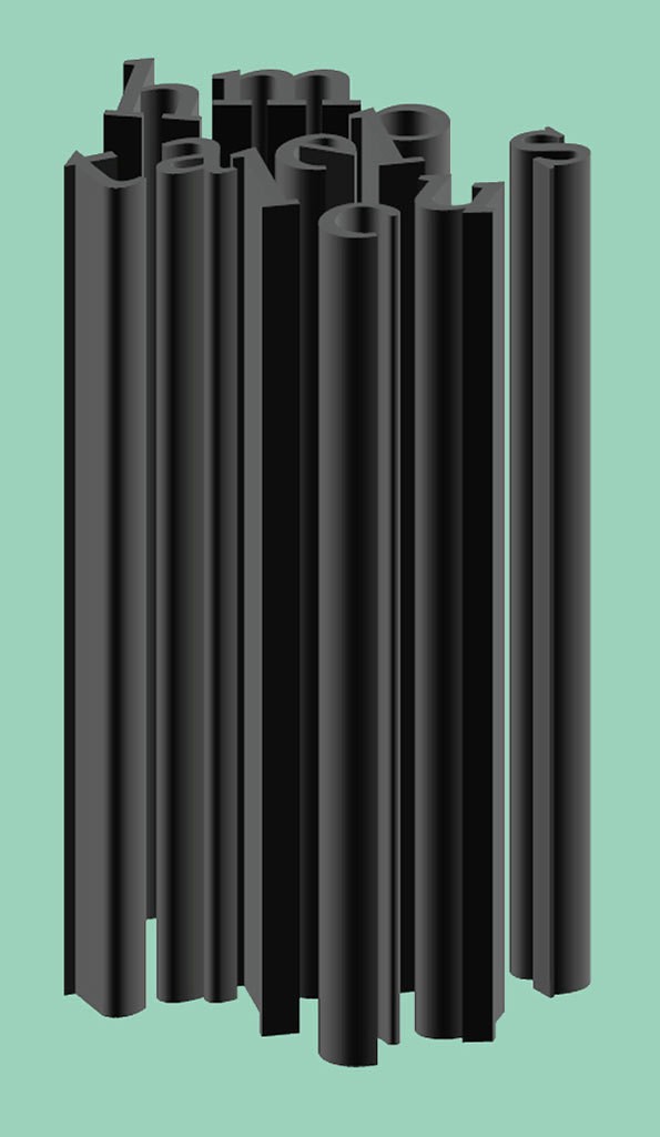
Fast-forward to November 2014, when the letterpresses were discovered in the river. Salvaging the type, that had been crafted after the Venetian letterforms of the 15th Century, began. A whole load of history is packed into those curves. Thanks to the painstaking work of Robert Green, a digital process has been underway to restore the type. His ambition to recreate the Doves Type was met with some difficulties as ink spread inconsistencies and anomalies made the job a tough one. Although wishing to be close to the original as possible, Green has made some concessions to include the dollar and Euro signs, which is pretty nice of him considering it took him three years to piece together.
Green must have had to pour over samples and ephemera, such as Marianne Tidbcombe’s book on the Doves Press. He was advised by the Port of London Authority to scan the river himself before employing professional divers. In Creative Review Green recalls, “I went on to the foreshore when the tide was out, looked around the riverbed and found three pieces within 20 minutes”. Green recovered 150 pieces, although he never found the whole alphabet.

The Doves Type facsimile has been digitalised and is now available to license. It’s even inspired designers over at Swiss studio Faure & Verona to create the Thames Capsule, where they’ve set it against various coloured backgrounds and given the story it’s own microsite. In enhancing some of the Arts and Craft qualities of the type, in particular “the richness of curves and the humanistic based shapes” the studio have attempted to bring the story to life, and to create an element of atmosphere around the type. Their work with the typeface is below:


jsmarcoms ltd June 16th, 2015, around noon
Beautiful — what a labour-of-love!