


Hato – Pick Me Up
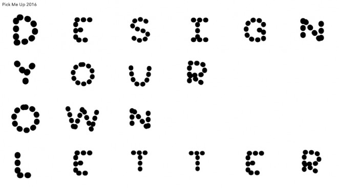
Graphic Art festival Pick Me Up is launching a new identity based around a digital tool allowing anyone to create and submit a letterform to be used in the branding. The new identity has been created by Hato, who also developed the interactive online tool that allows for letters to be created by members of the public. The concept for the branding and the online tool comes from Somerset House’s Utopia season, which will see the cultural epicentre hosting a series of Utopia-themed events throughout 2016 to mark the 500th anniversary of Thomas More’s classic Utopia text. All the letter designs submitted through the tool will be used during the “Pick Me Up” festival at London’s Somerset House, which runs from 21 April to 2 May. The festival will feature illustration, animation, 3D installations and more, and alongside pieces from emerging artists and industry names, it will also host a retrospective of work by Alan Kitching called “A Life in Letterpress.”
“We were interested in the idea of Utopia as a community and we wanted to bring people inside the creative process of Pick Me Up”

Ken Kirton, Creative Director at Hato, said of the idea behind the bold, and incredibly flexible new identity: “Each letter will be used somewhere in Pick Me Up, we could use them as large icons on their own or as part of a pattern. We have the vector files so we can use them as large as we need. We were interested in the idea of Utopia as a community and we wanted to bring people inside the creative process of Pick Me Up.” Hato is delivering the entire project in-house, with music by Nico Jullien.
The Partners – British Heart Foundation
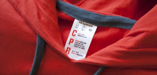
The British Heart Foundation is altering its branding in a subtle, but important way by adding a new tag to all of its merchandise that tells us how to look after our hearts. Developed by design consultancy The Partners, which previously developed the charity's current overall branding, the label came about after the BHF asked the consultancies on its roster to submit ideas for a t-shirt to promote its “Wear It Beat It” campaign, which encourages people to wear red and raise money for the charity. What they are referring to as the “Care Label,” features instructions and graphics showing what to do if yourself or someone close to you suffers from a heart attack, so could literally save a life.
“If you have care labels to remind you how to take care of clothes, why not a label to remind you how to take care of hearts”
Mark Wood, Design Director at The Partners, said: “We had been working with the CPR (Cardiopulmonary resuscitation) team at BHF to create a nation of lifesavers. As part of this, we helped them change the meaning to Call, Push, Rescue; a simple way of reminding the public what to do if someone is in cardiac arrest. While thinking about the T-shirt brief, we thought if you have care labels to remind you how to take care of clothes, why not a label to remind you how to take care of hearts?” The BHF is using the design on all its merchandise, including the “Wear It Beat It” T-shirts, and they hope to develop the idea further to push the Call, Push, Response message.
Made Thought – Ballymore
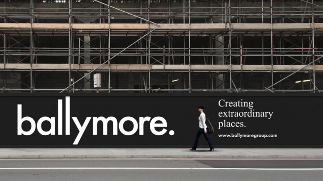
Ballymore, the London-based property developer, has been rebranded by Made Thought, who looked to design a more progressive identity with a look that borrows from the cultural rather than property sector. The new brand is simple and understated, but confident, with bold, iconic and effortlessly simple design cues. Made Thought undertook a detailed research phase by interviewing all stakeholders and used its findings to eschew luxury designs in favour of something more creative and culturally relevant. The new brand is rolling out across online, environmental graphics and stationery. A new website is also being redesigned and is set to go live in the spring.
“Our brand evolution reflects the core values of our family business and the people within it” Ballymore Chairman Sean Mulryan
The Allotment – Give London

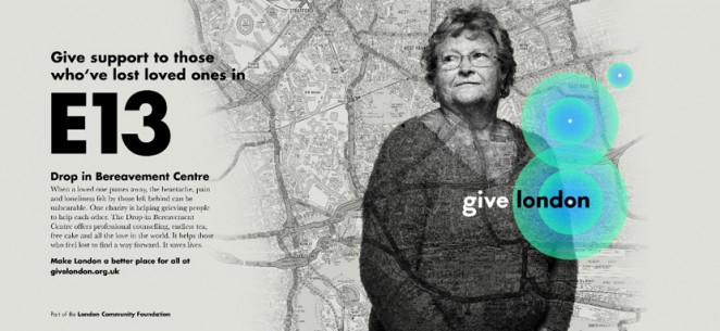
The Allotment design consultancy has created a new visual identity and website for London-based charity, Give London; a fundraising initiative founded by the London Community Foundation that looks to support people across London by raising money for local charities such as North & South London Cares, London Football Journeys, Mazi Mas and Baobab. The new Give London logo incorporates a geolocation device, which creates pulsating circles at your location when viewed online, coupled by portrait photography and A-Z maps of London. The idea is that users of the website can show their support by adding their postcode, and then their position will show up on the map. Paul Middlebrook, Managing Director at The Allotment, said: “Eventually, this will tie in with the donation process and light up the London map with constant pulses to show how generous Londoners are towards local people and charities in need.”
“Give London is about creating a highly effective way of making a difference to the lives of those who live in our city" Sonal Shah, CEO at the London Community Foundation
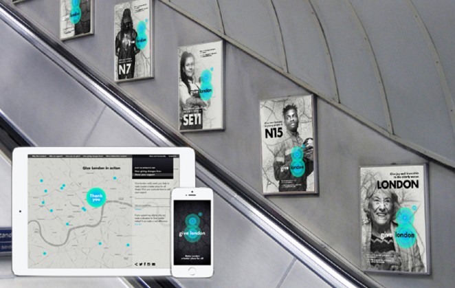
A colour palette of green and blue has been used for the geolocation device, alongside monochrome photography and logotype, a custom-drawn version of Futura typeface. The consultancy created a strong emotional connection with the new charity by using portraits from celebrated photographer John Angerson, of people supported by the various charities to help tell the everyday stories of the work that many relatively unknown charities do. The London Community Foundation was founded in 1995, and has given £50 million in funding to more than 9000 charities and charitable projects over the last 21 years.
LightBrigade – The Real Greek

The Real Greek restaurant chain has undergone a thorough rebrand and interior redesign in order to find a balance between traditional Greek designs and conventional modernisation. The LightBrigade consultancy worked with The Real Greek’s chairman David Page on the design direction, which introduced a secondary colour palette to the original navy logo, as well as a new “Eat Together” strap line. The new colours are being used alongside the primary blue colour, with different balances of the various colours used across restaurant branches in order to avoid the formulaic application of the branding across different restaurants. More colours, including shades such as mint green, terracotta, lemon yellow and red, have also been added to the palette to increase the brand’s breadth and flexibility. LightBrigade also constructed a custom logotype for the rebrand, which aims to replicate the square, mosaic patterns found on Greek tiles, with bold, block lettering.
“We wanted to stress the social, casual aspect of the authentic Mediterranean dining style and accentuate the idea of sharing”
The restaurant interiors have been modernised with white wall tiling and wooden floorboards, complemented by colourful feature wall displays which utilise the secondary colour palette. The website has also incorporated the designs, through inclusion of the new logo and colour palette. The new look will be rolling out across The Real Greek’s nine branches, eight of which are based in London, with one in Windsor. The redesign has already been applied to branches at St Martin’s Lane, Berwick Street and Marylebone, with work currently going on at Westfields. It will also be applied to four new branches, which are set to open later this year. Anthony Sydes, Executive Director at LightBrigade, said: “We wanted to stress the social, casual aspect of the authentic Mediterranean dining style and accentuate the idea of sharing, and we also wanted to make the restaurant friendlier and more accessible. It now has a much more stylish, modern identity.”
The great Uber design disaster
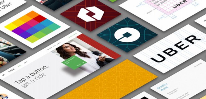
I reported last week on the recent controversial in-house rebrand by technologically inclined taxi firm Uber, and it appears my concerns over the rebrand (which many thought resembled a robotic bum hole) were not ill founded, as one of the men behind the radical redesign has left the firm. The idea behind the redesign was decent, with the concept of different geometric shapes and colours for different regions, but the execution left a lot to be desired. The idea behind the redesign according to Uber Co-Founder and CEO Travis Kalanick, was to reflect Uber's identity as a “Transportation network,” because he felt the original design was a little too exclusive and didn't reflect the more recent mainstream acceptance of the company. Still, the company's Head of Design, Andrew Crow, obviously didn't have as much faith in the company's new direction as his boss, as he recently explained he was leaving the company for “A chance to take time off to rest, reflect, and recharge.” but of course, we can all read between the lines. For more thoughts on the Uber rebrand, you can check my earlier piece on the news HERE.
Benjamin Hiorns is a freelance writer and struggling musician from Kidderminster in the UK.


