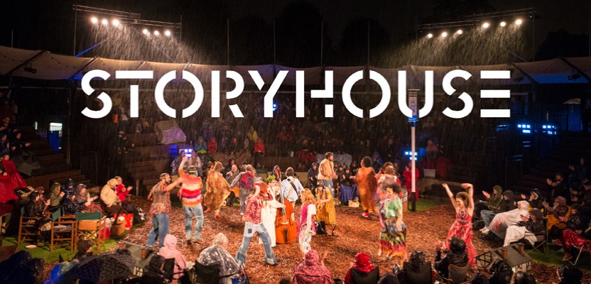

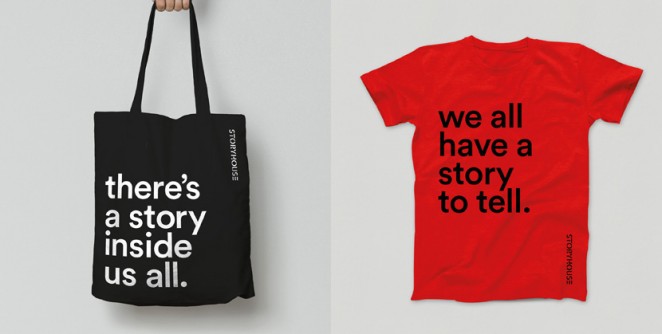
True North – Chester Storyhouse

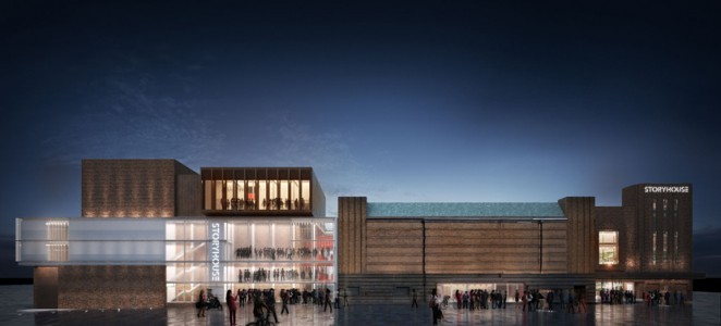
True North has named and branded the Storyhouse, a new £37 million arts development in Chester, which is being designed by Bennetts Associates. The Storyhouse will be the biggest cultural space outside of London, with an 800 seat theatre, cinema, studio, café, bar and library all on site. It is being designed as a flexible civic space and will be operated by arts group Chester Performs, giving them the freedom to run it as an 18-hour-a-day flexible space where joined-up events can be organised. The Storyhouse will also curate and produce a range of events and festivals throughout the Chester and West Chester region. True North has worked with benefactors and stakeholders from the arts, commercial and political landscapes before developing a brand that can promote the idea of connecting people and communities through storytelling. Accordingly the identity is made up of interlocking geometric shapes, which have been designed to reflect the values of the organisation.
“The identity feels reassuringly and instinctively right for both the building and the organisation ensuring it has authenticity and longevity” True North Creative Director Karen Hughes
An Art Deco Grade-II listed Odeon cinema (which was built in the 1930s and closed in 2007) is being reimagined and extended to make the project possible. Despite the building changing over the years and falling into disrepair, it still has the appearance and feel of a Grade II-listed building. The exterior is quite complete, and inside there is still some interesting plaster work and staircases. That isn't to say, however, that a series of extensive alterations have not been made. The multiplex rooms inside have been stripped away and the building has been given a new flow and functionality, whilst the library, café and bar now occupy what was once the main Odeon space. The new cinema space has been designed within an illuminated box, and to get to the new flexible theatre space, visitors will walk through the old proscenium. The building is set to open next year and True North will continue to work with the organisation developing its brand rather than handing over guidelines.
Studio Fernando Gutiérrez – The Design Museum
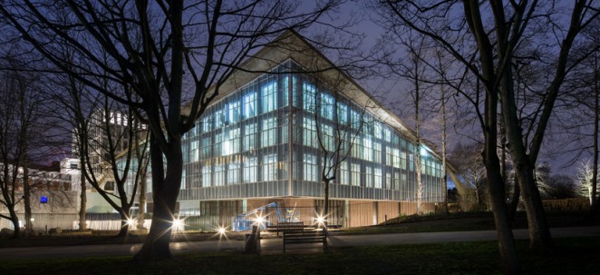
Studio Fernando Gutiérrez has developed the Design Museum’s new identity ahead of the design institution’s upcoming move to West London in November. The new identity features a a revision to the primary logo designed by Graphic Thought Facility, with a lowercase “the” added above the Design Museum mark. The characters in the word mark have also been redrawn to work with this addition. A graphical pattern has been developed based on the hyperbolic paraboloid (an infinite surface in three dimensions) roof at the Commonwealth Institute; the Design Museum’s new Holland Park home. This will be employed throughout the identity as a graphical element and, depending on its orientation, that it can represent either the interior or exterior space.
A range of logos has been developed as a family, to represent the different areas within the museum. This includes a new identity for the Design Museum Shop and the Designers in Residence programme. The new primary colour palette is inspired by the building and architectural references, and will provide the main colours used throughout the museum communications. The new identity comes as the museum has announced it will open at its new site on 24 November. It will leave its current Shad Thames site on 30 June. The Design Museum announced at the end of last 2014 that it was looking to refresh its identity. The museum also appointed consultancy Gravity Road to work on the launch campaign for the museum’s new site.
99 Designs – In House

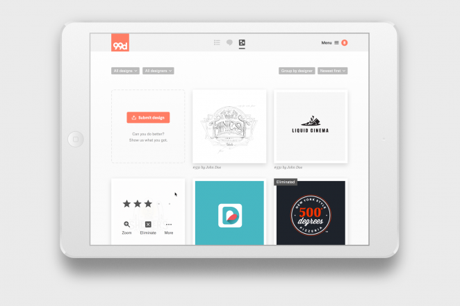
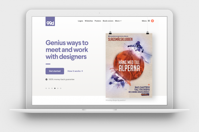
Popular design crowdsourcing site 99designs has announced an exhaustive rebrand, with a new look and a logo, which was aptly chosen from a contest the company ran on its site. The 1-to-1 Projects service simplifies design work by letting businesses invite a designer, collaborate, provide feedback, release the payment and get full ownership of the work once it’s done. The rebrand aims to showcase the company and its great designs, and attract more customers. For its new logo, 99designs ran a contest and received more than 4,000 entries from 556 designers all around the world. The strong, simple, and quietly confident winning logo was designed by a self-taught designer from Indonesia, and was chosen because the brand didn't want the identity to take centre stage. Founded in 2008, 99designs is the world’s largest on-demand design marketplace. The company caters to the design needs of entrepreneurs and small businesses. It is headquartered in Oakland, California, and has operations in Germany, Brazil, Japan, and Australia.
“We enjoyed our best year yet in 2015 as we achieved nearly $60 million in revenue, including a 50% year-over-year growth in our 1-to-1 Projects service that now accounts for 15% of all revenue” 99designs President and CEO Patrick Llewellyn
Why Not Associates – deSingel
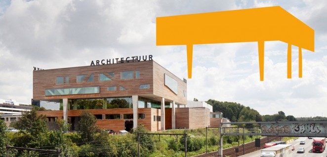
Why Not Associates has created a new visual identity for Belgian arts campus deSingel, which draws on its distinctive architecture and original logo from 1979. The campus stages art, dance, theatre and architecture events and educational programmes, and is also home to a music and drama college, the Flemish Architecture Institute and Radio 2 Antwerp. The original campus was designed by architect Léon Stynen in the 1960s and 70s and a new building by Stéphane Beel was added in 2010 to house an exhibition space, teaching rooms and rehearsal studios. Why Not Associates was asked to create a clear, bold visual language for deSingel that would illustrate its dynamic, vibrant and unique qualities, and reflect its distinctive architecture.
“deSingel is an avant-garde institution, they want to be seen to be pushing things and being different, but obviously everything has to look like it’s coming from the same family” Andrew Altmann, Partner at Why Not Associates
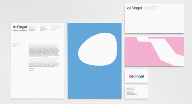
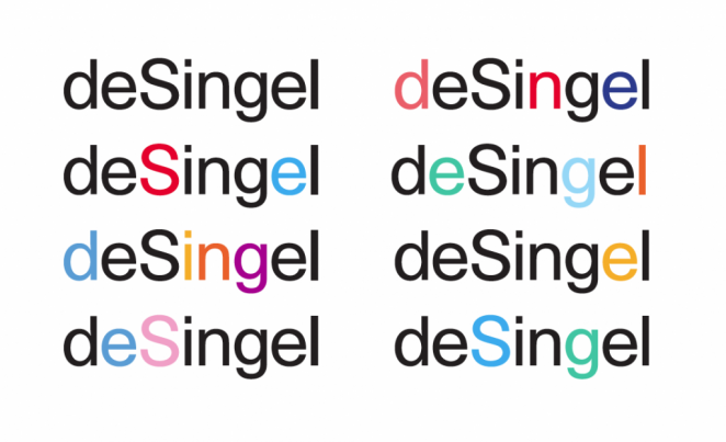
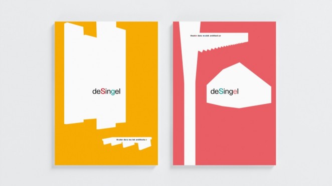
The new identity uses a suite of shapes based on the shape of deSingel’s buildings and features within them such as windows and staircases. These Shapes can be used alone, overlaid on imagery or used to crop photographs for posters and leaflets. The shapes can be used to ‘own’ imagery without overshadowing content, and provide an immediately recognisable language for deSingel. With a diverse programme of events, the graphic shapes help unify a disparate collection of imagery promoting different programmes and productions. The shapes also allow deSingel to make photographs the focus of its posters and flyers, something it had previously failed to do. The new logo, meanwhile, is based on deSingel’s original mark which was created by typographer Herbert Binneweg in 1979 and appears on the facade of one of its buildings. deSingel had previously been using a different logo, which Why Not was asked to retain. Instead, Why Not proposed returning to Binneweg’s simple letterforms, but changing up the colours of letters to create a more vibrant and dynamic look. Why Not’s branding for deSingel also provides a flexible suite of assets than can be easily adapted by deSingel’s in-house teams.
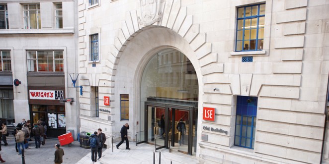
London School of Economics and Political Science – On the Look-out
The London School of Economics and Political Science (LSE) is looking to work with a design consultancy on a full rebrand, with the school reportedly looking for a consultancy to develop a strategy for the enhancement of the institution’s reputation and profile. The winning consultancy will establish through quantitative and qualitative research how the LSE is currently perceived, its strengths and weaknesses and how these vary by key stakeholder groups. A core set of values and an associated brand proposition will be established for diverse audiences in support of the delivery of LSE’s 2020 strategy. The mandate calls for an identity that will need to be adaptive and responsive to current trends, while remaining strong and distinctive, yet flexible enough to speak to all audiences effectively. A two-stage selection process is beginning, starting with expressions of interest, which must be submitted by noon on Monday 4 April. Shortlisted consultancies will be notified the week commencing 11 April 2016.