

485 Design – 92 Beans Coffee
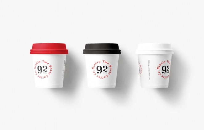
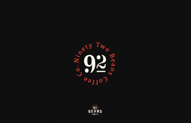
Restaurant Brands teamed up with Mt Atkinson Coffee Roasters and 485 Design to create a new coffee brand that could be exclusively retailed at Carl's Jr restaurants throughout New Zealand. The name and identity of the brand stems from the fact that they believe there are 92 coffee beans in a perfect shot of coffee. There are circles in every part of the coffee making process. From the filter to the cup, the circular form is integral to every part of the experience. This theme runs through the entire body of work, the logo, colour coded coffee bags, posters and cup lids. Red, meanwhile, symbolises heat, black for the beans and white for the creamy milk on top. Functionally the three colours help to identify product variants. Espresso grind, whole beans and decaf. The typography takes its cues from traditional coffee sacks; a subtle link back to the origin of the beans. The idea is that 92 Beans Coffee identity is simple, bold and clean, just like the refined art of coffee making.
After Hours – The Bay Tree
After Hours has rebranded The Bay Tree Foods’ range of artisan pickles, chutneys, sauces and preserves. The design puts the Bay Tree brand mark at the centre of the “Making the ordinary extraordinary” brand proposition. The original logo has been reworked and finessed and given pride of place on the jar. Rather than a passive manufacturer's endorsement, the tree is now central to the label architecture. The tree has been given 'roots' in a landscape which creates a powerful brand structure whilst also delivering a meaning and context to the brand's values, and the canopy of leaves has evolved to create a sense of flourish and dynamism. The colourful burst of additional leaves that emanate from the tree are symbolic of the artistry and passion that goes into each recipe, the hit of flavour and pleasure the accompaniments provide and that extraordinary touch of magic that these little jars aim to bring to even the most humble of meals.
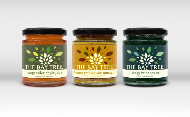
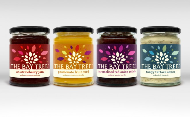
The theme of transformation is further built through the on- pack language with product titles pulling out the hero qualities of each recipe and descriptors that playfully describe how a spoonful of Bay Tree Foods can transform a key everyday dish. The colour palette and finish of the labels also plays a key role in dialling up appetite appeal, with each label having a unique selection of vibrant colours hidden within the leaves. This is intended to capture the unique balance of ingredients and flavour notes that each individual product contains. The substrate is an uncoated textured stock and the tree motif and landscape is hand rendered with tiny imperfections to reinforce the hand made, artisan quality of the products and the personal, small scale approach of the business.
Kingdom & Sparrow – Moonchild Brewing
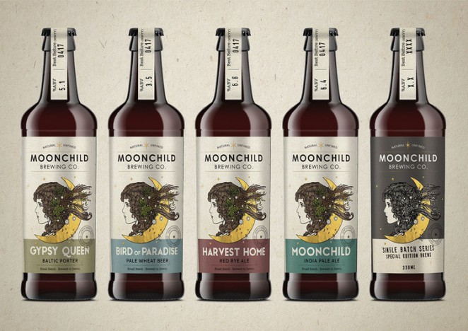
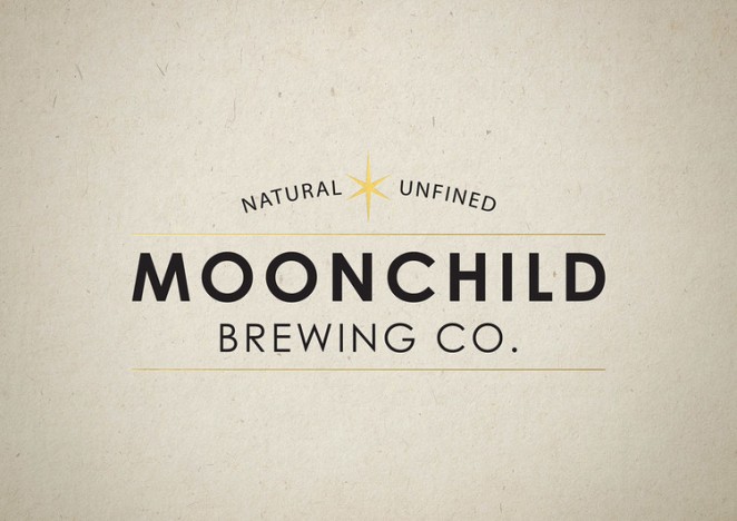
Moonchild Brewing came to Kingdom & Sparrow with an idea and a beautiful illustration from record cover and poster artist Richey Beckett. They wanted the agency to turn this illustration into an iconic brand and label for their ultra small batch, thoroughly craft beer. They worked together to create an earthy, yet sophisticated, small-batch brand that was uniquely them and drew on their love of music. They wanted a simple and cost efficient way to release experimental, single-batch beers without losing the high-end, hand-crafted feel of their core range, so K&S developed a label solution that could be stamped by hand.
Pentagram – Hammerson
European retail and shopping centre developer Hammerson has introduced a new identity as it looks to strike a deeper brand association with shoppers. The 70-year old brand owns 59 different retail sites across Europe, including the Bull Ring in Birmingham and Brent Cross Shopping Centre in London, but has remained in the background unlike its competitors. Hammerson worked with Pentagram to create the new brand identity, and tasked the agency with two goals; to make the brand more visible whilst staying true to its supportive personality, and to create a master brand that could to be adaptable, to be used for investors, communities, back of house and as part of centre identities.
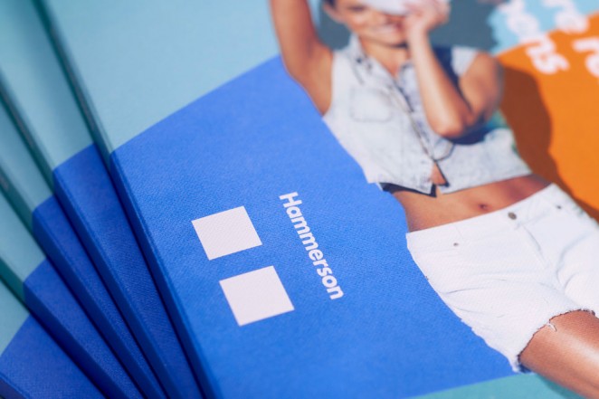
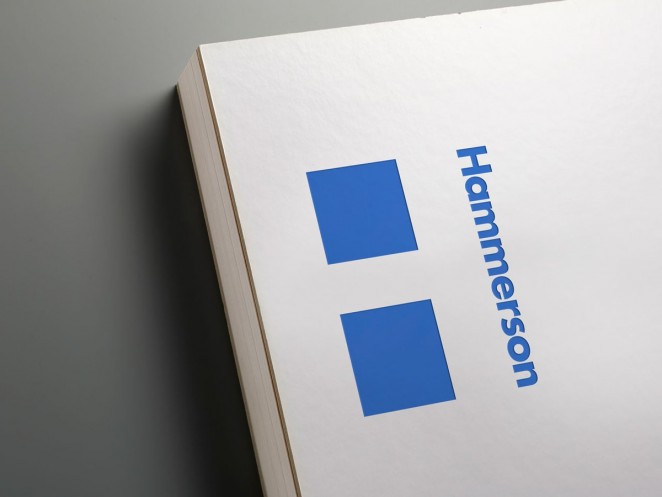
The master brand is centred on the logotype’s hidden H, that gives Hammerson a strong presence, whilst still giving individual centres and surrounding communities a sense of ownership. The H is both a logotype and symbol, which is adapted for all asset brands and new branding has been created for each centre and retail park, featuring an invisible H next to the centre name, with the location beneath it. This creates continuity throughout all the centres, without imposing Hammerson’s name of them. In addition to the new graphic identity, Pentagram created a verbal identity and advertising campaign for Hammerson, with the new strap line “Where more happens,” which has been adapted for B2B and B2C applications.
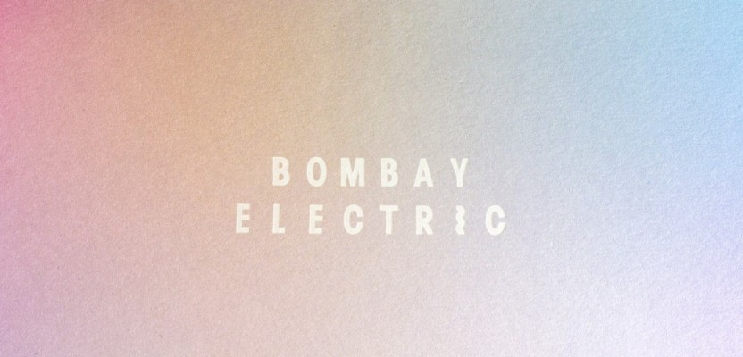
Michael Thorsby – Bombay Electric
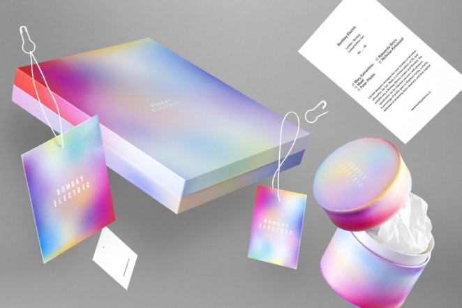
Michael Thorsby recently redesigned the identity of Mumbai's Bombay Electric fashion select store. Bombay Electric, which has been compared to Barneys New York and Colette in Paris, is a brand built on colour and vibrancy, so the new branding utilises these qualities rather strongly. Framed by a rather minimal typography and grid, the intense colour gradients are drawn to look like blurry abstract photographs, as if taken inside an Ann Veronica Janssens installation. The logo follows the minimal half of the identity visualising the almost utilitarian name of the company, where the vibrating letter “I” represents the restless curiosity that Bombay Electric stands for.
Wonderstuff – Phi Pie
Wonderstuff has created the branding for Phi Food’s range of filo pastries pies, Phi Pie. The consultancy's previous work helped define the Phi Pie brand and vision, and resulted in the creation of the Phi parent company identity and high quality, gold foil-blocked business cards. Building on this the project has now grown to encompass a family of brands and brand extensions. Phi Pie encompasses a range of delicious hand made filo pastry pies including the popular Spanakopita or spinach pie. The pies are unique in that they are made with 32 layers of filo pastry and taste unlike any other you may have tried.
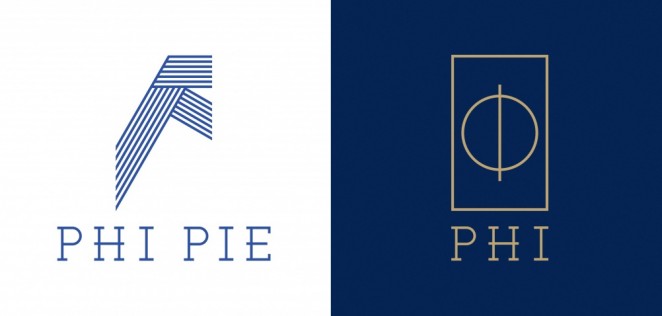
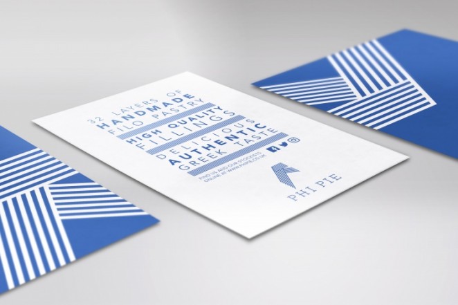
Aimed at young professionals, and well travelled individuals, who appreciate paying for quality food from the Mediterranean, the branding is anchored in the colours and brightness of Greece which emphasises the origins, yet positions Phi Pie as modern and fresh. The branding centres around the blue and white colours featured in the Greek flag. The logo itself not only represents the “F” found in “Filo,” but also emphasises the layers of filo that make up the product, resulting in a distinctive, ethnic identity firmly rooted in Greece. Initial branding work will be used on carrier bags, product cards, leaflets and window vinyls.
Bloom – Cow & Gate
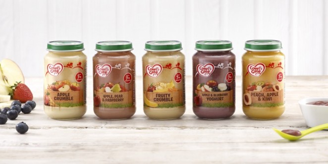

The Danone-owned Cow & Gate brand has introduced a new design across its glass jars of baby food to better display the provenance of the ingredients and differentiate them from its formula milks. Focusing on a farm-to-jar concept, the new design, developed by Bloom, aims to focus on the quality and natural source of the ingredients. It clarifies the role of jars within Cow & Gate’s product portfolio, differentiating them from formula milks and cuing that jars represent the start of a new developmental stage in which exploring different tastes takes on more importance. A key objective of the redesign was to strike a careful balance between functional reassurance and emotional connection. The new design also aims to position Cow & Gate's jars as the start of a new developmental stage in which exploring different tastes takes on more importance.
DewGibbons + Partners – Eleni & Chris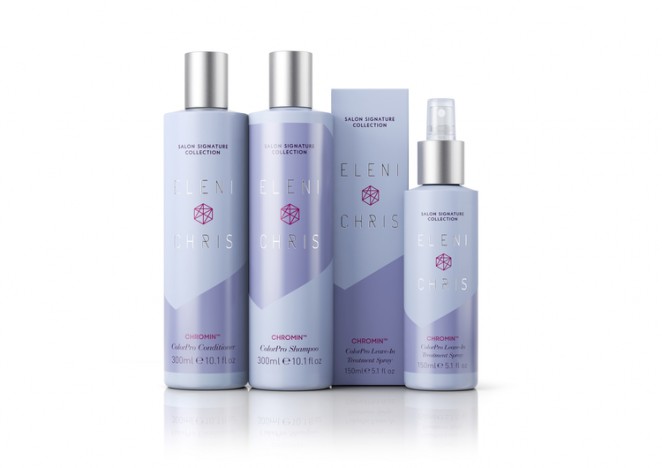
Eleni & Chris, founded by mother and daughter Inger Ellen Nicolaisen and Christinah Nicolaisen, is a hugely ambitious Scandinavian haircare and beauty brand determined to play credibly across many categories. DewGibbons + Partners developed a master brand positioning and identity to ensure consistency, clarity, and future stretch to support the brand's hair and beauty product portfolio strategy, as well as packaging design for Eleni & Chris Salon Signature Collection, the brand's inaugural six-strong range of premium salon professional haircare products. The positioning and design leverage everything that Scandinavian beauty stands for, celebrate the provenance of the brand's unique natural ingredients, and harness the founders' personalities. This is key to success in busy and brightly lit retail and salon environments where shelves are often stacked high with a myriad of products, and where in-store recommendations are all-important.
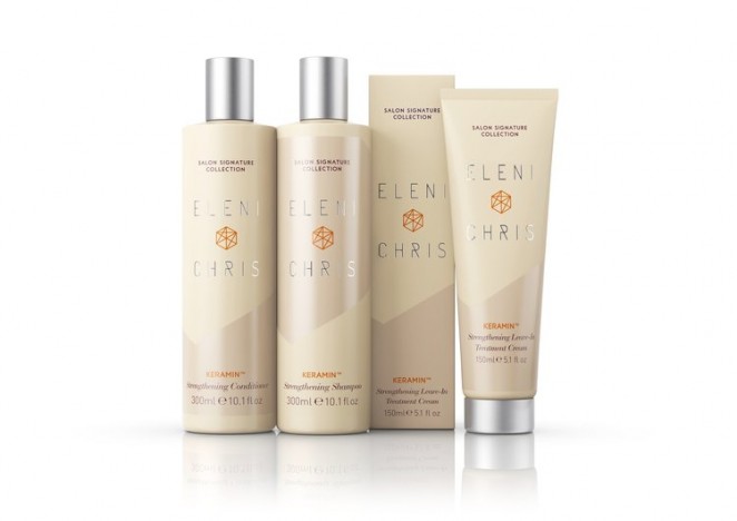
The Eleni & Chris brand is all about being “Beautifully different.” It reflects the contrasts and shared passion of its founders who are very different in background and approach, but share an extraordinary level of drive, passion, and creativity, rooted in and inspired by their Scandinavian home. The 3D geometric symbol, used as the master brand logo, can be layered with different meanings, depending on where and when it's used: science, expertise, alchemy, natural products, and more. It borrows from the graphic lines so often seen in Scandinavian design. For Eleni & Chris Salon Signature Collection, the symbol signals the alchemy and preciousness of the Scandinavian ingredients. The idea of contrast is visually expressed by a simple diagonal graphic device, which can be flipped, matt versus shiny textures, and lighter colours set against darker ones. Like Scandinavian beauty itself, the packaging is clean, stripped back, minimal, and effortless. DewGibbons + Partners also borrows heavily from the skincare category. Soft muted colours reinforce the brand's refined elegance and the natural Scandinavian aesthetic, and the use of silver references its premium nature.
Benjamin Hiorns is a freelance writer and struggling musician from Kidderminster in the UK.


