
Is there anything wrong with a writer reviewing a logo? After all, very few of us know our way around Adobe Illustrator or Photoshop, and I've never met a writer who went to design school. If then, you do think we have no business sounding off about logos, look away now.
To my dismay, another football World Cup is on the way. I hate football. Even as a kid, when my hometown team - Nottingham Forest - were the most successful in Europe, and my mates were cock-a-hoop every Saturday afternoon, I was completely nonplussed by the sport. Since then, copious quantities of money, cheating, dreadful behaviour and recklessness have become the footballing norm, giving me even more reason to see the national game as a spectacular but ubiquitous waste of time and effort.
However, nothing I can do will prevent the onslaught of endless TV coverage and interminably vacuous chatter scheduled for the summer. As you'll know, this time the tournament is being hosted by the Brazilians - and the whole shebang is already controversial. Several people have lost their lives building the facilities, and those living in dire poverty (no shortage of them in Brazil) have been pretty vocal about the vast government outlay associated with the event.
In the midst of all this, a logo is perhaps, small beer. Nevertheless, the branding icon is out there and dividing opinion.
'I suspect some poor designer has been told to stick the date in somewhere.'
We've been here before. When the official design for the London Olympics 2012 was revealed, the country went nuts for a week or two. Comments ranged from 'unintelligible mess' to 'looks like Lisa Simpson pleasuring Bart'. The general triumph of the Games and its opening ceremony eventually distracted everybody and calm was restored. I can't be sure how much fuss there has been in Brazil over this new creation, but there has certainly been some commotion on social media. 'Reminds me of a facepalm and I can't unsee it!' ran one tweet. I'm not sure about that, but I'm definitely not keen.
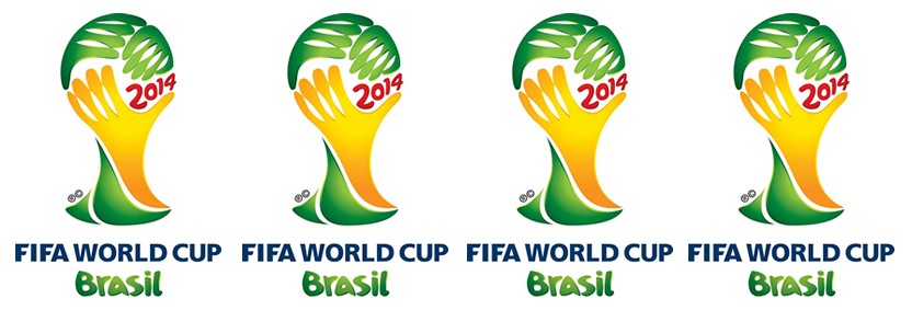
The device is clearly made up of three hands, two in green, one in yellow - wrapped around an invisible globe. Even I can tell the overall shape resembles the World Cup itself. But hands holding a ball surely runs contrary to the spirit and rules of football (the clue's in the name). As I understand it, unless you're the goalkeeper, picking up the ball is very much a forbidden tactic in soccer.
Then there's the issue of the text displaying the year. In a rather yucky 'bubble' font - reminiscent of that writing kids put on their exercise books in the seventies - the figures '2014' have been squeezed in to the right. To my eyes, this unbalances the design dreadfully. I can't be sure, but I suspect some poor designer has been told to stick this in somewhere, which would explain its incongruity. I know doodle-style is a perfectly acceptable design approach, but in this instance it doesn't feel appropriate as it does nothing to promote the substantial nature of the occasion.
In fairness, this is probably an impossible brief. While the budget is probably spectacular, the project is something of a hapless task. So many people to please, so many critics. It was built by the Brazilian agency 'Africa', is called 'Inspiration' and I suppose its success rather depends on the brief the designers were handed. All that said, I find it predictably weak and disappointingly juvenile. Then again, I don't really mind that much, as I will be going to extremes to avoid the entire international pantomime. As I say, I'm just a writer and I really don't like football.
Magnus Shaw is a copywriter, blogger and consultant