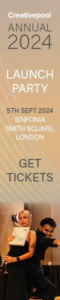

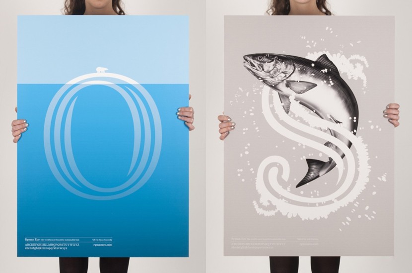
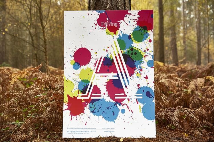
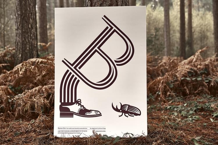
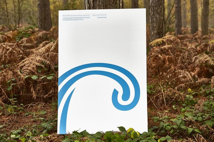
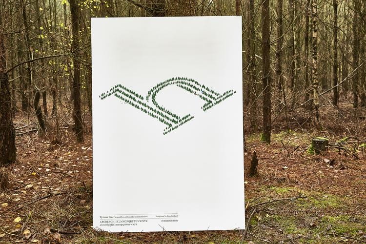
Ryman, the UK's leading stationer, has teamed up with Grey London to promote the sustainable Ryman Eco font through a new initiative called the “Alphabet Poster Project.” 26 leading British designers have created “Beautifully sustainable” posters to promote the font, which uses 33% less ink than a standard font and 27% less ink than the leading sustainable font, meaning that widespread use of the font could save up to 490 million ink cartridges every year if everyone used the font.
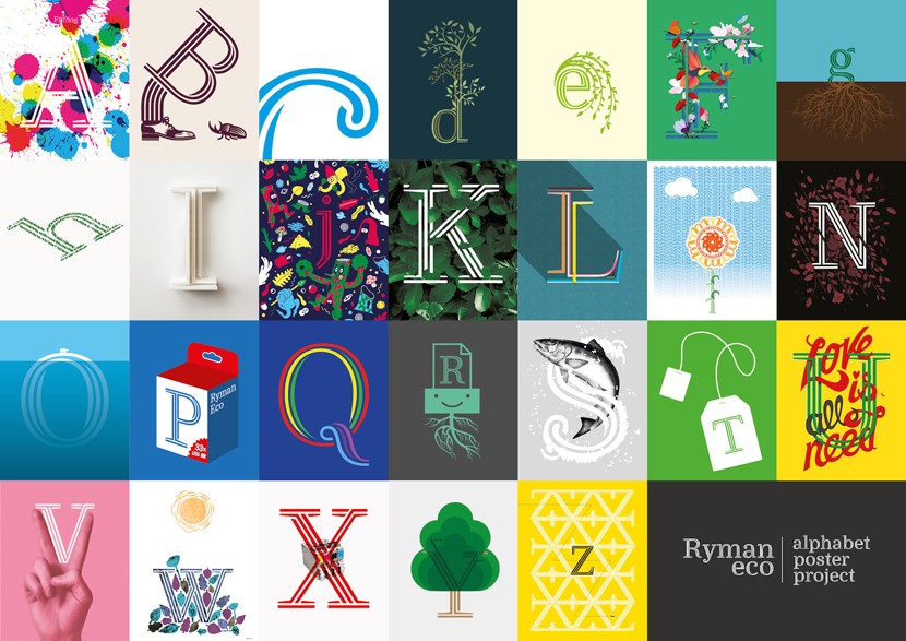
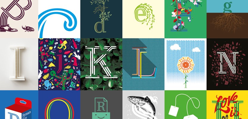
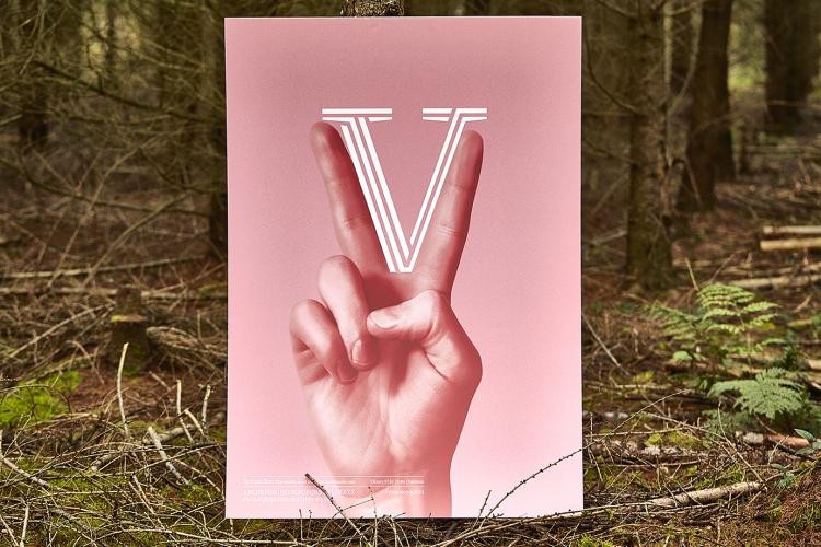
All 26 pieces have been combined into one elaborate collage (above), and Grey has also created a video (below) to show off the project, in which the designers are interviewed about the design choices for their specific posters (each based on a different letter from the Ryman Eco Alphabet), and what the project means to them. Collaborators interviewed include artist Richard Hogg, Design Studios DBLG & Bunch, illustration duo, Crispin Finn and award winning book cover designer, Jon Gray.
Ryman Eco – The Alphabet Poster Project
Of course, for any typeface to “Go mainstream,” it's important that it's embraced by the design community first and foremost, and this was undoubtedly the reasoning behind Grey's campaign. The results of the project are visually eclectic, but all serve to remind us of the font's environmental purpose. There's also a bespoke microsite at rymaneco.co.uk, which includes a host of additional content.
Ryman has teamed up with Grey London to promote the sustainable Ryman Eco
Andy Lockley, the project’s Creative Director. Said that “The intention was to stress test the font and demonstrate is versatility,” so they “Invited a broad cross section of creative and designers with different and eclectic specialties and styles to work on the Alphabet.” He hopes that what they've created “Is a series of artworks that inspire other designers to incorporate Ryman Eco into their font libraries.” The project marks a major push for the font, which has been available for free online for almost a year now and was originally designed by Monotype and Hogarth. Grey London have been implementing the font across its global 96 country network for just as long.

Monotype's Dan Rhatigan lent the font a clever design that capitalises on the ink bleed and toner spill that occurs on home and office printers. Rhatigan said “The entire concept for Ryman Eco is about the final print experience and finding the perfect balance between saving ink, legibility and aesthetics.” He added that “To encourage enough interest so that people would want to use the font,” they needed to “Make something that would be visually interesting at a close look or a large size, but useful and effective for everyday printed text.” Monotype looked at “How our eyes and brains compensate by filling in missing areas and how much of a character we can remove before we lose the sense of its form.”
Ryman Eco – The World's Most Beautiful Sustainable Font
Grey London ECD Nils Leonard, said that the agency realised if they could make printed words and numbers more efficient, they would “Make cartridges more efficient too, reducing their environmental impact.” He adds that he tweeted Ryman owner Theo Paphitis with the idea, and “He understood its wide-ranging implications straight away.” Well, if it's good enough for a dragon!