
Strategic brand agency Robot Food has undertaken a global rebrand for pet care brand YuMOVE. Owned by parent company Lintbells, the specialist, high-efficacy brand’s mission is ‘giving pets an active life for life'.
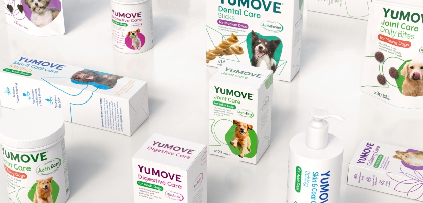
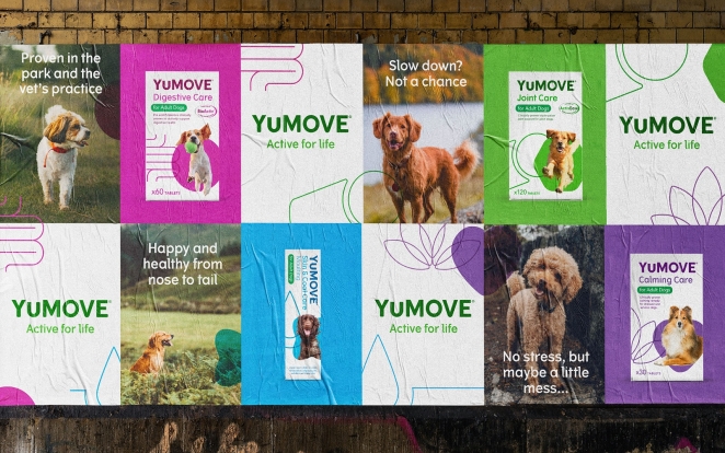
The new brand architecture brings all products together under the YuMOVE name, with each clearly stating its individual benefits (such as dental, joints, and skin/coat care) on-pack. Now, the proud, consistent YuMOVE name and masterbrand can flex across various propositions
The rebrand comes at a time when people’s relationship with their pets is changing dramatically. YuMOVE’s core buyers have historically been more ‘traditional’ dog owners, since larger breeds like Labradors are more prone to joint issues. Now, with the growth in ownership of smaller dogs and an increase in younger, more city-based pet owners, the designs needed to appeal to a broader audience.
To learn more, we spoke to Emma Collingswood, Senior Account Manager at Robot Food.
What was the brief for the rebrand?
In the world of joint supplements, Lintbells’ YuMOVE was top dog. But over time, as they’d expanded their range beyond joint care into other areas (like YuDIGEST) the brand’s core equity had become stretched.
We needed to help Lintbells clarify the strategic direction and provide a clear approach that would help the business move forward with one central idea, helping them lead the way as the go-to pet wellness brand. Making YuMOVE the masterbrand aligned with the mission ‘active for life’ — it made sense commercially, and to consumers. One URL, one brand for all your dogs' needs.
How did the initial brainstorming phase go?
As YuMOVE was already a well-known and highly respected product brand, there was no desire to throw the baby out with the bath water and start completely from scratch – it was important to keep some familiarity.
We knew we wanted to create a brand that blended trusted science with an approachable/friendly feel that wouldn’t only be understood by those ‘in the know’ but also welcome a new generation of consumers.
As a starting point we looked at trends in the human wellness space and how they were moving more into mainstream/lifestyle and D2C territory, speaking directly to the consumer and demystifying the science.
Describe the purpose of the brand and its target audience
The rebrand comes at a time when there is a growing population of pet ownership and people’s relationship with their pets is changing dramatically. Pet owners have been replaced by ‘pet parents’, with a greater degree of emotional connection their pets - always wanting to do the very best for them.
As with human wellness, the pet wellness category is in steep growth. YuMOVE has an opportunity to lead the category and become the go-to, trusted brand for any pets’ condition or wellness needs.
What was your thinking behind the rebranding solution?
While YuMOVE is mostly sold in the UK and US, the brand needed an omni-channel, global approach that could straddle both on and offline sales across a number of markets.
Using the YuMOVE name across all products increased brand clarity, this alongside the simplification of the different range names meant the products could be ‘decoded’ far more easily.
With most sales made online, we worked to address the information heavy pack fronts, to let the website and the back and side of packs do some of the work. We simplified them and amplified what mattered: care for your pets.
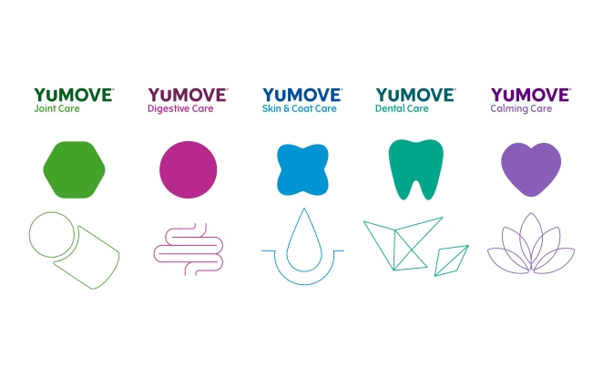
The new logo is a modernised version of the former to aid recognition, but with a more contemporary, impactful look. The overall design system is based around using visual segmentation to denote each product’s benefits through the use of shapes and colours, such as a purple lotus flower on the calming product and blue crystals for dental care.
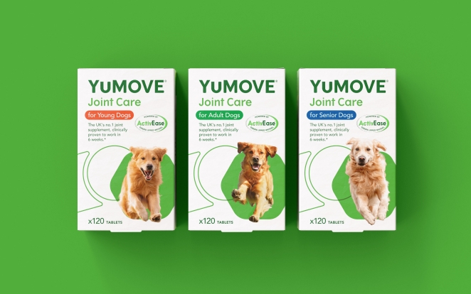
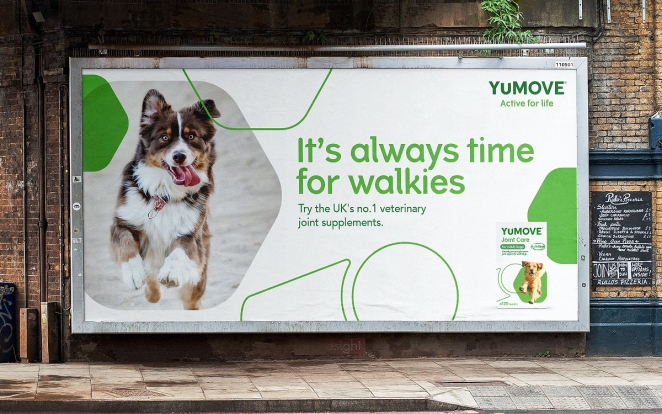
The brand mission is ‘active for life’ so we wanted this to come through in all aspects of the design. So the dogs appear jumping out of and interacting with the graphic assets to inject life and energy into the design, as the product does for the dogs.
‘Active for life’ doesn’t just have to relate to pets, this can also apply to owners, so it was an opportunity to show a healthy, active lifestyle all round. Therefore, it was important to include pet and owner interaction in the brand world to add an emotional connection and warmth to the brand.
Did you learn anything new during the project?
It was surprising to see that in pet wellness there is a clear divide with very fun, trend led brands and other very scientific brands, which gave us the opportunity to hit the sweet spot.
We didn’t want to be too friendly and not represent the years of expertise that’d gone into developing the products, but on the flip side we didn’t want to be too science focused and alienate the new consumers, we needed a balance.
What was the biggest challenge? How did you overcome it?
We used the dynamic representation of dogs through photography to help bring the packs to life and provide a singular clear look and feel throughout the whole brand world.
The dynamism of these images relied on choosing fur colours that ‘pop’, and shots where the dog is looking into the camera as far as possible. We worked closely with the YuMOVE team to decide on the right breeds, ones that aren’t too obscure or ‘trendy’ — it had to feel like an ‘everydog’.
What details are you most proud of any why?
People want to know they’re doing the best thing for their pets’ wellness. Making it easier for consumers to understand the benefits of YuMOVE products makes it easier for them to make their pets’ lives better. It’s great to have played our part in that.
What visual influences fuelled your solution?
We were inspired by the wider world of wellness brands — such as freer layouts, simple iconography and a more approachable colour palette — which create a friendlier look and feel that maintains the sense of efficacy.
We’ve seen products with a medical ‘need’ becoming increasingly accessible, and categories that once relied purely on scientific efficacy now employing more everyday lifestyle cues — pet care is not immune from this.
What do you hope it achieves for the brand?
The new brand architecture brings all products together under the YuMOVE name, with each clearly stating its individual benefits (such as dental, joint and skin/coat care) on-pack.
Now, the proud, consistent YuMOVE name and masterbrand can flex across various propositions without losing any of the efficacy or trust of the former designs: it’s clearer, stronger and primes YuMOVE for future growth. YuMOVE can play in its heartland of scientifically proven formulas and ingredients and also into more lifestyle and preventative categories.
The new design system and guidelines provide a seamless transfer across advertising, packaging and online, and facilitate the briefing of agencies in future to ensure consistency around how the brand appears.