So you're all ready to go. The brand new Full HDTV has arrived. The iPhone app uploaded. The Daily Star wall chart is mounted over the fireplace. And a replica of the trophy created entirely from beer cans has started to form in your lounge. Yes, finally, the 2010 World Cup has arrived, but before the glare off Wayne Rooney's rosary necklace blinds us all, let's look back at the highs and lows of some previous World Cup posters.
Uruguay 1930. Bendy keeper
Thirteen teams, seven from South America, four from Europe and two from North America entered the first ever World Cup tournament. Yeah well, that's enough of the history. Here we see a bold attempt at art nouveau from the Uruguayans. The keeper is holding onto that ball in Shiltonesque fashion, all the more remarkable given his body is going in two quite different directions. And how disappointing for the striker, that ball was heading straight for the top right hand corner. He'd be gutted about that.
Italy 1934. Ave it
Wound like a tightly coiled spring, here we see a left sided Italian striker ready to pull the trigger and unload. An image bursting with sheer power captured in azzurri blue, I can imagine Mussolini literally salivating over it. Interestingly enough, Spain met Italy in the first match and 7 Spanish players left the field injured. Per chance Italy won. Funny that.
France 1938. Strident
Typically French, this Coupe du Monde (Cup of World) poster from 1938 has a swagger all its own. It shouts; Come an take le ball if you sink you iz hard enouf. But then it shouts; Zut alors, this is a pretty shit poster a great deal louder.
Brazil 1950. The leg warmer
One single sock adorned with the flag of every competing nation may be a slightly left of centre concept, but I think the Brazilians manage to pull it off. (See what I did there?) However this design is likely to have had Gentleman around the world up in arms. Most will tell you that socks should be at least as dark as your boots. Indeed, in the Directory of Etiquette it clearly states socks such as these are only suitable for playing tennis.
England 1966. Willie
There were a lot of amazing things happening in London in the 60's. Designing posters for football tournaments clearly wasn't one of them. Crudely knocked together seconds before the designer threw on his Kaftan and headed for Richmond to see The Stones.
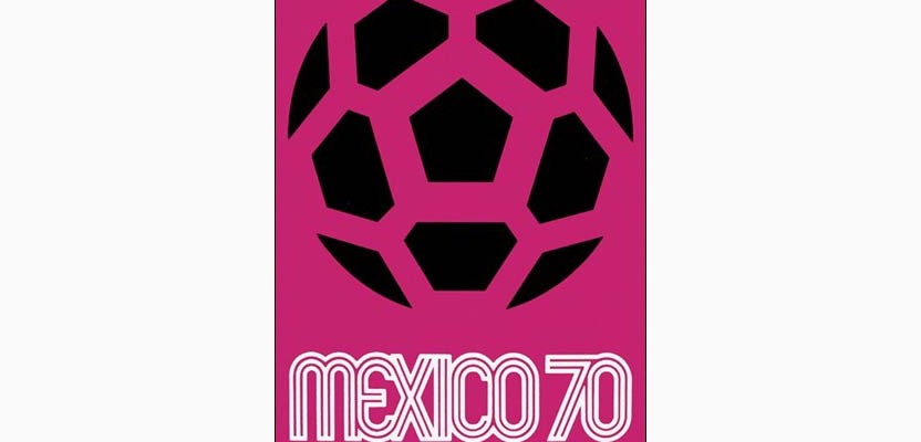
Mexico 1970. Cheese grater
Graphic. Bold. Simple. But it's the typography that scores. A bit of googling revealed The 1970 Mexico World Cup logo is credited to graphic designer Lance Wyman. Magic. It was the first tournament I remember watching and as well as the best ever poster it had the best ever team, the best ever player and Bobby Charlton cut a dash with the best ever comb-over.
Argentina 1978. Brokeback Mountain
The Argies knew that they had to beat Peru by four clear goals to advance to the final. Argentina managed it with what some saw as a suspicious degree of ease. Trailing 2“0 at half-time, Peru simply collapsed in the second half, and Argentina eventually won 6“0. Rumours suggested that Peru might have been bribed into allowing Argentina to win the match by such a large margin. Oh yes, and the Peruvian goalkeeper, Ramón Quiroga, was born in Argentina. You scratch my back, I'll scratch yours.
Italy 1990. Gladiator
Iconic really isn't it. Such a simple idea. Shame about Gazza though. And Stuart Pearce. And Waddle. Oh god, let's move on.
Korea and Japan 2002. Agricultural
And then it went weirder. Dedicated to farmers everywhere, the Korean and Japanese entry is decidedly unique. It was the first World Cup to be held in Asia and the first to be hosted by two nations. Thus it made sense that the poster should be brought to life using two artists - the eminent Byun Choo Suk, from Korea and Hirano Sogen from Japan. After two days spent collaborating, and staring out of the window, they decided on a football pitch. Not too tricky they both agreed. Then they rolled up their sleeves and made lots of big swooshy marks and the 'best' brushstrokes were scanned, digitised and coloured to create the final version of the poster. Both artists used their own brushes. They were not allowed to use an upside down plate for the circle.
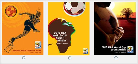
South Africa. 2010. Nice yellow
I don't want to be harsh. Really, I don't. But for me this is a great example why design by committee doesn't work. Some people love it though and even FIFA President Joseph S. Blatter had a few words to say on the matter; "Portraying a country in the shape of a man heading a ball is a new idea with potent symbolism. For me, football is all about emotion and passion, which is why I was particularly attracted to this poster. It invites the world to join in the celebration of the greatest football event on earth, while highlighting the pride and passion of the African continent and her people. It represents the African dream come true.
John Fountain is senior copywriter at Avvio