Unlike Naomi Klein, I like logos. In fact, I think everyone should have one. Not just every company every single person. We could do away with those boring, old fashioned signatures and photos and just stick our personalised logo on things like driving licences and passports. And you know what would make this concept really fantastic? Lots of people would have really, really terrible logos (I mean, just look at some folks' haircuts) and we creative types could get all smug and snigger into our hands every time we saw one. That's how much I like logos. But hang on. Like most design efforts, logos are pretty subjective. For every dude who thinks the ‘fruit with bite taken' emblem of Apple is the coolest thing they've ever seen, there's someone who is reminded of the fall of mankind in the Garden of Eden. So, how do we decide what constitutes a good logo and what represents a dreadful effort? There's only one way to find out ... (Harry Hill , all rights reserved)
The Baddies
Hip Hop HIV
It's not so much badly executed as badly conceived. Okay, using a microphone as an is pretty trite and the red ribbon is making everything a bit too busy, but there's something else making this wrong, wrong, wrong. The blood! Whether it makes you think of gang violence or infected plasma, it's not really helping the cause.
Eastern Temple
It really answers the brief in a warm and simple way. Nice big sunset, stylised sacred building up front. In fact, there's only one tiny problem. The whole image immediately looks like ... er ... well you know what it looks like. (If you only see a temple, then bless you).
Hot Dogs
I suppose, when designing a logo for a food product, the important message to convey is one of deliciousness. Perhaps a sentiment to avoid would be choking to death on a string of phallic tubes. Yes, that would be quite bad.
Zeromax
There is nothing wrong with a logo which is simply the company's name, written in a compelling and suitable font. Oh and the name should definitely be legible and not a jumble of jiggly lines that look like a broken climbing frame. In ice blue. Not that.
Price Waterhouse Coopers
Ya'know, accountants get a rough deal, with all that stuff about being dull, stuffed suits with nothing remotely exciting going on in their meagre lives. However, picking a font more suited to a professional clown agency isn't really going to overcome those negative comments. In fact, it may well make the whole situation much worse.
The Goodies
Firefox
This is actually just the best known execution from a suite of logos for various open source programmes. The colours always jump out, regardless of the setting but it's the immediately visible fox, with his tail curled round the globe which not only captures the product effortlessly, but is undeniably endearing.
Playboy
Love it or loathe it, here's a brand known universally by their mark. Simultaneously aspirational and rather childlike, it's one of those rare logos which has no need to carry its owners name and is destined to be recognised for centuries to come (ahem).
FedEx
Very straightforward, very bold with a little hint of cleverness. It may well take a few glances to notice the arrow hidden in the Ex' but that just adds to the appeal. I've actually seen people point it out to each other, and that's branding success right there.
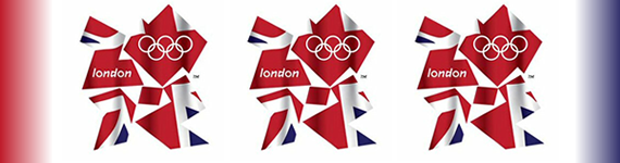
The Olympic Games
So easy to recall and so ubiquitous, I wonder how often this logo receives the admiration it deserves. There's actually more space than logo and yet it perfectly captures the notion of nations coming together, united and equal. It's rather a shame then, that its latest incarnation for London 2012 is so unnecessarily scrappy and complicated, because the original is pure class.
NBC
It's all too common for TV channels to opt for a very ‘broadcasty' design lots of overlapping spheres, cut-away slices and reversed-out numbers. In contrast, NBC's peacock is pretty refreshing, although it dates from 1957. Without the white teardrop, this would be no more than an abstract, coloured fan. Once added, it creates the bird and makes the logo venerable, memorable and timeless.
So, in my fantastical future, when you'll be required to build the personal logo for your passport, take a little time to consider which icon will win you the love and admiration of your peers and which choice may result in unwanted ridicule and enduring shame.