I built my first website in December 1993.
Back then, one had to create the HTML using a plain text editor, then view the page in a web browser called "Mosaic". Images were rudimentary... usually a "GIF" format, and they had to be relatively small and low resolution. Afterall, bandwidth speed via a dial-up modem was around 2400 BPS (several HUNDRED times slower than modern broadband speeds), and if a web page contained too many images, it took ages to load.
Technology has moved on considerably since then. Today, practically anyone can create and publish a website, and it's not even necessary anymore to have any knowledge of HTML, CSS, JS or (in the case of content-managed websites) how a database functions.
This total ease is both a good and a bad thing. One need know nothing about website design on a Friday afternoon. but by the following Monday can set themselves up as a "Website Designer", after following a few simple tutorials on youtube over the weekend.
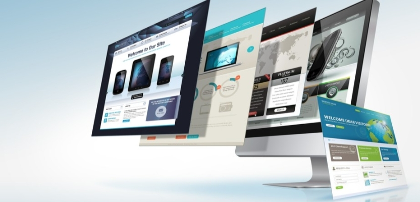
Consequently, the vast majority of websites are awful - not because they don't look pretty (many do) but because the visual design is given preference over operational functionality.
Around 10 to 15 years ago, the term "User Experience" was coined - abbreviated to UX - and this has become a popular metric by which most "professional" websites are judged. In addition to numerous online analytical services that evaluate core UX protocols, professional web design companies track and monitor user activity to get a better idea of how people are using the website, and to determine what needs to be improved. It's become quite a sophisticated science, and all reputable web design agencies will apply UX analysis to their projects.
Fundamentally, the objective of a commercial website is to increase business and bring in revenue for the organisation. As I mentioned in another article, a company must be able to determine the contribution their website is making to the company's earnings and profits. Online shops can achieve this relatively easily... Sales are made, revenue is earned, and through effective accounting, the value (profit) of the website can be determined.
However, all too often, functionality is given very little attention, and the graphic "look" of a website is considered more important. Many web designers (certainly those focusing on the graphics side) add visual features which may look fancy, but which actually detract from good functionality. It's quite common now for online shops to present an array of moving visuals, swirling banners, flashy pop-ups and other silly gimmicks, in the belief that somehow these elements improve the UX.
In most cases, they don't. People get irritated with all these unnecessary distractions. They may make the designer feel good (he/she is showing off their "skills"), but the audience hates them.
An effective website is one that takes the visitor to exactly what they are looking for - and does this quickly and efficiently. Outbound links, popups that flash up inviting one to "subscribe to our newsletter" or some other nonsense, slide-in banners and all the other ridiculous trinkets that just annoy people, are all too common.
They can actually be bad for business. Functionality must take preference - graphic design comes second. Just because some fancy new visual effect is now possible, does not mean it has to be incorporated into a website. You won't see all this "fluffy stuff" on the world's most effective websites (Amazon, eBay, Etsy are some examples). These sites know what they are there for... to generate money. Anything that detracts from that objective is avoided.


