


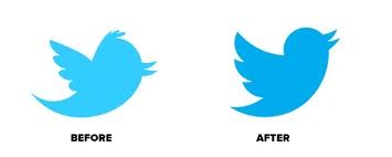
On Tuesday this week, as Her Majesty The Queen waved her hankie at the soggy hoards along The Mall, Twitter announced a new logo.
Yes, as Her Majesty finally kicked off her overly softened shoes and dunked her chocolate bourbon deep into a cup of finest English tea, the spotlight moved from London to San Francisco where the Creative Director of Twitter, Doug Bowman, had an announcement of sorts to make.
People close to the designer knew what was coming. Uncomfortable with the light blue silhouette of a cartoon bird in flight, Bowman had taken it upon himself to refresh the plumage and present the world with a new rendering: a dark blue silhouette of a cartoon bird in flight.
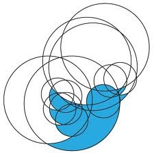
As is the way with these kind things some people liked it. Some didn't. Bowman tried to make some sense of it by proclaiming that, "Our new bird grows out of love for ornithology, design within creative constraints, and simple geometry. This bird is crafted purely from three sets of overlapping circles; similar to how your networks, interests and ideas connect and intersect with peers and friends."
 (Note for designers: Doug Bowman was visual design leader at Google in 2009, when Google ran scientific tests to find the perfect shade of blue and the one which most people responded to positively.)
(Note for pub quiz contestants: Apparently the Twitter bird is named "Larry".)
But Larry's overlapping circles were not the big story the Bowman was breaking this day. To the surprise of many, he had also decided to drop the name Twitter.
And that was very ballsy indeed.
As one blogger put it, "Twitter has achieved in less than six years what Nike and Apple took decades to do: To be recognizable without a name, just an icon. Regardless of the changes to the bird, this is a very significant evolution of the Twitter brand."
Another commented, "I think this is probably one of the best updates to a brand (and a well loved brand) that I've seen all year. Dropping the name from the icon only strengthens the Twitter brand", it says: "We're one of the big boys".
The chance to become a global symbol is the ambition of many. Starbucks has removed their name from their paper cups, the artist formerly known as Prince explored visual branding some years back and the bookshop Waterstones is slowly and rather tentatively heading that way with the recent removal of its apostrophe.
The truth is becoming a globally recognised symbol is not easy. You need to have strong brand values. You must never put a foot wrong. You must be brilliant, resilient and enduring. And getting there takes many years of hard work.
As that elderly lady who abides at Buckingham Palace knows only too well.
John Fountain is a copywriter.
Visit John Fountain's website
Twitter: @fountainjohn