


When it comes to accessibility, one sector of society that appears to have been largely neglected is dyslexic readers. As a lifelong keen reader (and professional writer for almost two decades) the concept of struggling so fundamentally with the written word is quite alien to me and so it’s always a condition that has fascinated me.
It’s also always puzzled me why nobody has made any great advances towards making reading more approachable for dyslexic readers. Looking for answers online I’m met with little more than suggestions such as “use comic sans because the letters are further apart.” This is a suggestion that’s half-arsed at best and flat-out patronising at worst.
Enter Lewis Moberly, a brand design agency that was recently asked with designing a new script typeface with the dyslexic reader in mind by, of all brands, Tropic Skincare. The brand approached the agency with the task of designing a bespoke typeface after discovering the difficulty customers were facing in reading the script on their website.
The challenge was to ensure the new typeface is readable and accessible to all, “without compromising on Tropic’s sophisticated and vibrant brand expression.”
Behind the idea
In the beauty industry, 25% of workers are dyslexic and across all industries 1 in 7 people reportedly have difficulty reading and writing. Typically, “Sans Serif” fonts have been the go-to choice for dyslexic readers and similarly simple and “spacey” fonts like the dyslexia-friendly “Dyslexie” font.
For too long, however, the neuro-diverse community has missed out on volume, variety and verve. Lewis Moberly wanted to “create an exciting and engaging typeface, breaking away from previous designs to create something modern and sophisticated.”
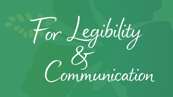
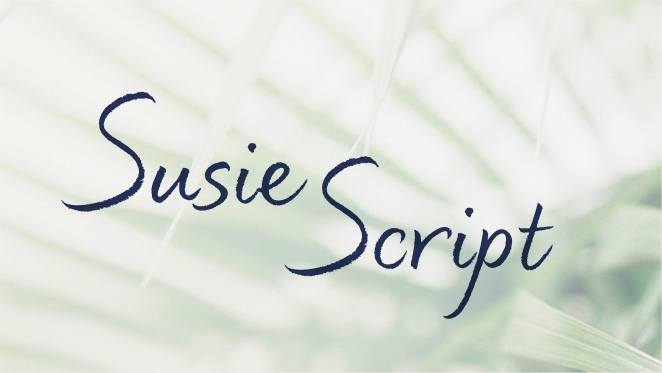
Named after the founder of Tropic Skincare Susie Ma, Susie is the first script type to rewrite the rules for challenged readers. The font aims to “unite clarity and beautiful disparities” and “untie the laces of letters to open, approachable, confident forms with textured irregularities.”
Several alternative versions of letters are included to align with the handwritten feel. This makes for an approachable and dynamic typeface; bringing pleasure to those who find reading a challenge, and hopefully to everyone else too.
Game-changer or PR stunt?
Emily Fox, creative director at Lewis Moberly, explains: “Our challenge was to create a handwritten typeface that could be easily read on all Tropic products and communications – where it may sometimes appear against a more complex backdrop. We were constantly testing and refining the script to ensure legibility, whilst not compromising on its expressive design.”
It’s a neat idea with its heart in the right place and Lewis Moberly tested the typeface on various dyslexic readers throughout the design process to ensure it was legible. The typeface was also oofficially approved by the BDA (British Dyslexic Society).
Otherwise, as far as I can tell, the research has been pretty minimal. It is, however, a necessary shot across the bow for those looking to reach neuro-diverse readers. Perhaps the next time somebody attempts something similar they might be encouraged to dig a little deeper?


Julia June 10th, 2022, in the afternoon
Speaking as a Dyslexic, It's not that readable!