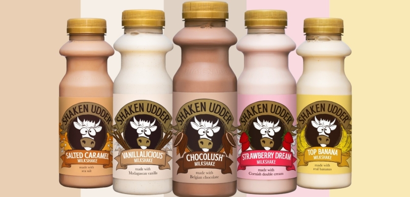

The UK’s number 1. Premium milkshake brand, Shaken Udder, launched a new packaging design earlier this year which evolves and strengthens branding and dials up premium taste credentials, whilst celebrating its festival heritage.
Shaken Udder worked with big fish brand consultancy to develop a new packaging design that reflects the superior taste and premium nature of their milkshake range. The hierarchy of messaging includes a bigger focus on the brand name itself and clarity around the product type by emphasising the word ‘milkshake’. Shaken Udder‘s infamous cow remains on the branding as it is such a recognisable asset.
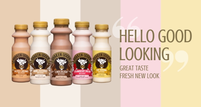
Consumer concept testing on the new packaging design has been extremely encouraging with 78% of respondents agreeing that the new design looks more premium than the current one and 72% agreeing that the new design looks tastier than the current one. To learn more, we spoke to Paras Arora, Senior Brand Manager at Shaken Udder.
What was the brief for the rebrand?
After conducting consumer research in 2020, we found that our delicious taste and the premium nature of our milkshakes wasn’t reflected in our packaging. With Shaken Udder seeing phenomenal growth in the past couple of years, we knew our bottles deserved a face-lift.
The brief was simple: we needed to find a way of bringing our premium offering & taste credentials to life through our packaging to have a wider appeal – yet at the same time taking our current consumers on the journey with us. We also wanted to make our name ‘Shaken Udder’ really pop out on the bottles.
How did the initial pitch/brainstorming phase go?
We teamed up with the well-known brand, design & marketing consultancy, big fish to help us with the rebrand. The first stage of the process was a workshop held at Shaken Udder’s office in Tiptree, Essex. Several stakeholders attended the workshop including the Shaken Udder founders and marketing team, and the wider creative team at big fish.
This workshop was all about understanding the brand, the consumers, exploring territories and defining what we were looking to accomplish. We also delved deeper into usage occasions, the category we sit in and the brand’s key differentiator. It was a really fun, creative, energising and eye-opening session!
Describe the purpose of the brand and its target audience
As adults, life can sometimes be a bit of a grind, so often you’re looking for little moments where you can get some positivity back into your life. Shaken Udder’s milkshakes do just that – bring little moments of positivity to daily life with delicious flavours and a thicker, creamier texture. All made using high-quality real ingredients.
Our target audience is anyone who snacks, but with an emphasis on milkshake consuming 30-54 year-old suburban adults looking for convenience and balance in their food & beverage choices.
What was your thinking behind the rebranding solution?
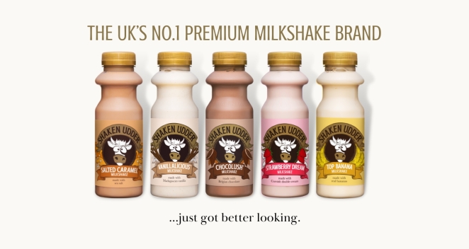
There were several things we were looking to do. At the core of this was a ‘coat of arms’ style design with banners, that acts as a nod to our festival heritage. Within this, it was important to keep our infamous cow the same, as it is a key recognisable asset for the brand.
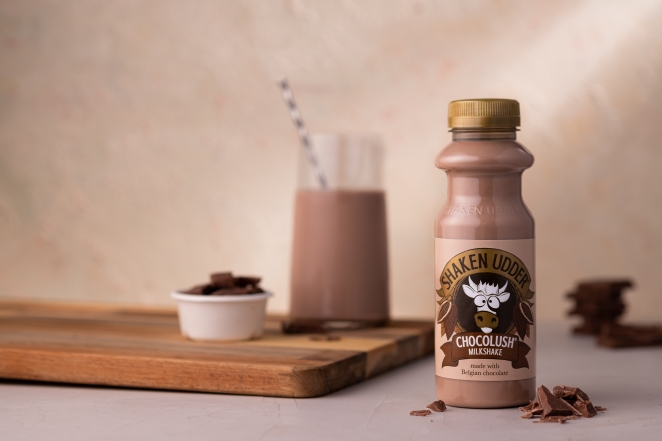
We dialed up the brand name ‘Shaken Udder’ to help build fame and awareness. In addition to this, we added gold accents (to the brand name banner, the cow’s snout, and our caps) to cue premium quality, and hand-drawn ingredient illustrations to cue delicious taste.
Did you learn anything new during the project?
I learnt a lot! Probably too many things to list. This was my first time leading an end-to-end rebrand project of this scale, so the learning curve was certainly steep. One of the key things I learnt was to always have the shopper and consumer at the front of mind in any decisions we were making.
In addition to this, I learnt to always assess any decisions against the core objectives in our brief. If it ticked these boxes, we were good to go, if not, we had to go back to the drawing board, which of course did happen. Amongst all, I learnt to be resilient, but agile. On a lighter note, I also learnt a lot about cow designs and pantones too.
What was the biggest challenge? How did you overcome it?
The biggest challenge was finding a look and feel that truly ticked off every box in our brief. That was, to look premium & delicious, build fame for Shaken Udder, create wider appeal, take current consumers on the journey with us, all in keeping with a modern & fresh new look.
The crux of this was an evolution to our branding, rather than to revolutionise it. At times though, we found ourselves doing the latter. To overcome this, we simply had to go back to the drawing board and start afresh, until we were genuinely happy that we’d ticked off every box in our brief.
What kit/tools/software were used to create it?
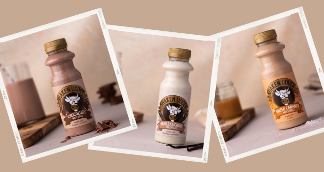
Most elements of the design were actually hand-drawn, including the ingredient illustrations and banners, which make them very distinctive and bespoke to our brand and flavours. Once these were agreed, the big fish team used their creative design tools to bring it all to life.
What details are you most proud of and why?
I feel immensely proud of the entire look and feel of the rebrand as there has been a lot of care and precision that has gone into the designs. However, if I was to choose one element that I am most proud of, it has to be the hand-drawn ingredient illustrations. Huge credit to the big fish team on this.
They really brought to life the taste cues on our packaging. Whilst many food & beverage brands talk about taste, Shaken Udder’s products genuinely tick this box in the milkshake category. We just had to show this off as part of our packaging designs and I really feel like we’ve nailed that aspect.
What visual influences fuelled your solution?
We took a step back to look not just at the flavoured milk category, but the snacking and food & beverage categories as a whole. For instance, we looked at Gu desserts and the way they’d used specific colours to cue premium quality.
At the same time we also looked at brands including Innocent for inspiration on playfulness, as well as Yeo Valley’s packaging which reflects its delicious taste and quality ingredients. This helped spark a lot of inspiration and discussions around who we are and what we’re trying to showcase.
What do you hope it achieves for the brand?
Our milkshakes bring little moments of positivity to everyday life for adults and we hope this is reflected in all elements of our rebrand designs from the playful cow to the ingredient illustrations for naturality & wholesomeness.
Above all, we’re hoping that our fresh new look encourages more people to pick up our shakes and try them. We know from research that once people try our shakes, they absolutely fall in love with them.
What would you do differently if you could do it over again?
I would ensure that we worked even closer with our printers, earlier in the project, to thoroughly understand the printing process and to make sure we nailed the colours of our packaging the first time.
Credit list for the work?
There were several stakeholders involved in the final creation of our rebrand both internally at Shaken Udder and externally too. In addition to myself, internally, the Founders and Marketing Director were vital stakeholders in the project. Externally, we worked very closely with various members of our design & branding agency, big fish, to develop a hugely successful rebrand.