

Naturally I assume that your product is great tasting, offers something new and interesting for a specific consumer, and keeps its promises. But wait…. is that enough?
Creating top-drawer branding and packaging for any new drink has never been so challenging. You’ll want your product to fly off the shelf – that’s a given. But long before you sign off on designs you and your team like, you’ll need to be sure your chosen demographic love it too, and will actually buy it! And don’t forget the retailers too – they are the custodians of the shelf space you desire.
 1. Name
The name should ideally capture the proposition with personality and emotion. You should feel something when you say it, and that something should have a clear link to the proposition: Innocent, Red Bull, Monster, Rockstar, Upbeat, Brew Dog, Absolut, GU, Bonne Maman. The list goes on, but the not so relevant name list is a lot longer. At the very least the name should be capable of being injected with personality and emotion through design: Arizona Ice Tea, Vitamin Water.
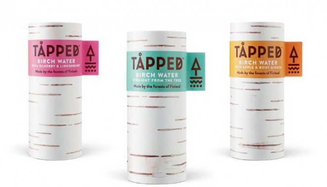
2. Bottle
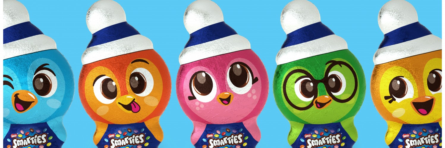
The bottle or any container, is a huge part of your branding – again it can communicate proposition, personality and emotion. Look no further than Coke, but that also has history and a zillion dollars of ads behind it. For a new drink the container (size, form, label and cap materials) provides both belonging (it’s one of those) and potentially differentiation: Tall vs wide, straight vs curved, clear vs sleeved, shiny vs matt, generic vs unique, all say something about what’s inside. Make sure that’s the right thing. If the container is generic, try to create a level of customisation, eg. Rockstar has black can tops and jewel like ring-pulls. Sensation transference (look it up) is a hugely powerful tool – packaging attributes become transferred into product and brand perception.
3. Graphics
Graphic design should give personality and meaning to the brand, and also a clear hierarchy to the messages. Looking at the brand logo (the brand name written in stylised form, plus any colours, shapes or symbols associated with it), does it build on the name to finesse the brand’s proposition and personality?Does it work on a T-shirt, without the support of the container?
4. Hierarchy
Hierarchy of messages refers to the order in which the (potential) consumer decodes (not reads) the information, so forms, colours and symbols should have already set the scene before any words are involved. Reading the logo plus product description plus a pay-off or strapline should now express what the brand is, does, and stands for. Never try to say more than three things, the consumer doesn’t have time (or processing power) for levels four, five or six.
5. Tell a Story
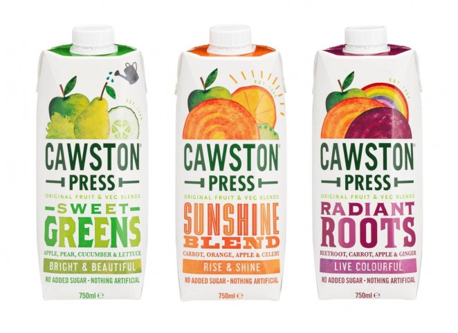
Our brains are wired for stories and the one we tell ourselves daily is ‘this is the kind of guy/gal I am’. How does your brand story fit with mine, your target (old school) or hero (much better) consumer? Follow all these rules (or stick them in your design brief), and you have a fighting chance of becoming the next Tapped or Cawston Press.