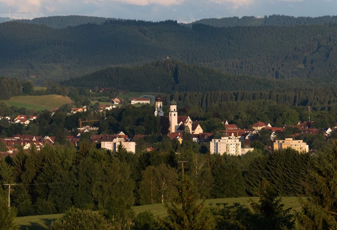
Isny is a small German town in a region called Allgäu in Bavaria. It’s a medieval town with colourful parapets set against a stunning mountainous backdrop. In the early 1980s the visual identity for the town was designed by Otl Aicher, but he made the controversial decision to create the identity in striking black and white.
His minimalist approach initially polarised some inhabitant’s opinions, but was well received and indeed awarded, within the design community, and is now much loved by the people of Isny. Nothing could be further from the typical Bavarian cliches of leiderhosen, Heino and giant steiners of beer.
‘Otl Aicher is an integral figure in the recent history of Isny. Since the introduction of his first posters 40 years ago, Aicher has given us a visual identity that is clear, beautiful and free from the clichés associated with this part of Germany.’
Karin Konrad, head of the Isny Culture Bureau
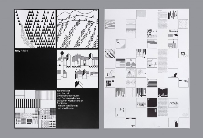
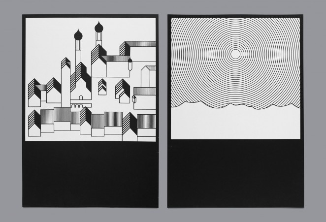
Aicher had already created sets of pictograms with repetitive elements for the 1972 Munich Olympics and for signage and wayfinding in Frankfurt Airport. He had been influenced by Masaru Katsumi, who had designed pictograms for the 1964 Olympics. However, he had gone on to create pictograms for Munich that used a strict grid and repetitive shapes. For Isny, he created initial drawings of images of the landscape, architecture, people and animals around the town and countryside, and these helped him to create a final series of 120 images. These images could be rearranged to show ”reportage” about Isny, on posters, brochures and collateral. Of course, in typical local council style, the identity was replaced by a more traditional photographic route after a few years, but it was then revived in the early '90s at the time of Aicher’s death and is still used to this day.
Most cities have to make do with a characteristic building or two to represent them — St Paul’s Cathedral, the Empire State, the Eiffel Tower... Aicher gave Isny an entire landscape and the power to tell a far richer story about the place than just architecture alone.
Patrick Eley, Creative Director of dn&co
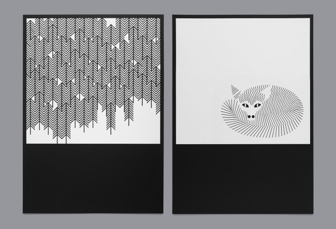
“One could think that a town in black and white is boring. But one gets to learn rather quickly that through reduction of elements it becomes possible to show intelligence, fantasy and playfulness.”
Otl Aicher
Aicher had previously attempted similar projects, some using colour, for other German towns and even in the '40s and '50s, his work had shown signs of strict geometric rules and grids. So in some ways, Isny's output became a channel for Aicher, the culmination of his minimalist work.
Leading brand and design agency dn&co host the exhibition in their gallery Ground Floor Space in Bermondsey as part of the London Design Festival, starting this week. A visit is pretty much compulsory.