
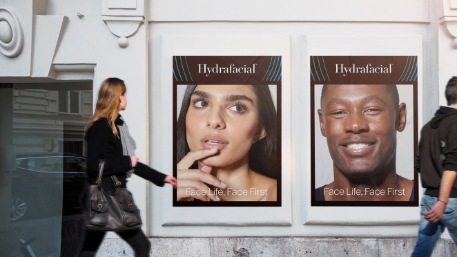
Hydrafacial, a category-creating brand at the intersection of beauty and aesthetics, partnered with creative agency Free the Birds to refresh its visual identity and brand architecture to support its explosive global growth plans.
Beloved by its vibrant Hydrafacial Nation community of estheticians, consumers and partners, Hydrafacial caters to a diverse and global audience crossing B2B and B2C touchpoints. The non-invasive treatment, performed by a professional esthetician, uses a patented vortex fusion device to improve skin health, create a glow like no other, and boost personal confidence.
In its work for the brand, Free the Birds sustained recognition of Hydrafacial as a fun and engaging brand, while elevating and maturing its identity as a premium, yet accessible, experience for both businesses and consumers.
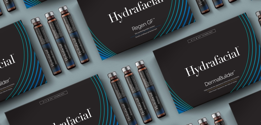
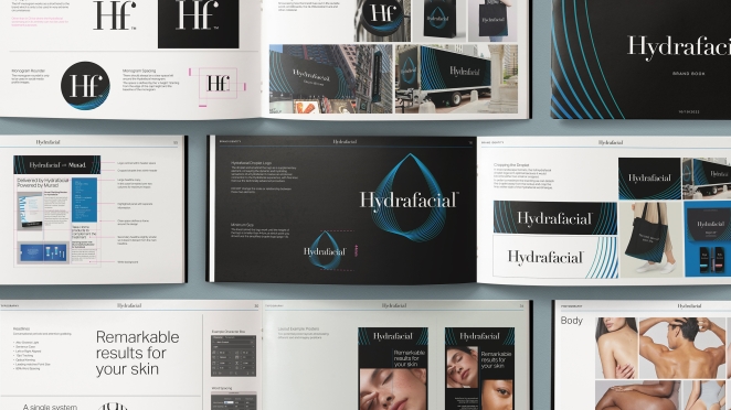
Hydrafacial’s logotype was elevated by tweaking the positioning of the water droplet found in the upside down “i” of the original, to slip it into the curvature of the “f’ in the new logotype. The design team also introduced a hero visual - the pulsating droplet - that descends in a cascade of blue hues to bring depth to each brand touchpoint; from packaging to Hydrafacial’s immersive brand experiences and events.
To learn more, we spoke to Matthew Gilpin, Design Director at Free the Birds.
What was the brief for the rebrand?

After continued growth around the world, the client came to us looking to evolve and elevate the Hydrafacial identity ensuring the continued expansion had a cohesive look and unified brand expression.
How did the initial pitch/brainstorming phase go?
As with every Free The Birds project, after a period of intense investigation of the landscape of the category, we created three distinct ‘Brand Islands’ which we shared with the client. These comprised separate worlds of verbal and visual stimuli which allowed the client to decide based on emotional and strategic criteria.
Describe the purpose of the brand and its target audience
Hydrafacial is a category creator. They created the category of ‘hydradermabrasion’ by using a patented Vortex-Fusion delivery system bridging aesthetics to beauty. As a brand, it seeks to democratize and personalize skin care solutions across age, gender, and skin tone.
It’s inclusive and innovative and wants to bring a genuine uplift to the confidence of both its customers in the aesthetics industry and the consumers who benefit from the treatments.
What was your thinking behind the rebranding solution?
The Island we progressed was all about evoking the unique sensation of a Hydrafacial and the transformation.
We created the droplet icon to symbolise the water-based technology and to compliment the established word marque acting as a beautiful, elegant shorthand to the experience with fine lines evoking the layers of your skin and the glowing feeling you get after.
Everything else was just bringing together the different touchpoints to work cohesively across the different markets. Working with the internal design team also to inspire with concepts on certain touchpoints (packaging) that wasn’t strictly in our deliverables.
Did you learn anything new during the project?

It was an exciting challenge to visually evoke a feeling and service which is very personal experience between client and aesthetician.
What was the biggest challenge? How did you overcome it?
To create guidelines that were strict enough to give consistency yet also new elements that can be used in an exciting way to really help the brand to achieve its ambitious goals.
What details are you most proud of any why?
The line details give a sense of movement and transformation even as a static picture. And of course, they are magical when brought to life with animation.
What visual influences fuelled your solution?
The experience itself. It is cutting edge using the latest technology. It is not the usual passive spa experience. Trying to convey the transformation in a hi tech, highly personable way we looked to brands such as Apple.
Credit list for the work?
Matthew Taylor – Designer Director