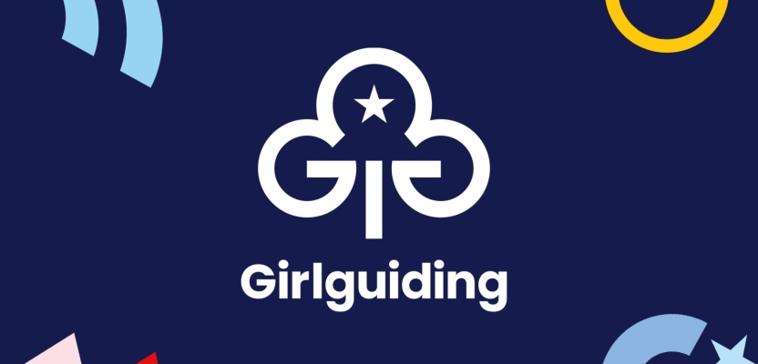

Girlguiding, the iconic British brand which is the UK’s largest youth organisation dedicated completely to girls, has launched its most transformative rebrand since being founded 113 years ago.
Launching on International Women’s Day, the rebrand was driven by the notion that girls can do anything, championing imagination and celebrating adventure, exploration, and curiosity.
Undertaken in partnership with leading brand and design consultancy Landor & Fitch, media agency VCCP Media, and earned creative agency Seven Communications, the rebrand has been designed to appeal to a new generation of girls and encourage more volunteers.
To learn more, we spoke to Amanda Azeez, Director of Communications, Marketing & Fundraising for Girlguiding, and Sarah Bustin, Design Director at Landor & Fitch UK.
What was the brief for the rebrand? (Amanda)
We’ve been here for girls for over a century. We provide a space where they can be themselves, build friendships, have fun, and explore through unforgettable and empowering experiences. To enable us to continue in our mission and reach even more girls and volunteers, we needed our brand to reflect how we have evolved and who we are today.
We conducted research that found of all the brand logos of Girlguiding’s sections, Rainbows, Brownies, Guides, and Rangers, only Brownies had near universal awareness (80%). Just a third (33%) knew about Rangers.
In 2018 we recognised an ideal opportunity following the launch of our newly overhauled programme of badges to undergo the most transformative rebrand in our 113-year history. A significant refresh was needed to increase our appeal to girls and attract new volunteers, brand partnerships, and investment.
How did the initial pitch/brainstorming phase go? (Amanda)
We started masterminding our initial rebrand plan in 2019, led by the core aims that it must be girl-centered and bring to life the fun, friendship and world of possibilities you can find at guiding.
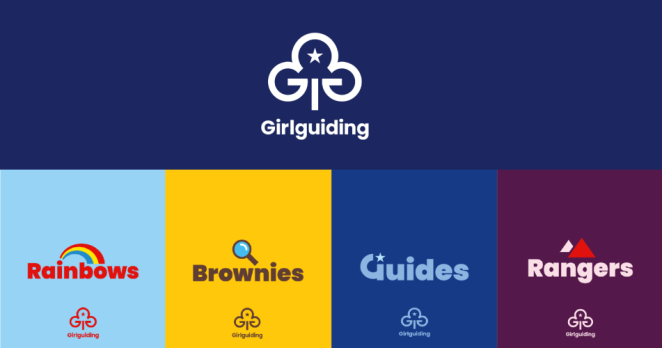
We also wanted to demonstrate that we are a family of brands across all four individual Girlguiding sections - Rainbows, Brownies, Guides and Rangers, all united by a shared purpose of helping girls to know that they can do anything.
We commissioned Landor & Fitch as our creative agency in 2021 following a procurement process, with a brief to create an identity that built on the historic iconicity of Girlguiding but also made the brand relevant for girls today and tomorrow.
Describe the purpose of the brand and its target audience (Amanda)
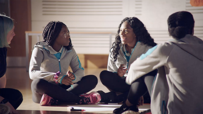
Founded in 1910, Girlguiding is the UK’s largest youth organisation dedicated completely to girls, with around 370,000 members. Girls can do anything. We help them know that, whether they’re four or 18 or in between.
All girls have a home at Girlguiding - whoever they are, and wherever they are, regardless of background. We show them a world of possibilities, big and small. We help them think big and be bold in a space where they can be themselves, get creative, explore, and have fun. We’re a powerful collective voice – with girls, led by girls – changing the world for the better.
We’re 300,000 Rainbows, Brownies, Guides and Rangers, who come together to laugh, learn, explore and have adventures, in communities across the UK and virtually. We're 70,000 volunteers who make guiding happen by giving time, talent, and enthusiasm.
What was your thinking behind the rebranding solution? (Sarah)
The creative concept behind these new brands was around inviting possibility. We outlined each section of the Girlguiding brand, including the Masterbrand, and reimagined and refreshed their iconic assets to encourage collective adventure, exploration, and curiosity.
We wanted to tell the story that when girls come together, they have the freedom to explore and achieve anything. Imagination is the only limit!
How does the new design enhance the brand and make it extraordinary? (Sarah)
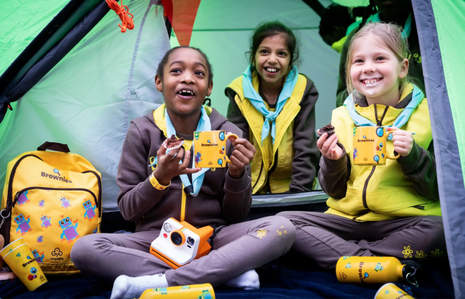
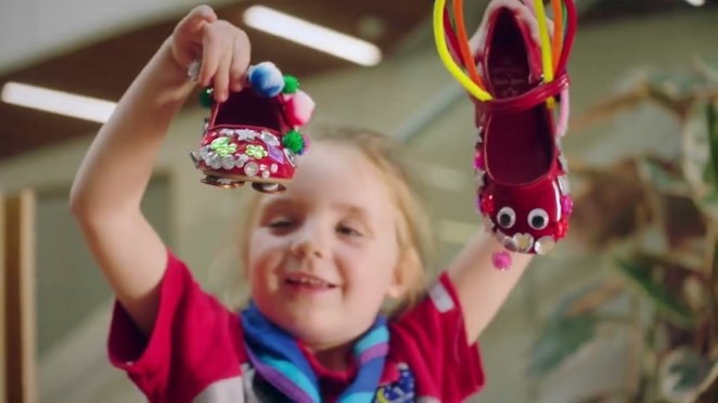
The Girlguiding rebrand is bold, vibrant, and exciting, with new badges, stationery, and icons for each section to enhance storytelling and encourage girls to express themselves throughout their Girlguiding journey.
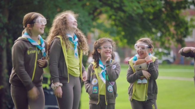
The iconic Girlguiding trefoil has been refreshed, as have the historic colours that defined Rainbows, Guides, and the yellow and brown of the Brownies. The new colour palette is designed to showcase modernity and vibrancy, while building strong variation between the Girlguiding sections.
To ensure consistency across all sections, a new Masterbrand identity was created to include Girlguiding itself, followed by Rainbows, Brownies, Guides, and Rangers.
Did you learn anything new during the project? (Sarah/Amanda)
Sarah: We were vividly reminded of the importance of knowing your audience and how leaning into them during the process creates a greater emotional connection in work which, ultimately, enables you work harder. This brand is owned by every past, present and future Rainbow, Brownie, Guide and Ranger and designed to inspire them to explore what is possible.
Amanda: There were so many brilliant ways that young members describe guiding but our research with non-members showed there’s a gap between what members know and what the public thinks about us. We were surprised by this gap and realised that we need the public to feel the same our members do about what guiding can offer.
What was the biggest challenge? How did you overcome it? (Amanda)
The biggest challenge we faced throughout the rebranding process was ensuring that every decision we made was mindful of the deep existing passion and positive sentiment felt by many of our members and volunteers (past and present) towards the brand.
Girlguiding is one of the UK’s most iconic and historic brands and millions of girls and women of all ages have an emotional connection to it. From the start, we were aware of the risks that came with such a transformative plan, while remaining true to the strong heritage of the organisation.
We took several steps to ensure sensitivity towards people who love the brand. We had representatives of volunteers and girls on our project board that managed and governed the work from 2019.
We also collaborated with current Girlguiding members to create new and engaging icons that excited them, while also conducting research with parents, volunteers, and existing members to compare old and new designs.
Our approach was rewarded during the research as, when asked to choose between the new and current designs, all audiences overwhelmingly favoured the new ones, including approximately 83% of volunteers, and around 75% of parents and children. We’re confident that as the rebrand is rolled out, the same level of positivity will be shared across the UK.
What kit/tools/software were used to create it? (Sarah)
We created this brand with the most valuable tool any agency has; passion. The designers were part of Girlguiding themselves and were enthralled by the opportunity to work on the brand.
Their lived experience, knowledge, and commitment allowed us to shape the work in a relevant way but also enable us to truly uncover what made Girlguiding different.
What details are you most proud of any why? (Sarah)
Simply working on the project has been a huge source of pride for many on the Landor & Fitch team. We grew up as Rainbows, Brownies, and Guides and some who worked on the project are even still involved as leaders!
Redesigning the brand has brought back wonderful memories for us all and the experiences which helped shape who we are today. We’ve used those feelings to guide us with this rebrand and created designs that encourage new possibilities, while fulfilling its purpose that girls can do anything.
What visual influences fuelled your solution? (Sarah)
When refreshing different aspects of the Girlguiding brand, we were mindful not to change what made it so iconic in the first place. As such, we were heavily influenced by Girlguiding’s instantly recognisable visual assets. For example, the historic trefoil logo has been retained with all the elements that make it Girlguiding, the three leaves, the star, and the flame, but refreshed with an updated, white-led colour palette.
We have taken the approach of refreshing existing visual assets for a modern world when developing other visual assets, from icons to illustrations, with vibrant colour palettes and bold icons that capture the imagination of girls of all ages and backgrounds.
What do you hope it achieves for the brand? (Amanda)
Most importantly, we hope the rebrand continues to charm and inspire current Girlguiding members and encourage collective adventure and curiosity, whatever stage of their Girlguiding journey they are at.
We hope that our bold new designs stand out and attract new members and volunteers to grow our membership and help create happy memories that last a lifetime.
Refreshing the brand provides an opportunity for Girlguiding to challenge outdated perceptions. We believe this rebrand goes a long way towards demonstrating we remain a modern and dynamic youth organisation that equips girls for the future.
Judging by the fact around half of girls in Rainbows (58%) and Brownies (48%) agree the new designs would make them more likely to join, we are on the right path.
What would you do differently if you could do it over again? (Amanda)
Having to work through a global pandemic was not ideal and undoubtedly led to some unavoidable delays. However, we are proud that we overcame the challenges this presented and still managed to collaborate and consult with our key audiences throughout the process.
Representatives from our membership have been involved at every stage and have shaped this project with their enthusiasm and love of guiding with girls kept at the centre of every decision.
Credit list for the work?
Landor & Fitch was Girlguiding’s sole design transformation partner, with media planning and buying handled by VCCP Media and creative PR by Seven Communications.