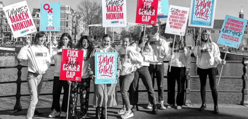
Global branding agency Bulletproof has joined forces with Amsterdam’s top universities to launch ‘Amsterdame’, a campaign that highlights the increasing gender gap in the Netherlands and demands legislative action towards closing it.
Leveraging the city’s upcoming provincial elections on the 15th March and coinciding with International Women’s Day, Amsterdame will see the entire city plastered with witty slogans and hard-hitting statistics that demonstrate the real impact of ignoring the issue any longer.
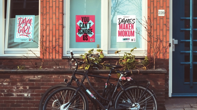
A collection of bold graphic posters, banners and custom stickers fuse symbols from gender politics and the city’s history to publicise the campaign’s three demands.
Two are addressed to the government: to implement an Equal Pay for Men and Women Act and to fund research into sex differences to improve healthcare for women. The final demand goes out to all eligible voters in the Netherlands: to vote for women on the 15th March to increase female representation in government.
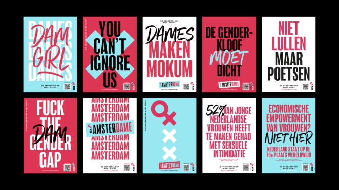
Bulletproof has designed six graphically striking posters to go live in 125 locations across the city, as well as “wildplak” locations.
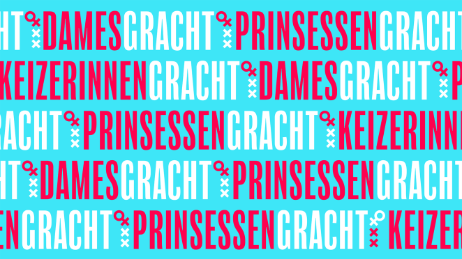
The studio has also created street sign stickers that will be placed over the names of the most famous canals - Herengracht (Gentlemen’s Canal), Prinsengracht (Prince’s Canal), and Keizersgracht (Emperor’s Canal) – transforming them into their female counterparts, Damesgracht (Dame’s Canal), Prinsessengracht (Princesses’ Canal) and Keizerinnengracht (Emperesses’ Canal).
To learn more about the campaign, which also includes placards, banners, flyers and stickers that, with the help of university students, we spoke to Jorijn Harms, Client Partner at Bulletproof.
What was the brief?
This was an interesting project for us because there wasn’t a brief! Well, not from a client anyway. Bulletproof Amsterdam was moving offices from Prinsengracht (Princes Canal) to Herengracht (Gentleman’s Canal), and we noticed the dominance of male names in the Amsterdam physical space. With only 12% of city streets named after women, we realised that this is an expression of a much bigger societal structure.
When we dug deeper, we were shocked by the level of gender inequality in The Netherlands; a place that’s generally seen as progressive. The brief we gave ourselves was, ‘how can we use creativity to target the gender gap and promote positive action?’.
How did the initial brainstorming phase go?
We discussed and researched the gender gap in The Netherlands – which has increased between 2008 and 2022. The Netherlands has dropped from 9th on the Global Gender Gap index to 28th – we all agreed that this was a very important issue.
We worked on developing creative ideas to put the issue at the top of people’s agenda – like plastering over the canal street names with their female counterparts. But we also wanted to make a wider impact, to effect real change. That’s why we also created the more ambitious and far-reaching AmsterDAME campaign that will hopefully endure to make a real difference.
We identified three priority issues to focus on – the gender pay gap, the research gap, and the democratic representation gap. From here, we started looking for partners to help us propel awareness and come up with solutions.
We contacted the top universities in Amsterdam, InHolland University of Applied Sciences, University of Amsterdam, Vrije University, Amsterdam University of Applied Sciences and Mediacollege Amsterdam, who were equally excited about the concept.
They helped us to amplify the campaign, organising a lecture and panel discussion for International’s Women’s Day (8th of March). The focus for these events was those women in Amsterdam – AmsterDAMES such as Marieke Samallo and Zahra Runderkamp – who are already driving positive change and could share solutions to close the gap.
What was the process behind ideating the concept?
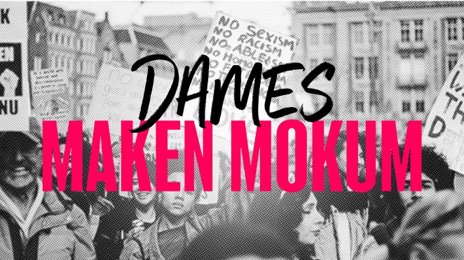
Our campaign was inspired and built from our city. From the name to the iconography, each element was created to evoke a sense of place. Our creative team used iconic Amsterdam elements such as the city flag’s Saint Andrew’s Crosses (or “Andrea’s”!) and drew inspiration from women’s movements of the past, like the Suffragettes.
We wanted to create a fresh look and feel that captured the bold and courageous attitude of the AmsterDAMES we’re highlighting in our campaign, but also conveyed a real sense of positivity and excitement.
We combined these visual elements with a punchy tone of voice and brought the design to life across digital and physical. For example, we played with the names of Amsterdam’s many famous canals, overlaying the male ‘Princes Canal’, among others, with its female alternative, Princesses Canal.
Visual assets include a series of typographic posters, flyers and hoodies, as well as a full website and social media content. Ultimately, we asked ourselves how we could best show the mark that the women of Amsterdam make on our city.
What was the production process like?
As we were running the campaign ourselves it was a lot more hands-on than what we’re used to, but it was great to have full creative control, and amazing to see how excited everyone was by this cause. We managed to pull off so much in a short period of time. From film to print, we had our hands full.
As well as the production of the design elements, we interviewed ten different women and wrote content, created a short film, built a website, an interactive map and set up a social campaign. It was hard work, but very rewarding.
What was the biggest challenge during production? How did you overcome it?
Time was short and we had a lot of moving parts and different production partners to liaise with. But by working closely together and focusing on the issue we all care so much about, we were able to make so many things happen in a short period of time.
Also, with not having a paying client we had to invest our own time and money into getting the campaign off the ground. We are very lucky that Bulletproof’s founders are extremely supportive and see the power of creativity. They allowed us to not just make this happen but really encouraged us to push this campaign as much as possible.
What kit/tools/software were used to create the project?
o Figma for the interactive map and website
o Adobe photoshop for the halftone AmsterDAME posters and social content
o Adobe Illustrator for stickers, type posters, banners, and flyers
What is one notable thing that happened during production?
It was so inspiring to see how galvanising a big idea and a shared cause can be, and we didn’t do this completely on our own. The university students helped us to flypost the city, film makers partnered with us to capture the journey, the MediaCollege ran a radio show and our AmsterDAMES got up on stage to promote real action.
All in all, to create a movement you need to embrace help from every angle to make as much noise as possible.
What’s the main message of this project and why does it matter?
Our main message is that it’s inexcusable to still have a gender gap. So many people see equality as a fundamental human right, yet the reality is that even a country with a very progressive image like the Netherlands has a long way to go.
A more inclusive and diverse society is better for everyone, not just for women. Making real progress is totally possible, but we do have to make it happen! AmsterDAME shines a spotlight on Amsterdamers who are creating change and actively closing that gap – through the university partnership and new collaborations we aim to create springboard for more and more AmsterDAMES year on year.
How long did it take from inception to delivery?

It took about seven weeks from our concept deck to our campaign hitting the streets. It’s been fast, but we know we want to keep the campaign alive and make it even bigger and more impactful over the coming weeks, months, and years! We won’t stop until the gap is closed.
What do you hope it achieves?
We want the gender gap to be closed in the Netherlands by 2030.

