
Last month, Chromatic Brands launched a new online marketplace brand, including name, brand strategy, brand identity and campaign.
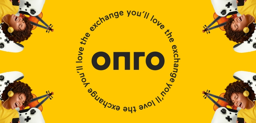
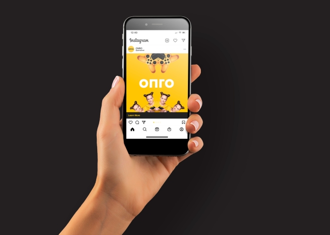
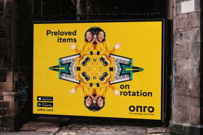
Created on the promise ‘The exchange you’ll love’ the Onro brand is brought to life using kaleidoscopes, animations and audio loops to create a warm, engaging style and to reinforce the role of the resale market in the circular economy, encouraging reuse and reducing waste.
To learn more, we caught up with Simon Case, Director at Chromatic Brands.
What was the brief for the brand?
Endeavour International approached Chromatic Brands through technology firm Monstar Labs, with a vision to create a new pre-loved brand built on a platform that makes it extremely easy for both sellers and buyers to exchange goods and to embrace a more sustainable lifestyle.
The pre-loved market is surging. A 2021 report from GlobalData shows that the resale market is growing 11 times faster than traditional retail and Ebay’s annual revenue was up by 217.30% in 2021.
How did the initial pitch/brainstorming phase go?

We were invited to discuss our ideas around how the pre-loved market is evolving and how we could help to position Endeavour’s platform in a way that emphasizes the idea of fairness. Our pitch focused on the strategic positioning of the brand and the need to develop a meaningful and memorable name.
Describe the purpose of the brand and its target audience
The factors that drive people from using other preloved platforms, such as haggling and unfair pricing, drove the development of the Onro brand promise 'The exchange you'll love'. This is a marketplace which goes beyond the transactional: a brand which like-minded people can relate to and build relationships upon.
The uncertainty of haggling and the chore of queuing at the post office are barriers for many potential users. The Onro platform ensures pricing is always fair, because it is determined by benchmarked data. Door-to-door delivery removes the inconvenience of leaving home to arrange delivery and pick up.
The audience for Onro is climate-conscious people who love preloved goods. Those who are into electronics, gaming and musical instruments are particularly of interest for Onro as the platform fills a niche that isn’t already represented on Ebay, Facebook Marketplace and others.
What was your thinking behind the branding solution?

We created the Onro name, brand strategy, brand identity and launch campaign. We also worked closely with Monstar Labs to create the platform which delivers the brand promise, advising on how to leverage the network effect of established online communities to launch the brand.
While using embedded carbon was part of the idea behind Onro, we recognised that concern for the common good is not the fundamental motivation for most users. Buyers and sellers are energised by the opportunity to pass on and pick up cherished and cherishable gear at a fair price and with zero hassle.
These insights led us to the idea of using rotation as a springboard for the name and visual and sonic language.
Did you learn anything new during the project?
At Chromatic, most of our work focuses on B2B clients, so developing a brand that is exclusively consumer focused enabled us to look at the project from a fresh perspective. As the brand was new, we were able to inform every aspect of the experience, from naming, to the design of the platform, to the creation of TV ads.
What was the biggest challenge? How did you overcome it?
From our perspective, the biggest challenges related to our own desire to create a brand expression that is completely cohesive across design, sound and movement.
To solve this, we settled on a simple idea that ‘what goes around comes around’, which gave us a foundation upon which we could create kaleidoscopes, sound loops, repetition and rotation in every element.
What kit/tools/software were used to create it?
All the Adobe suite, plus Figma.
What details are you most proud of and why?
I‘m very proud of the entire project, but if I had to choose, I would go for the bespoke typeface and sound signature.
The typeface incorporates a small number of quirky characters that make the Onro brand distinctive without ever being gimmicky. The music draws inspiration from Philip Glass and Laurie Anderson and is truly hypnotic.
What visual influences fuelled your solution?
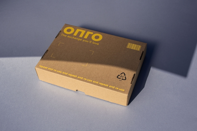
The Onro brand is brought to life using kaleidoscopes, animations and audio loops to create a warm, engaging style and to reinforce the role of the resale market in the circular economy, encouraging reuse and reducing waste.
The brand promise is typeset in a circle so that it reads two ways. By combining these elements with the single-minded use of warm yellow and a bespoke typeface, we produced a fun colourful brand, and gave Onro a style of engaging that is wholly distinctive, authentic and cohesive.
We also worked closely with composer Angus McLeod to create a bespoke piece of music that references the idea of rotation through loops and repeats, staying with the listener long after hearing.
What do you hope it achieves for the brand?
At Chromatic, we try to do our bit to alleviate the climate emergency and challenge the disposable economy. Actions have consequences and what goes around comes around. By partnering with Onro we're supporting a business which is helping to change behaviours for the better - saving carbon by sharing the love.
What would you do differently if you could do it over again?
It has taken a while for the app to reach completion, so if I could change anything I would have the app ready six months earlier.
Credit list for the work?
Client: Onro UK Ltd
Brand design & art direction: Chromatic Brands
Composer: Angus McLeod
Platform design & build: Monstar Labs
Media agency: Sondr