In 2012 Colorado became the first state to pass laws governing the legalisation, tax and regulation of marijuana. Washington, Alaska and Oregon followed soon after, and overnight the magical herb’s image and perception in American culture was catapulted into the spotlight.
Fresh from its criminal status, the weed industry is growing faster than the smartphone industry. In 2014 a reported $2.34 billion worth of legal weed was sold in America, just imagine its growth over the next ten years. We’re talking about a product set to go stratospheric in its reach. And where there’s that kind of money there are, of course, sought-after marketing and advertising deals to be won. But how do you brand something so high profile, in-demand and so recently illegal? Not to mention a product which already conjures up very specific connotations in popular culture. Think stoner iconography along the lines of Jamaican flags, tie dye and Bob Marley.
This was a question which America's Surface magazine posed to 12 leading design studios recently. Fed up of the "kitsch, cliché, and decidedly amateur" packaging, design and branding options available in legalised marijuana networks, the magazine decided to boost creativity with a simple brief: create a fictionalised aspirational marijuana brand. Essentially the future Starbucks of weed. The results give a clear insight into how cannabis culture will soon be sold to the consumer.

HI BY BRUCE MAU DESIGN: LA
“Hi is a monthly subscription service that aims to democratize the experience of living with cannabis in a way that demystifies the product. Customers order ‘BudBoxes’ online, indicating what kind of usage they desire—they can choose from select product lines such as Soothe, Relax, Passion, Energy, and Focus."
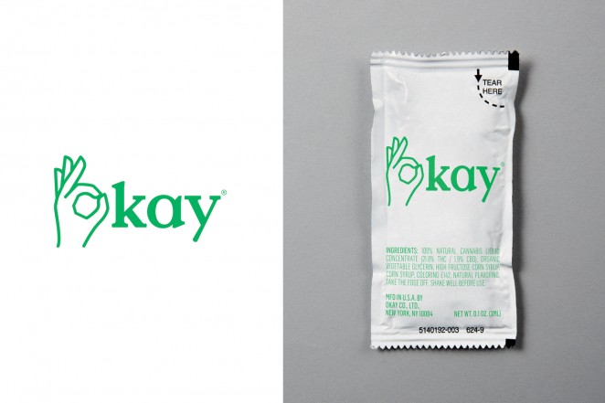
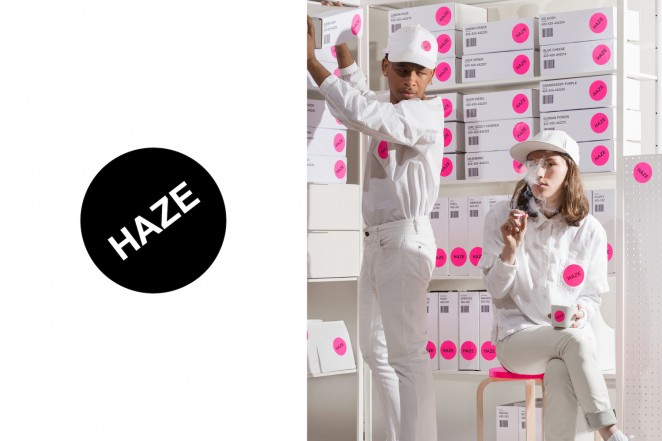
OKAY BY BASE DESIGN, NEW YORK
“Because legal marijuana is a relatively new category, existing products rely heavily on conventional symbols. We wanted to instead imagine how marijuana might exist 10, 20, 30 years from now, as a part of everyday life. We envision Okay as a mood modifier, a socially accepted additive as common as coffee or chamomile tea—in essence, a less sinister version of Soma from Aldous Huxley’s Brave New World."
The key messages found in the branding copy across all 12 designs are based around the medicinal benefits of marijuana, and akin to those used to market a newly discovered superfood. Buzzwords fuel off ‘wellness’, ‘healing’, ‘calming’, ‘healthy’ and ‘nutritional’ messages.
We’re in a new age of ‘high’ design. Check it out!
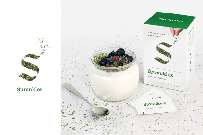
SPRANKLES BY FRANKLYN, NEW YORK
“Sprankles is the original cannabis condiment. A premium blend of flower crumbles and kief, decarboxylated to optimize the medicinal or psychoactive effect, it turns anything into an herbal edible. Sprankles is a conflation of the words ‘sprinkles’ and ‘dank’—the latter a slang term for high quality marijuana. It also sounds a bit hip-hop, which we like. Packaged in single-serve packets, it’s convenient and discrete. The visual identity is clean, modern, a bit irreverent, and primarily focused on showcasing the herbal shake.”

L’ENFER EST VOLONTAIRE BY KARLSSONWILKER, NEW YORK
“Our brand’s name is French. And it rhymes. It’s quite long, unwieldy, and nicely pretentious. It means that hell is only optional, that one has a choice to live in it or not. The accessible premium products of L’Enfer Est Volontaire (or L’EEV) give you that choice. The first one is a bag of artisanal chips filled with organic weed smoke from the Rocky Mountain, conveniently sealed together for highest quality and freshness. Adding marijuana smoke doesn’t use any additional energy or resources in its supply chain than an ordinary bag of chips.”

HI BY MGMT, BROOKLYN
“Our brand is a personal chronic concierge, providing both on-demand delivery service via mobile and web and a monthly curated selection of high-end organic varietals. Products vary each month and include artisanal take on classic munchies: Himalayan sea-salt chocolate bars, organic gummy bears, and hybrid kale chips—all providing a guaranteed ‘Hi.’ The aesthetic could be described as a post-modernist lava lamp; the mutable logo acts as a free-spirited doodle."
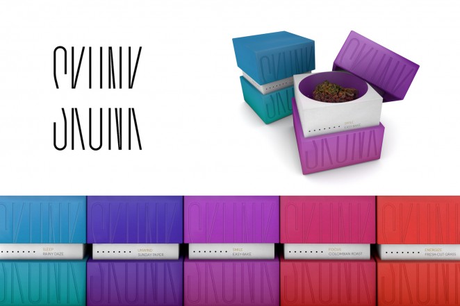
SKUNK BY ORIGINAL CHAMPIONS OF DESIGN, NEW YORK
“Skunk’s aerated packaging delights your sense of smell on first contact. Across a miscellany of products, scent and sensation work together to affect your mood. Cool undertones of sandalwood relax; zesty wafts of lemongrass energize. The brand and its packaging design reflect the way you’ll feel when using Skunk. In marijuana culture, ‘skunk’ refers to strong-smelling cannabis strains. We liked that, so we adopted it."
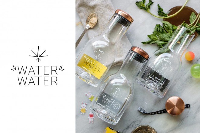
WATER WATER BY OMNIVORE, BROOKLYN, PORTLAND, AND LOS ANGELES
“Water Water is marijuana-infused, organic, and has fewer calories than alcohol. Flavors in three different THC levels pair with supplements to accent the three pillars of the working mother’s life: work (“Air”—power), children (“Earth”—balance), and partner/relationship (“Fire”—love). Water Water was born out of our own chaotic lives as working mothers. We wanted to poke fun at our impossible dream to “do it all” without sacrificing anything.”
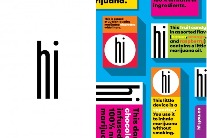
HI BY OPEN, NEW YORK
“Hi is a gateway brand. We always encourage companies to talk directly to their customers and make them feel comfortable and welcome. The friendliest way to do that? Say Hi. Hi sells cigarettes, snacks, and vaporizers to people who want to enjoy some weed, but don’t need to make a big thing about it. The few existing and forthcoming commercial marijuana brands all trade on preexisting aesthetics and clichés. Other categories of products have gotten past that by now. We didn’t want to wait."
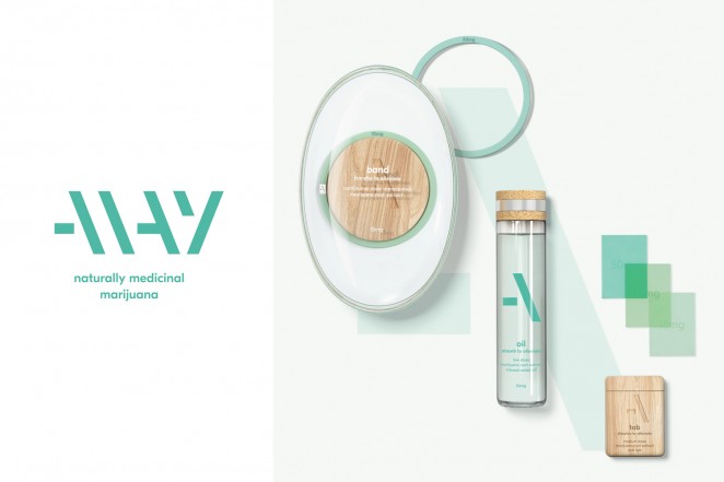
ALLAY BY PEARLFISHER, NEW YORK AND LONDON
“Allay is a product range that uses the naturally alleviative properties of the marijuana root to relieve persistent symptoms of stress, sickness, and pain. Taking a number of on-the-go lifestyle forms, including a wristband, an edible oil, and dissolvable oral tabs, the selection is designed to soothe and sedate by intuitively administering controlled and customized medical dosages of marijuana. The aesthetic is simple, calming, and pure, challenging the traditional and functional language of the pharmaceutical category.”

FLOAT BY PUBLIC LIBRARY, LOS ANGELES AND PORTLAND
“In coming up with the brand’s name, we wanted a word that sounded and looked like the emotion we wanted to convey. The meaning, sound, and letterforms were all elements we wanted to work together to reinforce the concept, an abstracted and visual onomatopoeia. In the design, there’s a lot of play with textures, opacity, muted colors. It’s the grown-up version of a nostalgic high-school experience: the various plastic bags, envelopes, and paper footballs that were vehicles of the bathroom-stall trade.”
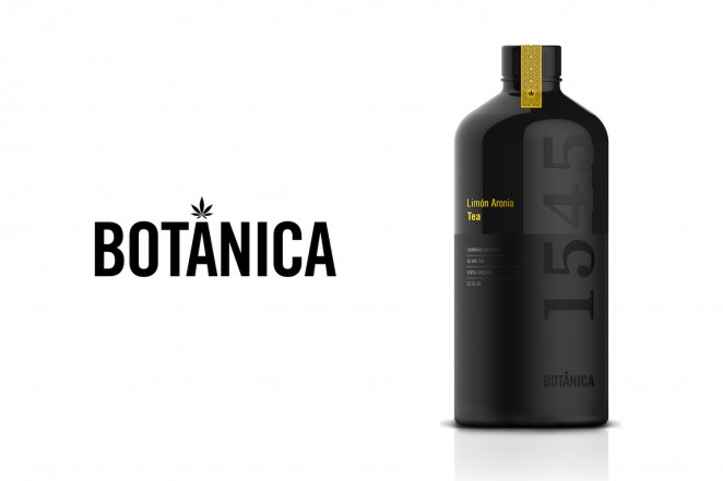
BOT&ANICA 1545 BY SAATCHI & SAATCHI DESIGN, NEW YORK
“Cannabis and tea are combined here to create the Botánica 1545 cannabis-infused botanical teas. The name is no accident: We chose the Spanish word for botanical and 1545 is the year cannabis officially arrived in the New World aboard a Spanish ship. Interestingly, tea—having been introduced to Europe in the 16th century from China—would likely have begun to make its way to the New World around the same time. The historical Spanish connection inspired not only the name but also the bottle form and pattern design.”