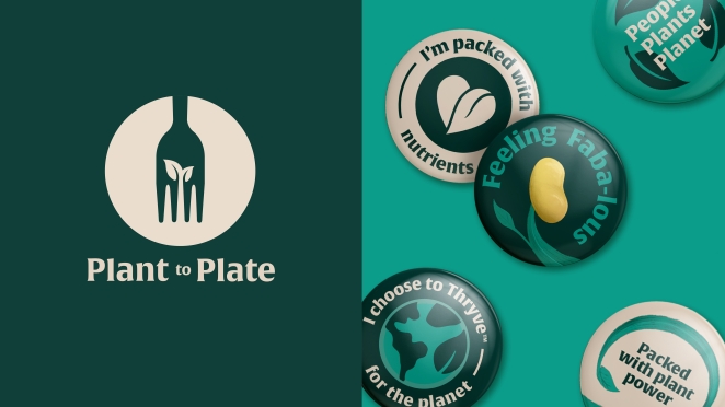
In collaboration with IFFCO’s Plant-Based Venture, WMH&I recently created THRYVE; a new plant-based food brand born in the Middle East. The brand sets out to spearhead a movement of change towards healthier and more sustainable eating in the Arabian Peninsula, at the same time celebrating local cuisines and traditions.
After appointment, branding agency WMH&I discovered that many existing plant-based food brands have entered the Middle East from outside the region, and do not have a meaningful connection with the local market. THRYVE plans to buck that trend.
To learn more we spoke to the team at WMH&I.
What was the brief for the rebrand?
With plant-based eating relatively unfamiliar in the GCC region the task was in educating consumers as to the benefits of eating plant based, dispelling some of the myths around 'plant-based food tasting like cardboard' and inspiring them to make easy healthy swaps without the need to change their overall cooking and eating repertoire.
This meant working with IFFCO to define products that fitted with the local culture and way of eating, rather than forcing more generic Western products into the market.
Health, sustainability and cultural fit were key messages for the brand and creating a hero of the faba bean, a staple in Middle Eastern cooking since ancient times, meant we could comprehensively address all these concerns and ensure that the products felt like 'real food' that had appetite appeal and was good for you and the planet.
How did the initial pitch/brainstorming phase go?
The pitch was focused on a strategic response to the brief. Following appointment, we started the immersion phase and, in this exploring the different cultural stories and semiotics to feed into creative exploration. Led by our research team scouring through literature, social media, tourist boards, reference books, websites, museums, exhibitions, blogs, recipe books, menus etc.
These were further culturally checked this to ensure we understood any cultural sensitivities, stories that shift meaning or significance by region or local cultures. Some of the cultural stories we explored were Tree of Life, Fertile Oases and Karam is the ancient art of Middle Eastern hospitality.
Describe the purpose of the brand and its target audience
Thryve is a new Middle Eastern plant-based food brand, offering new health benefits, and championing regenerative, local, greener agriculture. Its ambition is to spearhead a movement of change towards healthier and more sustainable eating in the Arabian Peninsula and India, at the same time celebrating and respecting local cuisines and traditions.
Thryve plant-based food and drinks are inspired by our land, nurtured with wisdom, and harvested for the next generations. The brand will help consumers express their abundant love for and desire to nurture themselves, their loved ones, and the planet – in doing so they are both receiving abundantly and giving back generously.
The brand targets Millennials and Gen Z who are early adopters of food and health trends. Omnivores who are open to a conscious choice to become flexitarians, and current vegetarians and vegans.
People who realise that their actions today impact how they can thrive tomorrow. I want my food choices to benefit their health and the greater good of the planet. Although mothers are not the only audience, women are critical as a driver of positive change in the Middle East.
What was your thinking behind the rebranding solution?
The packaging and wider visual identity brings to life the thriving power of plants, supported with the
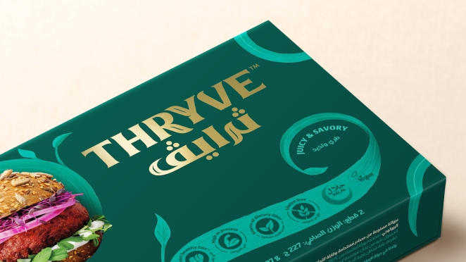
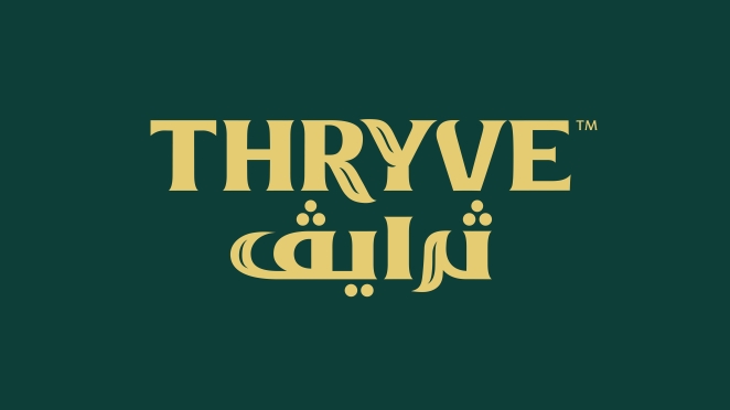
‘Born to Thryve’ strapline. It is a bold yet elegant marriage between the vigour of plant life and with the artistic flowing characteristics of Arabic script. The visual language sees flourishing plant vines metamorphose into the fluid lines of Arabic calligraphy.
This visual language has been crafted throughout every small detail in the packaging design, including nature inspired iconography which incorporates a leaf flourish. The plant vine illustrations, based on Arabic calligraphy, gently holds and presents the delicious food photography.
These plant-like shapes link from pack to pack across the range, to create a single movement, one plant, one life-giving energy that is THRYVE on the store shelves.
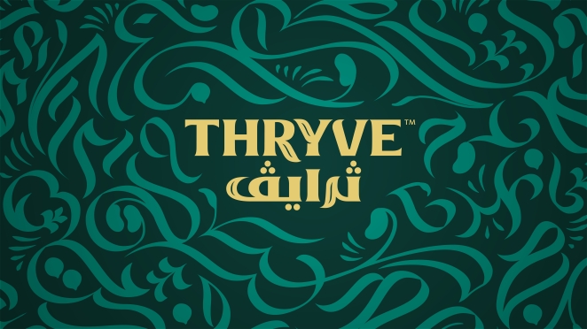
The logo has been drawn with careful attention to regional nuances. It has been developed in collaboration with illustration artist and designer Ruh Al-Alam. The type uses high contrasting strokes and flow from Arabic script with subtle organic touches that visually communicate plant growth.
The brand’s colour palette represents the endless cycle of growth. The palette is centred around the gold colour inspired by the Arabic Sun that gives energy to plants. The wider colour scheme is a combination of fresh greens of seedlings with darker greens of flowering and the taupe of the ancient crops, such as faba beans.
Did you learn anything new during the project?
This project was a deep dive into the Middle Eastern culture, and in particular food culture.
We learned that throughout the ages, Arabian Peninsula civilization has been able to adapt to harsh conditions whilst continuing to evolve, thrive, restore, and innovate. It is in their DNA to continuously build on the learnings from the history, deep-rooted traditions, evolving new technologies to spearhead to a brighter, healthier future.
What was the biggest challenge? How did you overcome it?
The biggest challenge was naturally getting to understand the culture of the Arabian Peninsula. In particular, its food culture, and not only what people eat, but better grasp the role food has in Middle Eastern families.
We worked closely with our partners in Dubai and Saudi Arabia, were hands on with the various rounds of consumer and market research. We also used local partners to ‘check’ our work over the course of the process, to ensure our work was relevant, appropriate, and not seen as too European.
What kit/tools/software were used to create it?
Adobe CS; Photoshop, Illustrator, After Effects
What details are you most proud of any why?
We believe that we have been able to create an elegant marriage between Arabic calligraphy and plant life.
The logo in Latin script has been drawn with high attention to detail in terms of Arabic nuances. Whilst Arabic brand mark has been designed to reflect similar characteristics which are achieved in the English word mark. This logo feels similar in weight and effortlessly works alongside our Latin script mark.
Alongside our calligraphy nuances, we have subtle organic touches that visually communicate plant life growth. On packaging specifically, our plant-life illustrations have a real sense of purposeful yet effortless motion, similar to how Arabic calligraphy is traditionally written.
This hopefully creates a modern brand that is rooted in the Middle East.
What visual influences fuelled your solution?
Together with traditional and modern Arabic calligraphy, we were also inspired by BBC’s The Green Planet. In this series, David Attenborough shows that plant growth is not something calm and tranquil, but full of vigour and free flowing energy.
What do you hope it achieves for the brand?
We hope that Thryve can truly spearhead a movement of change towards healthier and more sustainable eating in the Arabian Peninsula and can feeding new life into people’s diets with healthy and tasty plant-based foods rooted in the Middle East.
What would you do differently if you could do it over again?
It was a great project to work on with close collaboration with our clients and other creative partners, such as typographer Ruh Al-Alam.
Unfortunately, due to Covid, we couldn’t travel to the Middle East at the immersion phase of the project. Visiting the region would have further enriched the experience, and potentially could have accelerated the project.
Credit list for the work?
Creative Director: - Mark Nichols.
Lead Creative: - James Flint.
Design & Motion: - Dan Coleman.
Managing Director: - Daisy Benn.
Strategy Director: - Wybe Magermans.
Production Manager: - Val McCrum.
Artworker / Retouching: - Chris Clarke.
Illustrator: - Archetype.
Photography: - Toby Davies.
Typographer: - James Flint & Archetype.
Head of Plant-Based Venture THRYVE: - Valeria Krynetskaya.
Marketing Manager of Plant-Based Venture THRYVE: - Ciara Boyle