
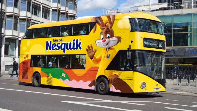
NESQUIK has partnered with global brand-led business transformation company FutureBrand to deliver a modern brand identity. At the heart of the work sits NESQUIK’s much-loved iconic mascot, Quicky, who has been reimagined for a digital future. With a focus on purpose and relevance, FutureBrand has created a brand world which will prime NESQUIK for future product innovation and communication, whilst retaining existing audiences.
This digital-first and motion-led Quicky still feels as familiar as ever and retains his buoyant sense of fun. Immense detail went into his development, ensuring he was a dynamic mascot through his outfits, postures and appearance. To support Quicky’s roll-out, FutureBrand also created a new brand expression and a wider brand world in which he exists, speaking to the wide age range of audiences who engage with the brand.
These work together to create a cohesive brand experience, enriching ‘Quicky’s World’ at every turn. Going beyond just on-pack assets to focus on social media also enables NESQUIK to move towards being a truly digital-first brand that can speak more authentically to the growing teen market.
FutureBrand also created a bespoke typeface called NESQUIK Sans, with the aesthetic reflecting the brand's playful and fun personality. This personality was the inspiration for the new logo too, with the animated milk splash bringing it to life in a digital-first world. The new packaging for NESQUIK is bold, immediate and has a real presence on the shelf, with a simplified packaging design system ensuring easy consumer navigation and allowing NESQUIK the opportunity to amplify its iconicity once again.
To learn more we spoke to FutureBrand design director Ben Hutchinson and ECD Stephen McGilvray.
What was the brief for the rebrand?
![]()
The initial brief was to refresh NESQUIK’s 75-year-old brand mascot, Quicky, reimagined for a digital future, but giving him a new role beyond the traditional role of a mascot. Imagined and brought to life with a focus on purpose and relevance, we created a brand world that will prime NESQUIK for future product and service innovation to reach new audiences.
How did the initial pitch/brainstorming phase go?
We looked to push beyond a traditional role and purpose of a brand mascot. To do this, we looked to the digital world that the next generation plays in for inspiration, drawing on cues from animation films and the gaming industry to bring contemporary relevance and real longevity. A lot of detail went into Quicky's development beyond his appearance, starting with his origin story, personality, behaviours, interests, clothing, and much more.
Describe the purpose of the brand and its target audience
The brand believes that growing up should be fun. It focuses on working towards a brighter future for the generations to come, believing that good nutrition can be fun and tasty. Along with being an ally to the parents, the brand also provides variety of propositions to the teens.
What was your thinking behind the rebranding solution?

For decades NESQUIK has been a beloved family favourite, with Quicky acting as an icon of fun for generations of parents and children alike. However, as consumer priorities have shifted, NESQUIK saw an opportunity to reposition Quicky’s purpose and role.
The brief for us was clear: re-energise NESQUIK in line with a new family landscape and evolving roles in the family, positioning Quicky as an ally to parents with an active voice in important topics such as nutritious diet, active lifestyle, sustainable habits and positive thinking.
Did you learn anything new during the project?
The intense level of design detail and craft that goes into a moving 3D character was far greater than we were aware. As the process unfolded, we learned new technologies, processes and the benefits of a live 3D rigging model. We were on a journey of discovery from the first sketch, through the development and to the final delivery of the 3D model.
What was the biggest challenge? How did you overcome it?

Timings are a challenge on most projects nowadays, but learning different ways of working with new technologies made the process an even more significant challenge. We had to work hard to get Quicky finalised for the launch of the rebrand, and we soon learned 3D character design at this level takes time to explore but also time to complete and technically build.
What details are you most proud of any why?
Creating a moving 3D character isn’t something you get to do every day. It was great to see the teams’ vision for the brand and the teams’ sketches come to life and be developed into a high-fidelity, all moving digitally inspired character.
What visual influences fuelled your solution?
At the heart of the work is Quicky, the much-loved rabbit with whom generations have grown up. FutureBrand looked to the digital world that the next generation play in for inspiration, drawing on cues from computer animation films and the gaming industry to bring contemporary relevance and real longevity.
This playful but highly polished style of illustration for Quicky inspired the second design influence. We felt there was a need to balance this new 3D rendition with a tasteful yet very flat and graphic brand world.
This graphic landscape acts as a backdrop for our hero to live but is also a place to share brand messages. Its deliberate flatness contrasts with Quicky and puts him centre stage once more.
What do you hope it achieves for the brand?
We hope our redesign helps the brand achieve three objectives to form one greater goal. We hope this new visual world and digital led Quicky will boost brand relevancy and enable growth into new audience segments.
We also hope this redesign has real longevity. If we reference the world known characters from animation and gaming industries, these characters remain almost unchanged over the years and decades. That is what makes these characters icons.
Thirdly, we set out to build a coherent brand, not just a consistent one. We hope this creative approach will allow the brand to flex and stretch, meaning wherever the brand wants to go in the future, the visual language will help the brand connect with its intended audience in a more imaginative way than today. The visual langue created will be ready to do so too.
These three points: Relevance, longevity and coherence are the cornerstones to creating a truly iconic brand, this is something we hope to have archived, but only time will tell.
What would you do differently if you could do it over again?
Evolving Quicky was the most technically challenging mascot design the team has ever been involved in. We have so many great learnings, and we now know what it takes to bring a character to life at the highest level that we can apply to the next one.
Credit list for the work?
Stephen McGilvray – Executive Creative Director
Ben Hutchinson – Design Director
James Pearce – Senior Designer & Illustrator
Eleri Cleaver – Client Director
Selen Kilic – Senior Account Manager
Ashleigh Steinhobel – Strategy Director